By Ellen Howard
Sunsets slow us down. They invite us to pause, to notice, to acknowledge the passing of time. For painters, they offer something richer still: a living lesson in light, atmosphere, and impermanence.
Their drama, though we tend to describe it in poetic terms, is governed by precise physical laws. And here’s the thing: understanding those laws doesn’t diminish the magic. It sharpens your perception and deepens your connection to what’s in front of you.
Why the Sky Looks the Way It Does
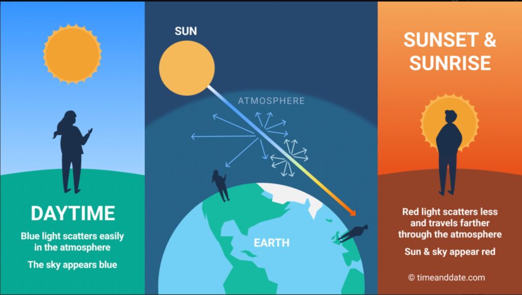
Rayleigh scattering explains why the sky changes color throughout the day: when the sun is high, shorter blue wavelengths scatter in all directions, making the sky appear blue; at sunrise and sunset, sunlight travels through more atmosphere, scattering away blues and violets and allowing longer red and orange wavelengths to dominate.
The key is a phenomenon called Rayleigh scattering — the atmospheric process that determines how sunlight travels through the air before it reaches your eyes. At midday, sunlight passes through roughly 60 miles of atmosphere, scattering blue light broadly across the sky. At sunrise and sunset, with the sun low on the horizon, that same light has to travel through nearly 100 miles of atmosphere. The shorter wavelengths — blues and violets — scatter away entirely. What’s left are the longer wavelengths: reds, oranges, and warm yellows.
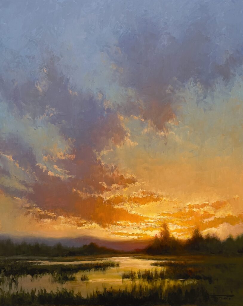
“Into the West” (oil, 20 x 16 in.) by Jane Hunt
Those colors don’t appear as hard, separate bands. Moisture, haze, and air density soften every transition. Painter Jane Hunt thinks of the sky at these moments “less as separate zones of color and more as a single, continuous field of light — warmth and coolness constantly interacting rather than competing.” That’s a useful way to hold it in your mind when you’re standing at the easel.
Value Before Color
Here’s where it gets practical. Rayleigh scattering explains which wavelengths reach your eyes, but you still have to translate that into paint. Painter John MacDonald puts it simply: atmosphere is created by value, not color. Without correct value relationships established early in the painting, no amount of sophisticated color mixing will produce a convincing sense of air and distance.
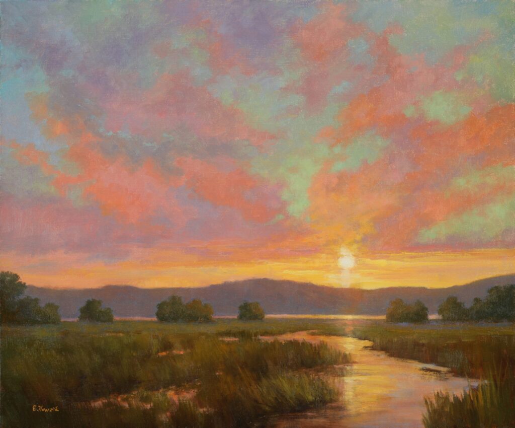
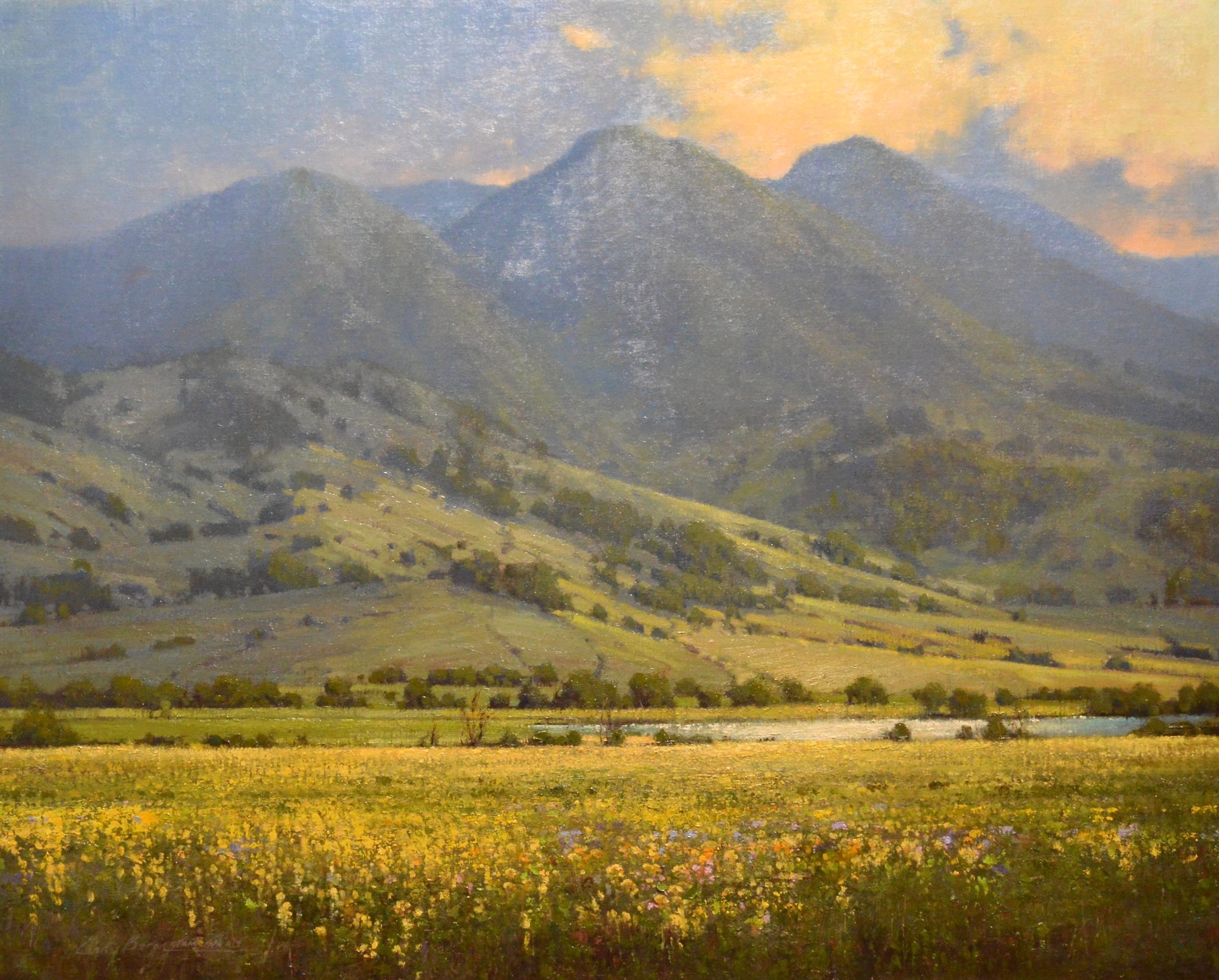
“Beyond the Light” (oil, 20 x 24 in.) by Ellen Howard
Not convinced? Look at a black-and-white photograph of a landscape. The feeling of space is still completely intact, even without color. Get the values right first. Then worry about color.
Sky to Land
Here’s the part that surprises most painters: Rayleigh scattering doesn’t stop at the horizon. At sunset, the sky becomes the primary light source, and its color progression filters through the air and influences everything below it. And crucially, the color sequence in the sky and in the landscape run in opposite directions.
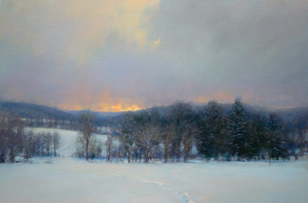
“Flurries at Sunset” (oil, 24 x 36 in.) by John MacDonald
In the sky, color shifts from violet and blue overhead toward orange and red at the horizon. In the land, that same atmospheric filtering reverses — the foreground holds the strongest warmth, while distant forms cool and soften toward blue-violet.
One of the most common mistakes at this transition point is treating the glow near the horizon as a hard line — painting sky as one thing and land as another, with a sharp edge between them. Painter Cindy Baron has observed this in her own students. “When you study it,” she says, “there’s a softness where the two meet.” That softness — achieved through subtle value shifts, varied brush direction, and a light touch — allows color to merge optically and produces the illusion of distance. Paint the edge, and you lose the air. Suggest it, and the landscape breathes.
Many sunset paintings fall flat not because the colors are wrong, but because that sequence gets distributed evenly across the whole canvas. Painter Jacqueline Jones puts it well: “Strong color everywhere competes for attention and collapses space. We must decide where color intensity belongs — and allow everything else to support it.”
That’s the insight worth carrying with you next time you set up your easel at golden hour.
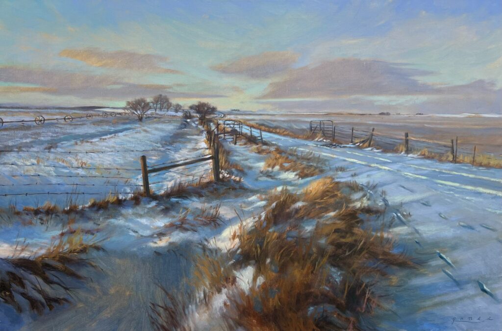
“February Thaw” (oil, 20 x 30 in.) by Jacqueline Jones
Want to see Cindy Baron’s approach to atmospheric distance in action? In her video workshop Painting Harmony in Nature — she covers soft edges, value relationships, and the kind of light that makes a landscape feel expansive rather than flat.