by Robert Moore
After more than 20 years of doing art critiques, I have found 10 areas to be the most important to the creation of a strong painting.
- Look for 3 to 6 clearly defined masses
Following this simple organization of masses and values will result in a presentation of clearly communicated information for the viewer to easily decipher and enjoy. In a poll (given by and to me) 80% of bad paintings are caused by confusion of this “simple massing” concept.
- A) Masses must remain clearly separate and unbroken except in a transition area (a portion of an edge).
- B) Masses must follow the concept of the Mass/Value Range Chart:
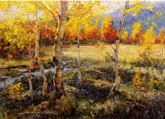
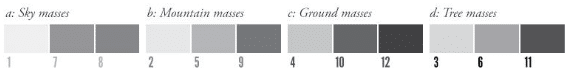
Mass / Value Range Chart
This chart describes a hypothetical painting with 12 values in 4 masses. The actual number of values and masses shown here is arbitrary. The concept is what is important.
- Develop the masses with closely related values within them
If you arrange a first-grade class from shortest to tallest and a sixth grade class from shortest to tallest, the tallest first grader is still going to be shorter than the shortest sixth grader. This separation is critical when you are painting those separate masses in your painting.
For example, you have sky mass values that are your first graders (the lightest). Within that mass there are going to be areas that are light-light, medium-light, and darker-light.
There is a range just as with first graders—some are shorter, some are taller, but they are all first graders. When you compare those values with the darker upright tree mass, the darkest light is still going to be lighter than the lightest dark value. This clear separation is what creates a mass. So to maintain separate masses we must keep the first graders with the first grade, sixth graders with sixth graders, and twelfth graders with twelfth graders, etc.
Robert Moore, “October’s Voice,” 70 x 96 inches, Oil on canvas
A sample structure of a failed painting:
What often happens is that we compare the darker lights to the lighter lights and forget that the relationship also has to be with the other masses. So we paint the dark lights too dark and the light darks too light, etc.
A sample structure of a failed painting:
What often happens is that we compare the darker lights to the lighter lights and forget that the relationship also has to be with the other masses. So we paint the dark lights too dark and the light darks too light, etc.
- Ensure the major shapes have unequal relationships
The simplest way to define a dynamic shape is that good shapes will have unequal distributions:
- A) The simplest unequal ratio is 2:1. If our reference gives us a 1:1 ratio it is our responsibility to change it. We are not slaves to the reference.
- B) Differences are sought out and celebrated in every aspect, including making sure there are unequal portions within a given mass. Edges and smaller segments of the silhouettes of the masses also need to be varied.
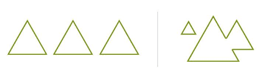
Both illustrations above show three trees. The first one may be a true representation of nature, but the second still communicates the truth but in a much more dynamic way. Keep shapes unequal.
- Interlock the silhouettes of the masses
- A) Avoid uninterrupted lines or visual movements off the edge of the composition.
- B) Do not allow the painting to be a set of uninterrupted bars.
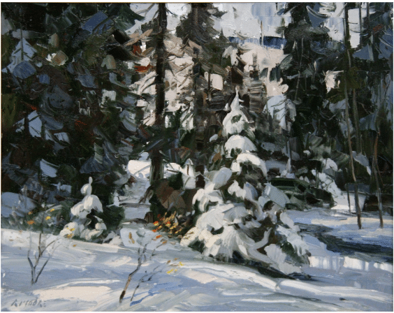
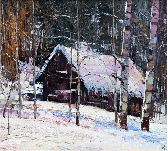
Robert Moore, “Heavy Snow,” 20 x 24 inches, Oil on canvas
This is an example of interlocking where there are darker masses injected into the lighter and the lighter into the darker. This causes shapes that are forceful and will maintain the viewer’s gaze longer than parallel bars.
- Relate and adjust your edges
- A) Do not leave any edges to chance. Design requires intelligence!
- B) Compare edges and relate them.
- C) Exercise freedom. The eye accepts many edges: brush, knife, towel, finger, etc.
- Create a sense of depth using linear and atmospheric perspective
- A) It is a valuable tool to use perspective in a landscape painting even if you have to generate it from other sources. (e.g., a road, a path, a creek, fallen logs, etc.).
- B) Distant forms are influenced by atmosphere (small and numerous veils of colored light). The sky starts at your nose.

Robert Moore, “Fullness Thereof,” 24 x 48 inches, Oil on canvas
- Keep the eye moving
- A) Compositional “magnets” of contrast and information near the edges must not be too strong or they will arrest the eye for too long.
- B) Use contrast and information to lead the eye around the painting. If a visual magnet is too strong then lessen the contrast and the information.
- Prioritize depth and perspective; don’t just copy the reference
- A) A vertical distance low on the picture plane increases exponentially in its perceived size as it moves toward the horizon. The inverse is true in the above-the-horizon line in the sky.
- B) Vertical distance is especially important with roads and waterways of any kind. Any ellipse depicting the shape of a road or waterway will kill the painting as it distorts the vertical component.
- C) Like elements must decrease in size as they move toward the horizon. This is a tool for showing depth.
- D) Do not just copy like elements from your reference. Do not be a slave to your reference! You are the master and you are responsible for your creation!
Both the rabbit-cow and the Godzilla-cow are the same actual size.
- Create color harmony with a common denominator
Natural light brings harmony—think in terms of stepped progressions of hue, value and intensity that bring the effect of natural light. Define the elements of the scene defined by differing local colors with many subtle steps of transition, bathed by a common colored light.
- A) Assign warm and cool color to the masses in a way similar to the values in the Mass/Value Range Chart above.
- B) Make steps and progressions of hue and intensity within a given “mass value.” Don’t fall into the 80%failure range by forgetting about massing principles when you apply your attention to color.
- C) Compare similar color to similar color and then celebrate the differences while maintaining the overall order.
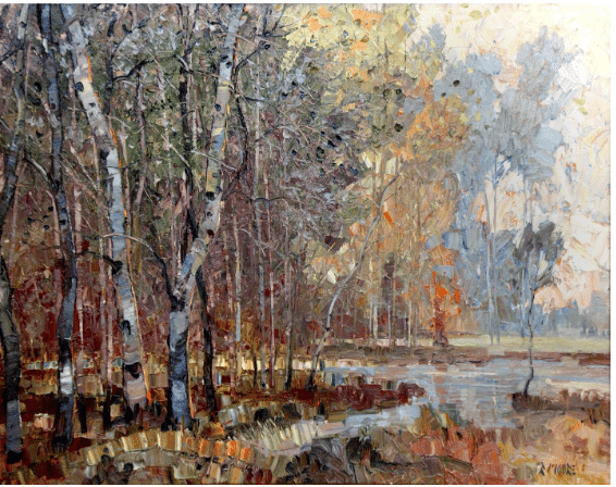
Robert Moore, “Harmonies,” 24 x 36 inches, Oil on canvas
If you have followed the previous nine principles and your painting is still not exciting, the problem is probably with your shapes.
- Make your shapes dynamic and unique
- A) Shapes should not express similarities between objects; rather, shapes should celebrate the differences.
- B) Shapes must be unequal unless monotony is the feeling you want to communicate.
- C) Avoid trite shapes like cotton balls, lollypops, and teepees. Do not emphasize the ways that shapes are equal and similar.
- D) Shapes will become eroded through the process of painting as you paint one edge into another and chip away at the different, unique shapes. Draw back into the shapes and redefine them as part of the painting process.
- E) Avoid amoeba-like shapes that are not dynamic. Make them unequal and unique. Try to imagine objects represented by the shapes (e.g., a cloud that looks like a T-rex or a shadow on foliage that looks like a roadrunner).
- F) In order to focus on design, start out with shapes that are highly defined and bounded by strong contrast around their entire perimeter. However, if the shapes are left this way the result will be a “cutout” effect. To achieve a natural feel, transition (or lose a portion of) the edge of the shape into the adjacent shape.
The problem correctly defined is its own solution.
When we are painting alone it is critical that we are able to correctly diagnose problems. Easily heading off problems such as these may require years of practice or study, but that is also what keeps the variety in a life engaged in the discipline of painting.
Learn more about Robert Moore at: www.rmoorefineart.com


