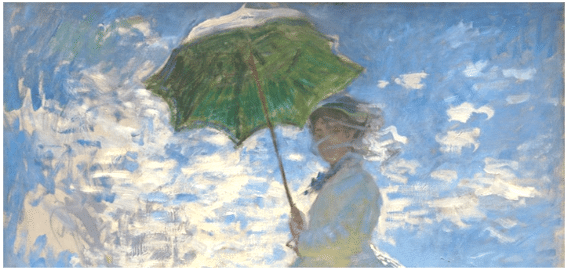
“Woman with a Parasol – Madame Monet and Her Son,” 1875
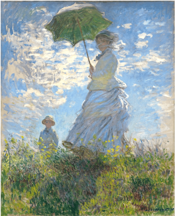
Claude Monet , “Woman with a Parasol – Madame Monet and Her Son,” 1875 (Photo: Wikimedia Commons Public Domain)
Most perfectly well-intentioned web sites and even art historians will tell you who these figures are and where they were when Monet painted them – thereby completely missing what’s interesting and wonderful about Woman with a Parasol. Let’s not do that.
Woman with a Parasol makes an indelible impression by surprising the viewer with an unusual below-the-horizon-line perspective. What does Monet gain by such a choice? This remarkable viewpoint, besides being interesting just because it’s different, pushes back the figures and emphasizes the lush surroundings – the swaying, light-filled grasses, the animated sky, Madame Monet’s rippling dress (yes, it’s the artist’s wife and son on holiday). The reflected light in the figures, especially Mme. Monet’s dress, visually integrates the figures with the background and foreground. Again, why?
So what?
On the literal level, blending the figures and their natural surroundings creates a strong organic coherence throughout the entire painting. Now, on the non-literal level, integrating the figures with the natural beauty around them suggests they’re in harmony with the same summer energy that infuses the moment.
Monet’s painting is not famous because it’s a portrait of his family. It’s famous because it’s not a portrait of a person or two, but rather something at once more grand and more simple: the evocation of a perfect moment on a breezy day in a sun-drenched meadow by the sea. Everything is swirling, and it all moves together.
How Did He Do It?
Because of the way Monet’s laid down the paint, the angles of his brushstrokes make the grass sweep to the left and seemingly aspire to flow right up into the sky. The clouds pick up this movement and splash upward like a fountain before drifting over to the right on the breeze. There’s NO fussing over details or “accuracy” here. It’s all about getting life into it through color, movement, and light. It’s an excellent example of Monet’s carefree interpretations of nature, so characteristic of this artist, who once noted that he “would like to paint the way a bird sings.”
So let’s talk about color.
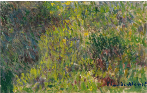
Starting with the grasses, how many different colors and values has Monet managed to incorporate and make work together? Not going to bother counting, but all the primaries and secondaries are represented, interwoven with a spectrum of different greens of various shades, values and temperatures. Look at all those tiny dabs of “broken” (unmixed) color – that’s the hallmark of impressionism.
Now let’s take a close look at the dress.
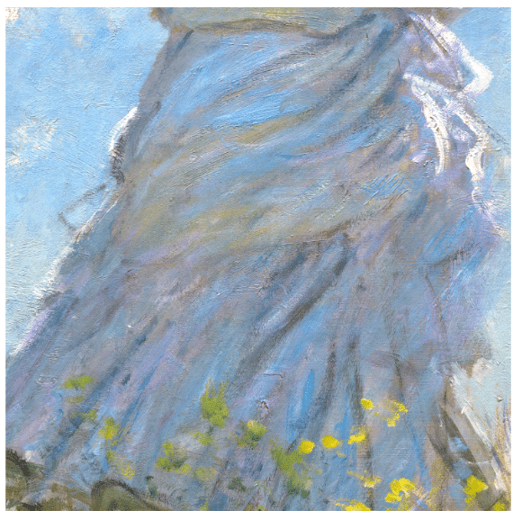
What do you see? I see extremely skillful control of colors, values, and temperatures amid a range of orange-ochre, blues, violets, and much in between. Lest we forget, this is a WHITE dress. I also see that Monet has incorporated one of the same shades of blue he’s got in the sky into the dress’s shadows.
You can really see here how yellow-gold warms the blue shadows and helps establish the dress’s whiteness. But not to be missed is the bigger picture – how the blue shadows and white edge-highlights join up with (but don’t blur into) the sky colors.
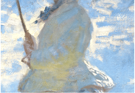
The same thing happens with her veil –
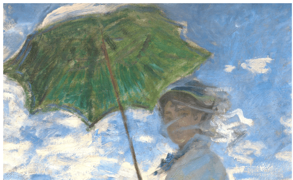
Because of the brushstrokes, the folds of the gauzy veil seem to flow into and be continued by the clouds directly behind her head. Note, too, how the crowning touch – the inside of the parasol – is the same color (green/s) as the grass. The brushstrokes here suggest nature’s green radiating down from above the figure as well as reaching up from below.
That’s how Monet performs the magic of harmonizing and integrating these figures with the natural beauty and the movement all around them. And that is the true subject of this painting and why it is so beloved.
How Modern was Monet?
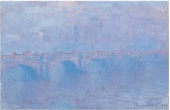
Claude Monet, Waterloo Bridge, effet de brume, 1895
Over 100 years later, it’s easy to miss what a radical and subversive artist Monet was in his time. In fact, Monet’s work massively influenced the American abstract art movement from the mid-twentieth-century and continues to do so today.
Monet’s Waterloo Bridge, effet de brume depicts the Thames under an effervescent evening haze. It’s part of a series in which Monet reveled in London’s ever-changing atmosphere and the play of light across the river. Monet’s views of Waterloo Bridge stand as pure meditations on color, light, and atmosphere, evocatively capturing the shifting character of the famous bridge under varying weather conditions at different times of the day.

Joe Goode, Ocean Blue #6, 1988
Compare Monet’s Waterloo Bridge with a work from Joe Goode’s Ocean Blue series. First recognized for his Pop Art milk bottle paintings and cloud imagery, Goode’s work was included along with Wayne Thibaud, Roy Lichtenstein, Andy Warhol, Jim Dine, Edward Ruscha and others in the 1962 ground-breaking exhibit New Paintings of Common Objects. This historical exhibition was the first exhibition of Pop Art in a United States museum.
Ocean Blue #6 drops any reference to the objective world of cities, bridges, and fog, dissolving the physical world in washes of blue that evoke soothing, sunlit ocean depths without realistically rendering them. In the absence of the traditional elements of the ocean-scape or the landscape painting, the abstract artist must carefully manipulate colors and the distribution of shapes (or in this case, just values of a single color, blue, and subtle distributions of light, dark, and temperature) in a way that creates a balanced composition in its own right. It looks easy – until you really look at it and see what’s really going on.
Goode’s is a very different painting from Monet’s, but it too revels in atmosphere and color. The 1988 painting would be unthinkable if Monet hadn’t astonished the world with his lyrical genius all those years ago – which is one of the reasons we still revere the master Impressionist today.