Would you like to understand more about composition and what makes a painting work?
This week, a reader sent me an image of the above painting, along with a great idea – what if readers suggested paintings to be analyzed for composition and what makes them so striking?
If you have a favorite painting and would like to see its composition analyzed in Inside Art please send me an image of it. I’ll put it up as our next example of how composition makes great paintings work.
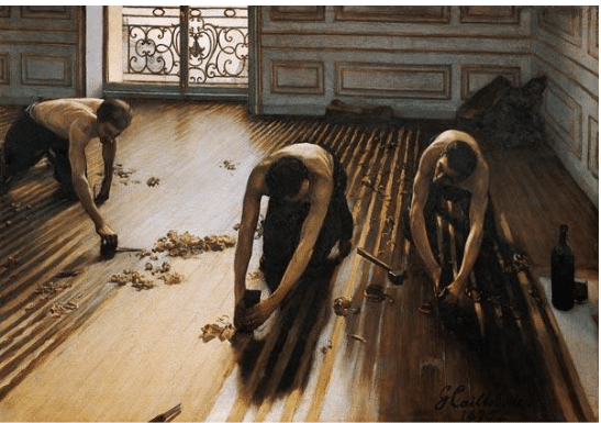
Gustave Caillebotte’s “Raboteurs de parquet” that is, the floor-scrapers or floor-planers, certainly boasts an unusual and striking composition. I think we can sum it up in two words: value and composition. Both are extraordinary. But just saying that doesn’t get us very far does it? Let’s take a deeper dive.
To start with, it’s an unusual choice to give over so much of the picture’s space to diagonal lines. Also unusual is that Caillebotte, in a technique learned from Cezanne and van Gogh, has tilted the picture plane very much down and flattened it toward us.
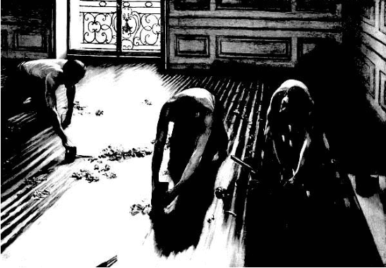
Here’s the painting as a “notan,” with the color removed, which allows us to see the values (lights or darks of the colors) at work. Note the division into two asymmetrical dark masses, one dominant and one subordinate, divided by the light on the floor. The smaller, subordinate shape (with less visual weight, we would say) is the guy on the left merged with his perspectival floorboard reflections, while the dominant shape (hence with more visual wight) consists of the two men and their perspectival diagonals on the right AND – Caillebotte connects these dark shapes using the shadows in the debris strewn between the men, and their shadows merge with those of the back wall). Additionally, Caillebotte uses the directional line of the far-left man’s left arm to diagonally point toward the others in the group, creating an implied linear connection.
Then there’s the light. It’s less important to think about where the light is coming from (that’s merely a technical issue) than it is to consider the role light and dark plays in the overall impact of the painting. The contrasts are extreme – the shadows, the bottle, the men’s hair and the pants they wear are super dark black, so they contrast sharply with the high-value light coming thought the window and streaming across the floor to the point of dissolving the dark-and-light scheme of the floorboards.
But perhaps the best way to see what’s really going on composition-wise is to diagram its lines and their relationships with color.
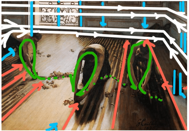
One of the first things you see is how those foreground diagonals (orange) point you into the painting – the (white) wall stretching across the background stops the eye that is following those (red) lines from even thinking about leaving the painting. Meanwhile, we get three very strong ovals arranged in visual rhyme across the open space (green, the workers’ arms – the dotted green lines show how they’re connected, not isolated). This is not a composition you see in a lot of other paintings but boy does it work!
The closest thing to a horizontal line is that far wall, and even that is far from parallel to the painting’s edges. As a compositional device, tilting the picture plane and giving us so many diagonals very strongly leads us IN (not out) of the painting, because all these lines are like arrows for the eye to follow. The light is coming from the window forms an organic counterpoint to the diagonals as it spills across the picture plane from left to right.
On this painting, the Musee d’Orsay, which owns it, has rthis to say:
“This painting is one of the first representations of the urban proletariat in Western art. Whereas peasants (Gleaners by Millet) or country workers (Stone Breakers by Courbet) had often been shown, city workers had seldom been painted.
“Caillebotte had undergone a completely academic training, studying with Bonnat. The perspective, accentuated by the high angle shot and the alignment of floorboards complies with tradition. The artist drew one by one all the parts of his painting, according to the academic method, before reporting them using the square method on the canvas. The nude torsos of the planers are drawn from sculptural heroes of Antiquity; such a physique would be unimaginable for Parisian workers of those times. But far from closeting himself in academic exercises, Caillebotte exploited their rigour in order to explore the contemporary universe in a completely new way.
“Caillebotte presented his painting at the 1875 Salon. The Jury, no doubt shocked by its crude realism, rejected it (some critics talked of “vulgar subject matter”). The young painter then decided to join the impressionists and presented his painting at the second exhibition of the group in 1876, where Degas exhibited his first Ironers. Critics were struck by this great modern tableau, Zola in particular, although he condemned this “painting that is so accurate that it makes it bourgeois.”
Again, if you learned something from this analysis and would like to understand more about composition and what makes a painting work – please send me your suggestions! I’ll be happy to take a swing at analyzing it for composition and what makes it a worthy example for study.
Composition is an essential skill for any painter. You can learn all about it, from prominent and popular realists in any number of professional teaching videos, available for browsing here.


