It takes practice at the easel to master value, the relative lights and darks of colors. Many students and beginners struggle to get color right, when nine times out of ten, it’s really a value issue, and fixing the value solves color problems.
Color has three properties, of course – hue, value and intensity. It’s obvious that the two colors in the graphic below are different in hue (green vs. purple), but difficult to tell that they have the same value:
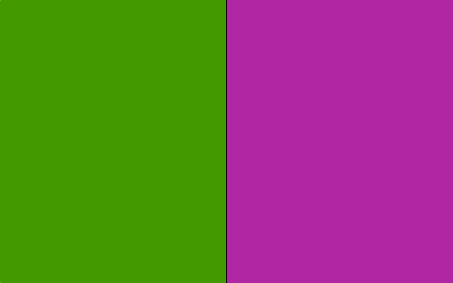
However, if you squint to the point of eliminating all color, filtering it out by peering through your eyelashes, you should just be able to make out the close similarity in value.
And here’s the proof: Below is the exact same graphic with the saturation turned all the way down – in art school terms, the chroma (saturation or intensity) is so low that we can no longer distinguish hue. However, neither rectangle is visibly darker or lighter than the other, so we say they have the same value.

And it’s not a matter of “correcting” your values; it’s about adjusting the relationships between them. Below is a beginning student’s landscape painting before and after value adjustments performed digitally in a graphic design program. Beginners often lose sight of value relationships during the process of getting the colors and shapes of objects to behave.
The good news is that many a painting can be improved simply by going back in at the end and lightening the lights and darkening the darks.
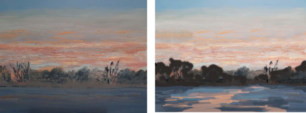
In this example, in addition to adjusting the overall values, the tree shapes on the horizon were rather similar and symmetrically arranged. We chose one off-center tree shape to make a single, dominant form, a shape somewhat larger than the others. Variety – no two of anything – is the name of the game. (In fact, in the version on the right, I think the two adjusted tree shapes (the dominant hat eh sub-dominant ones) are two similar. I’d go back and change one, probably the one on the right because it should be made even a little more smaller than its big brother anyway).
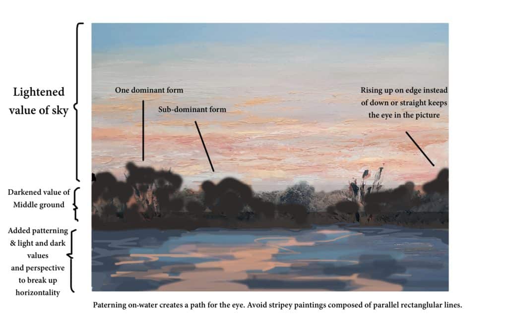
Ideally, more patterning in the sky (fewer same-size parallel horizontal lines, and more clouds-in-perspective creating diagonals) would make it stronger still. As a general rule, any sky tweaking should be done with an eye toward complementing or completing the “path for the eye” (the one we started by adding patterning in the water).
It’s not intuitive to think this way – that’s why composition is one of the hardest roadblocks for newer painters. Composition requires that you not think in terms of painting “water” “reflections” “trees” or “clouds.” It demands that you momentarily forget the names of the things you have painted and see them solely in terms of directional lines and shapes that you need to relate to each other.
But in this case, as in many, value that was the first and most important adjustment.
Want some anonymous critique for your paintings? Send us an image of your own work, if you’re game, and we’ll take a shot at suggesting ways to improve it. Don’t worry, we won’t name any names.
And if you’re looking to overhaul your value skills, look no further for a deeper, hands-on dive than these outstanding titles from Streamline Publishing’s art-instructional DVD library.
This Apple Dreams in Color
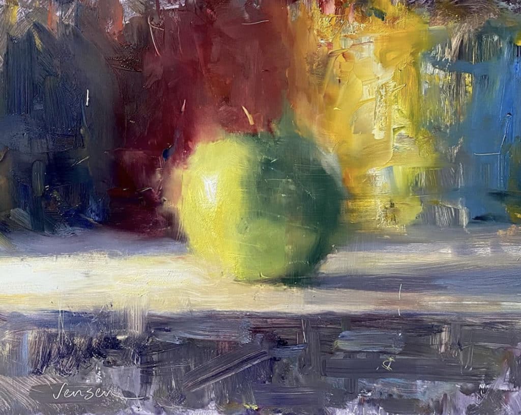
Ryan Jensen, Green Apple Dream, oil, 12 x 16 inches
California oil painter Ryan Jensen paints plein air and in the studio. In the still life above, Green Apple Dream, Jensen finds a dreamy combination of color variety and value contrast that works particularly well.
If you squint at this painting to remove most of the color, the value choices become obvious, especially concerning the central motif (the apple-sphere). TWhat’s because Jensen created strong enough contrasts between them, even as the edges that separate those darks and lights are soft, not hard. The lesson? Tread softly – but carry a big understanding of values.


