I’ve a confession: the title of this post is a bit deceptive. When it comes to color mixing, there’s actually no such thing as “mud.”
Don’t believe me? Look at the colors that dominate the lower right quadrant of the following painting by Stephen Quiller, below.
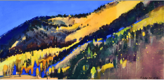
Stephen Quiller, Autumn, Snow Shoe Mountain, 10.5” x 20.5” watercolor and gouache
Well, yeah, there’s “mud color” in there, but it only makes the painting better and more interesting when you think about it: look how well the relatively murky reddish and greenish browns relate to the acid greens, errant mauves, middle-ground blues, and splattered yellows. Think of its relationship as a muting and balancing element next to the electric mango orange in the mountain and the glowing field of blue in the left top corner diagonally opposite. Paint that is the color of mud is beautiful and absolutely right when placed on a canvas with intention and relationally (in relationship with other colors).
“Mud” (the bad kind) is something that happens not on the palette but on the canvas. So-called mud happens not from mixing but from smearing paint, usually because you’re either not thinking about what you’re doing or you’re using TOO MANY BRUSHTROKES in a desperate effort to “fix” something. Either way it ends in a helpless fugue state as you try to blend paint into submission (resulting in mud). It’s not the color that’s the problem – it’s that everything’s just mushing together, all of it out of control.
Mud? Not if it “works”!
Nine times out of ten, the trouble isn’t color at all, but value. When in doubt, forget color and think only in terms of dark and light – are the darks too dark or not dark enough, and are the lights too light or not light enough. In the little patch of the painting we looked at above, you can see that the colors (even while breaking all the rules about mixing, complements and secondaries, etc.!) are close enough in to play nice together. No one color-value is stepping out of line or trampling on another.
If you find yourself dealing with “mud” on your canvas, it’s time to clear the slate. It’s much better to scrape off the offending area with a palette knife, rethink, and remix your color to the proper value, and then put it back fresh.
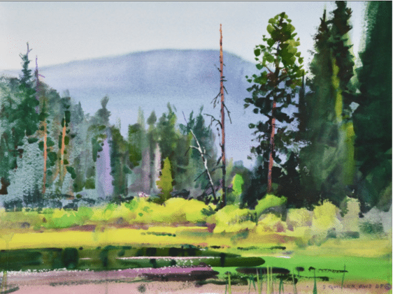
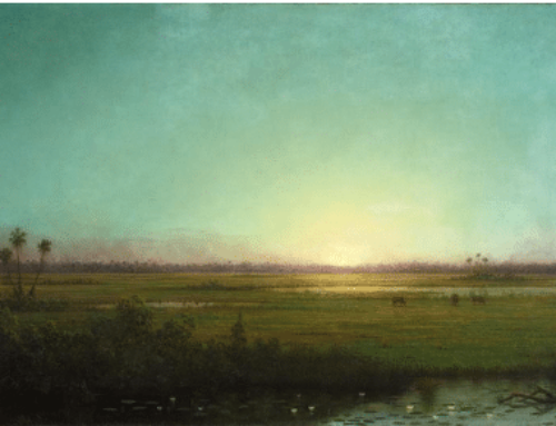
Stephen Quiller, Pond By Tahoe Lake, 18” x 24,” watercolor
Experienced painters tend to pay as much or more attention to what’s happening on the canvas as they do to whether it looks like what’s “out there.” Ultimately, as you can readily see in the paintings of colorist Stephen Quiller, it’s not accuracy or faithfulness to the visible (to a particular marsh, tree, foliage color, or ocean wave), but what ends up on the canvas that makes the painting live or die.
Consider everything – color, shape, value, stroke – in relation NOT to what’s “there” (in the world) but to everything else on the canvas. It’s the clear expression of vision and the harmony and integrity of the painting, not what it’s a painting of, that matters most.
Stephen Quiller has a video that starts with the basics of color for artists and moves into the sense of freedom that comes from understanding it thoroughly. Check out “Color Foundation for the Painter” here.
WINNER HIGHLIGHT
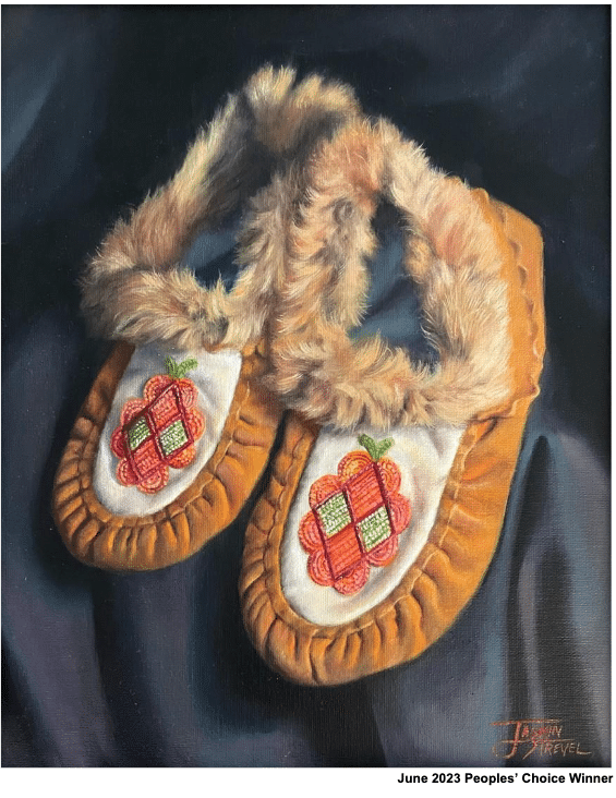
Moccasins, by Jasmin Strevel
Master Artist, Peggy Immel, was the judge for the June 2023 PleinAir Salon Art Competition. Jasmin Strevel’s realist portrayal of a pair of moccasins, with an array of textures from bunched suede to beading to fur, walked away with the Peoples’ Choice award.
Congratulations to Jasmin and all the winners of the June PleinAir Salon. You can view all the awards at PleinAirSalon.com, and while you’re there enter your paintings in the August Competition. Master Artist, Albert Handell is on standby waiting to view your winning piece!