Not long ago I posted a story containing a “mysterious” list of 10 excellent bits of advice for painters. I’ve since learned that we owe the list to master Tonalist Dennis Sheehan.
Number One on the list: Get the Viewer’s Attention. Your first job as a composer-designer is to catch the eye of strangers. Ultimately the name of the game is to hold your audience’s attention as long as possible, but first you have to get them interested. So let’s look at a few different ways to flag down the distracted and the busy, starting with contrast and design.
Contrast
Contrast is the quickest and surest way to reel in your viewer from a distance.
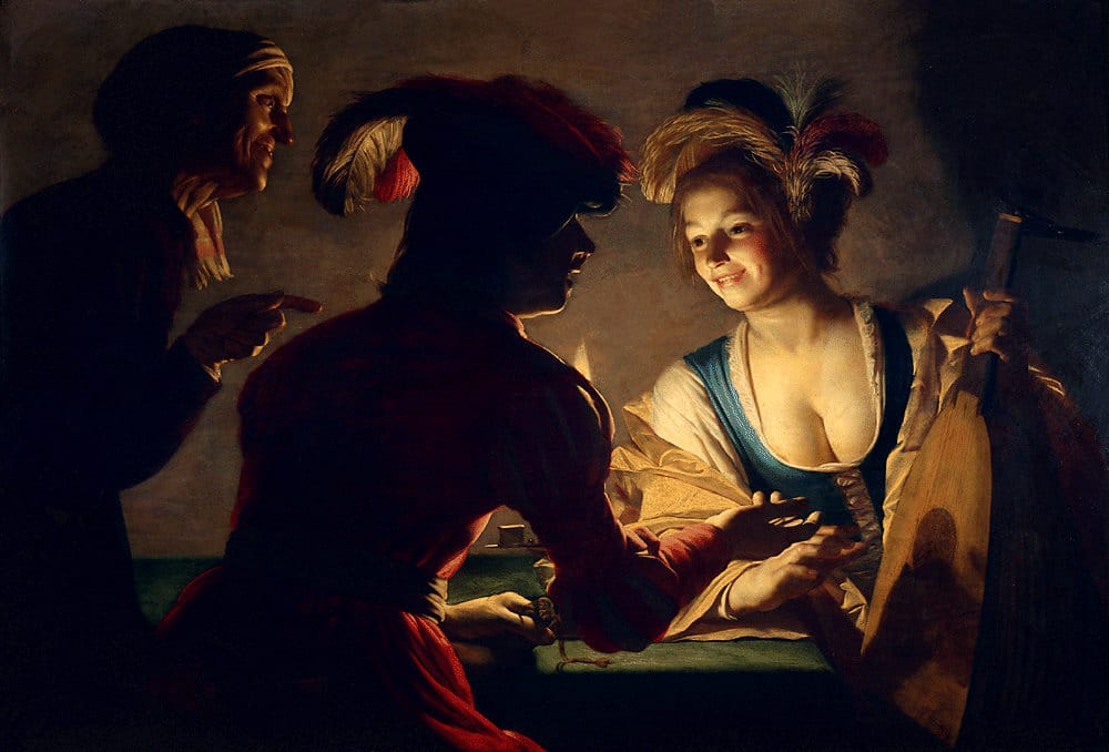
Gerard van Honthorst, The Procuress, 1625, height: 71 cm (27.9 in); width: 104 cm (40.9 in)
In art, the use of strong contrasts between light and dark is known as chiaroscuro, an Italian term from the Renaissance and Baroque eras literally meaning “light-dark.”
Color – and the contrast between colors – as well as value (relative light-dark) will grab attention too.
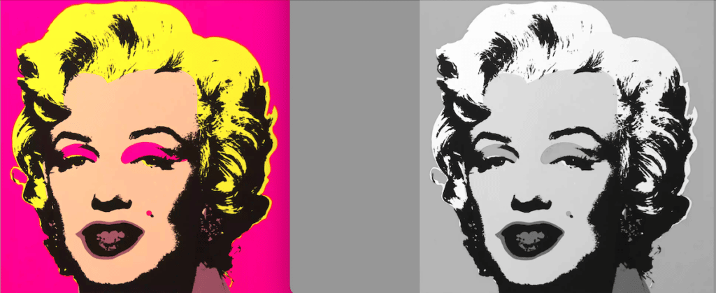
In the case of the reproduction of one of Warhol’s Marilyns (above), the color is more than adequate to catch the eye on its own – but as you can see in the desaturated version on the right, there’s a good deal of chiaroscuro (light/dark contrast) involved here as well.
Motion (an aspect of Design)
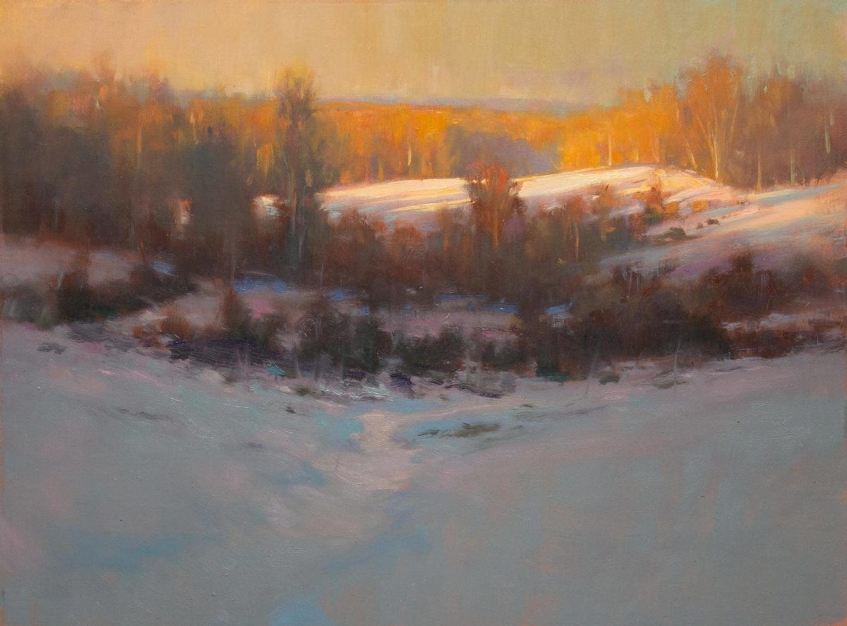
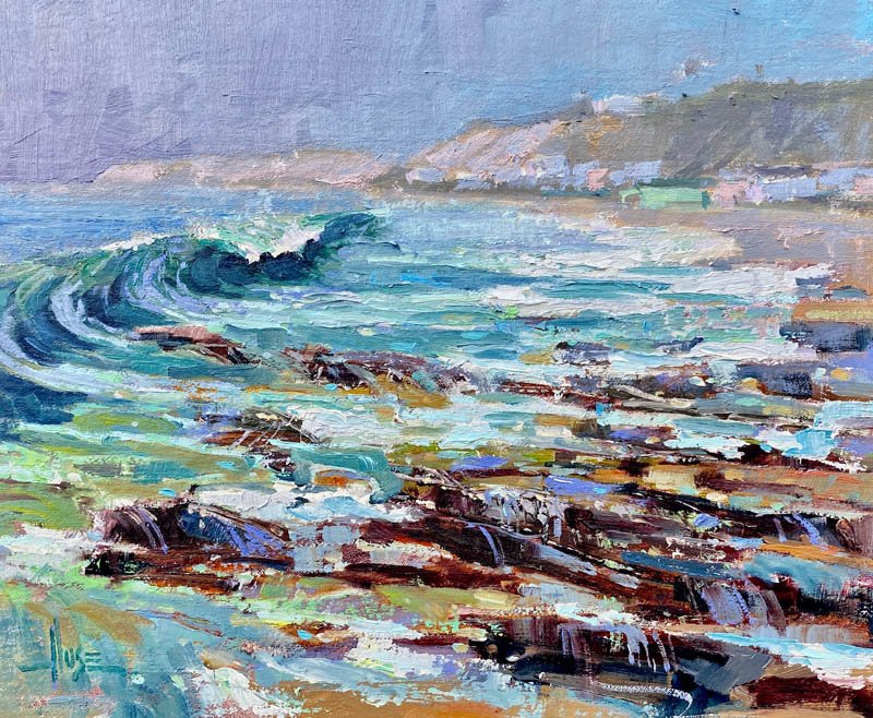
John MacDonald, Icing Over, oil
Motion in painting, sometimes called “rhythm,” has to do with the illusion of movement created when the eye follows the contours of the lines, shapes, edges, or brush/knife-strokes. All lines in painting can be thought of as directional – they direct the eye in a particular direction from one portion of the work to another, preferably in a controlled fashion calculated for maximum attention-getting.
This painting by John MacDonald fits the bill. It’s not full of a ton of stark contrast, but it has “enough” contrast to catch your eye – and once it does, you fall under the spell of the play of light, color, and shape between the ice and that SKY.
No ordinary “partly sunny” day, MacDonald’s sky is full of motion and intriguing positive and negative shapes animated as if by a magician’s spell. Radiating in a lively and jagged fashion from the center of the painting, the complementary colors of yellow-orange and purple vibrate across the surface of the top half of the painting. The bright, negative shapes between the clouds connect to create motion in the form of an arc your eyes follow from left to right and back again.
Likewise below, on the frozen pond’s surface, color, temperature and value vibrate against each other in the “cool” blue ice and the “warm” yellow light (relative terms) glancing off the water coming through the opening in the center.
The scattered dashes and trails of light orange against purple activating the space between the ice and the clouds (the patch of sky just above the land) further delights the eye with a sort of soft fireworks-display of spots and dashes that look like little planets, suns or nebulae. Attention gotten and held? Check.
Any other paintings come to mind that can stop someone in their tracks from across a crowded dance floor? Email me – I’d love to share them in a future post.
Check out John MacDonald’s teaching videos to understand the step-by-step creation of his brand of attention-getting work.
12 Days of DVD Workshops
Love art workshops? New this year, you can check out the PaintTube.tv “12 Days of Christmas” sale, which features a different art video workshop continuing now through December 23. Click here to see today’s special offer!


