Still quarried in Venice, but found everywhere including in Pozzuoli Red, English Red, Pompeii Red, and Indian Red among others, it is the world’s oldest mineral pigment.
Venetian Red is one of many names for a color made from a very common natural compound, namely iron oxide, which is basically rust. It’s been in continuous use in art, by one name or another, since the earliest pre-historic cave paintings we know of, a span of some 30,000 years of human history.

John Trumbull, The Death of General Warren at Bunker Hill, 72.5 in × 108.1 in
Famously used to dye the red coats of the British army, Venetian Red is a Renaissance red par excellence. Those earlier painters thought of it simply as a “red earth,” and they employed it, in varying tints and intensities, as a ground (as did Turner), in flesh-tones, and in some of their most glorious visions of sacred figures.
Besides its use in painting, Venetian Red was formerly used in making the bricks on which many of the old buildings in Venice are constructed, according to Natural Pigments. “The fine color of these bricks, heightened perhaps by their contrast with the green waters of the narrow canals, can scarcely have escaped the observation of travelers.”

Matisse, Venetian Red Interior, 1646. 92 x 65 cm
“The exact shade varies from location to location due to the concentration of hematite, an iron-oxide-based mineral. and the presence of other minerals that are specific to that area,” according to Jackson art supplies. “The colour that we know as Venetian Red is a particularly warm shade of earthy red. It is less orange than Pozzuoli earth, named after a city near Naples where the earth contains a higher concentration of hydrated iron oxides. Indian Red, so-named for the laterite-rich earth of southern India, has more purplish undertones.”
There are still places in the Venice region from which genuine Venetian earth is sourced, and these locations have probably been used since antiquity. Venetian painters were renowned for their skilled use of exquisite colors in oil paintings, and Venice’s position on the Adriatic Sea made it a major European distributor of pigments during the 15th and 16th centuries.

A Venetian pigment merchant’s shop, photographed in 2001, showing numerous red earths.
Pigment sellers, known as the vendecolori, sprang up across the city, and according to Jackson, import inventories that survive include Lapis Lazuli from Afghanistan, Red Lake pigments from South America, Smalt from Northern Europe, and various earth pigments that are listed as just terra rossa (red earth) and terra negra (black earth).

Ground Venetian Red pigment, waiting to be mixed with oil. Natural Pigments.
Not only was Venetian Red used to color passages in paintings of the Italian Renaissance directly, but it was also used in underpaintings, says Natural Pigments. “Palma Giovane describing Titian’s working method said, ‘he blocked in his pictures with a mass of colors, that serves as the ground… upon which he would then build. I myself have seen such underpainting, vigorously applied with a loaded brush, of pure red ochre, which would then serve as the middle ground; then with a stroke of white lead with the same brush then dipped in red, black, or yellow, he created the light and dark areas that give the effect of relief. And in this way with four strokes of the brushRed was able to suggest a magnificent figure.'”

Titian, Assumption of the Virgin, oil on panel, 1516–1518
Venetian Red is a warm and vibrant red pigment used for centuries in various art forms. Its unique tone and stability make it an ideal pigment for use in paintings and other art forms, and its rich history in art and culture makes it a fascinating and essential part of art history.
For a thorough and well-written account of the color, see this article by Dian Parker in Art New England.
For a 10-minute deep dive on warm vs. cool red ochres, check out this video by Natural Pigments.
Fascinated by color? Check out this video, Color Foundation for the Painter, a comprehensive soup-to-nuts guide by internationally known oil painter Stephen Quiller. His two best selling books on color, Color Choices and Painter’s Guide to Color, have become leading texts in this field. His video is a wide-ranging, thirteen-chapter demonstration of his deep knowledge of color, color-relationships, paint application and even neutrals, near neutrals and blacks. Order the video here.
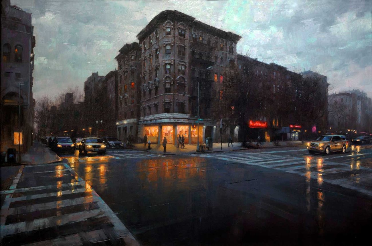
Alive and Awake at Night: Painting Nocturnes |
||
| By Gavin Glakas | ||
|
||
| I’ve always been a night person and I flirted with being genuinely nocturnal before I had kids. I think that when the sun goes low on the horizon is when things start getting interesting.
Everything seems more intense at night. More exciting. More dangerous. More peaceful. More solitary. More romantic. And on an abstract level, in terms of color and composition, there are so many more possibilities. During the day, there is basically one light source, whether the sun is shining or not. At night, light is coming from all over the place or from nowhere or both. Continue reading Gavin’s article on painting nocturnes en plein air at our sister site, Plein Air Today. |