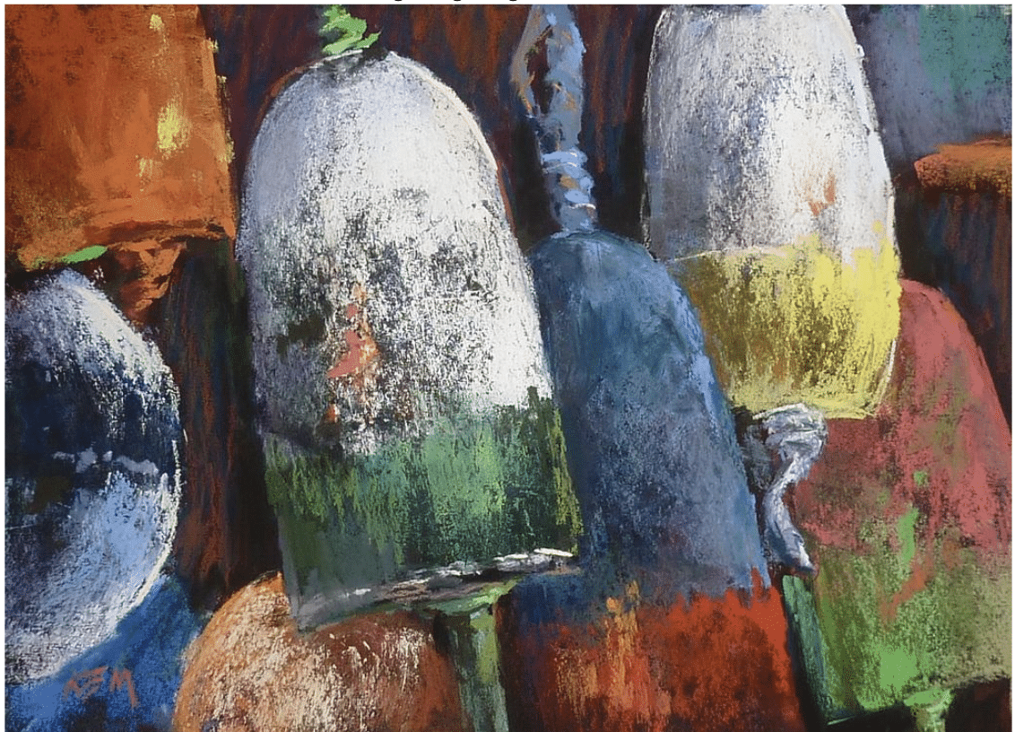
In Karen Margulis’s pastel painting “Color by the Sea,” above, the artist composes an eclectic (and potentially clashing) mix of hues. At a glance, we get a playful jumble of colors, a combination of cool hues (blue, violet-gray) and hot chroma (orange, lemon yellow, and acid green). Without a discordant note, Margulis separates yet harmonizes them in a way that brings their relationships – as well as, by way of contrast, her textures – to the viewer’s attention.
The result is a beguiling composition suggesting both the sea’s natural forces (present in the weathered surfaces) and its playful charm (abundant in the lively spectrum of bright yet congruent colors).
It is important to learn the basic techniques of mixing and the theories about how colors relate to each other. But there’s more to color than “getting it right.” Part of understanding painting is learning to “read” color in terms of the feeling it can convey. It’s the first step in knowing when to mix an observed color vs. when to create a modified version that works for other reasons (e.g. expression and color relationships).
Using color to convey feeling often happens in the course of a painting – there’s an unexpected discovery, a new line of thought to follow, something to exaggerate or enhance. It can also be present from the start. I imagine the latter is how Karen Margulis approached “Color by the Sea”; the basic conception was visible before her mind’s eyes as well as right there in front of her right from the start. Her main job was to keep the colors in line so as not to break the spell.
The very first step in taking color to the next level in your painting is remembering that color in art does, in fact, have an aspect of feeling to it. Beyond mastery of technique, conveying something with intent allows your viewers to feel intrigued and included when they look at your work.
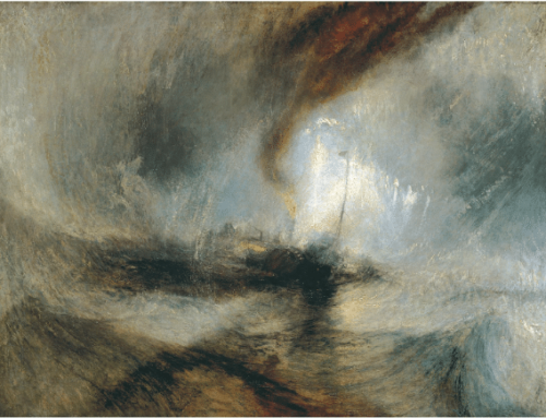
Let’s look at an example from the other end of the spectrum – a quiet nineteenth-century landscape by French Barbizon artist Jean-Baptiste-Camille Corot (1796-1875).
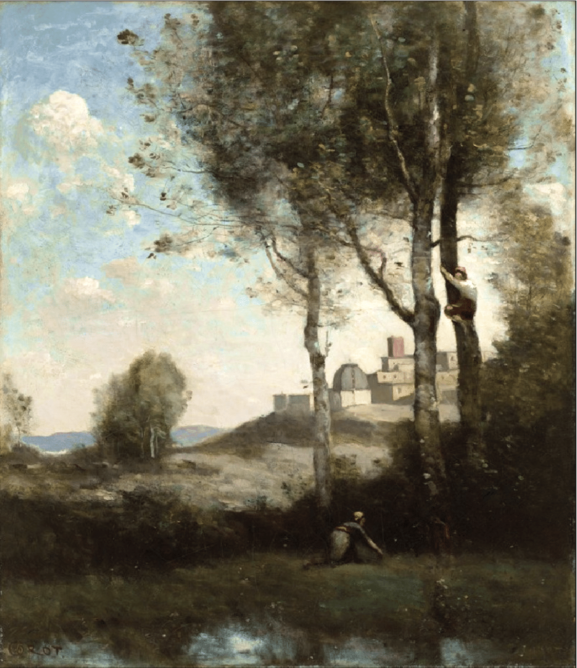
Camille Corot, Les Denicheurs Toscans, showing masterful use of and restrained use of high-chroma red. C. 1860.
Take a quick look back at the Margulis pastel and then look back at the Corot, and ask yourself, What’s your initial gut reaction to each one – what’s your from-the-hip feeling, just based on the color, and how do your reactions in each case feel different?
Corot practically invented the “muted” color palette sometimes associated with lyrical and calm (sometimes called “poetic”) painting. Over and over again, he used what largely amounted to “colored grays” in harmony with each other to convey a soft, lyrical mood well-suited to what he wanted to say about the virtues of life in the French countryside.
And yet, Corot loved to add tiny spots of hot, high-test color (often red) to the hats or shawls his figures wear in these predominantly cool gray-green paintings. Why? Yes, it “pops,” but there are other ways to make a painting pop. Why did Corot make this choice?
Except for the red caps, the two figure are dressed in nearly the same colors as the landscape. Corot uses just enough high-chroma color to add life and emphasis while keeping his figures integrated with – implying they’re an inseparable part of – the landscape. This was not just an aesthetic or technical choice – Corot very specifically wanted to celebrate the “simple life” of humanity in harmony with nature, in contrast to the discord and imbalance associated with Europe’s newly industrialized cities. Whether consciously or not, Corot’s felt intention dictated the color choice.
Handling color with intention and strategy comes with experience and training. The contemporary artist in today’s issue, Karen Margulis, does it exceptionally well. If you’re ready to dive into the world of finely tuned color handling, the following video may be for you:
Karen will be one of the 25 top pastel artist-instructors at this September’s online event, Pastel Live.
What Can a University Art Museum Can Do When the University Pulls the Plug?
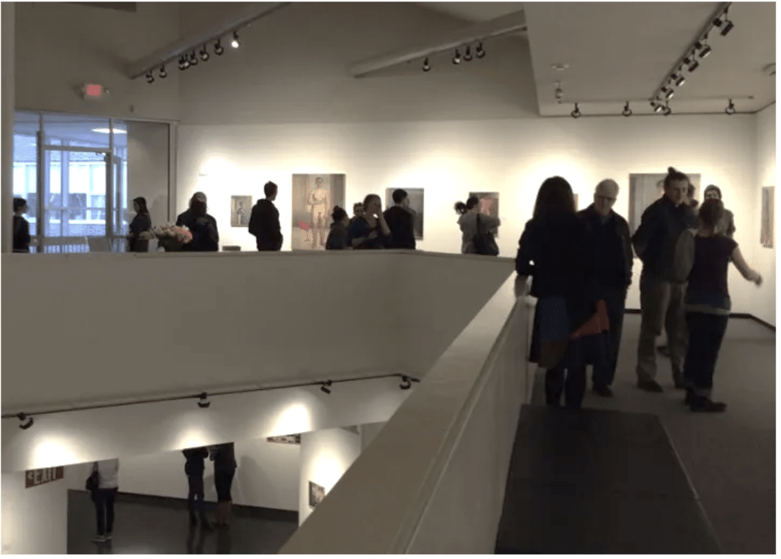
BA, BFA & MFA student show at the UNH Museum of Art
Facing a $14 million budget shortfall, the University of New Hampshire (UNH) earlier this year abruptly shuttered its Museum of Art to save money. The move underlined the vulnerability of museums and liberal arts programs nationwide as higher education overall faces declining enrollment and higher operating costs.
Benjamin Cariens, chair of UNH’s art department, vowed to find creative ways to keep the doors open, and that determination has borne fruit. While university students have reponened it for their own shows, the UNH Museum of Art will start the 2024 academic year with its first “outside” exhibition since its closing.
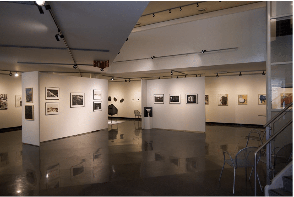
BA, BFA & MFA student show at the UNH Museum of Art
In April, Cariens, a sculptor and assemblage artist, reached out to two local art groups: the Rochester Museum of Fine Arts (RMFA) and Katzman Contemporary Projects. Cariens proposed they unite to curate a show for the Museum’s exhibition space.
The RMFA is an all-volunteer, grassroots effort founded in 2011 to exhibit talented regional, national, and international artists in accessible public spaces in addition to monthly shows in its own gallery. Katzman Contemporary Projects is a relatively new artist-run project space in neighboring Dover, NH, committed to featuring contemporary artists with a focus on the Northeastern US.
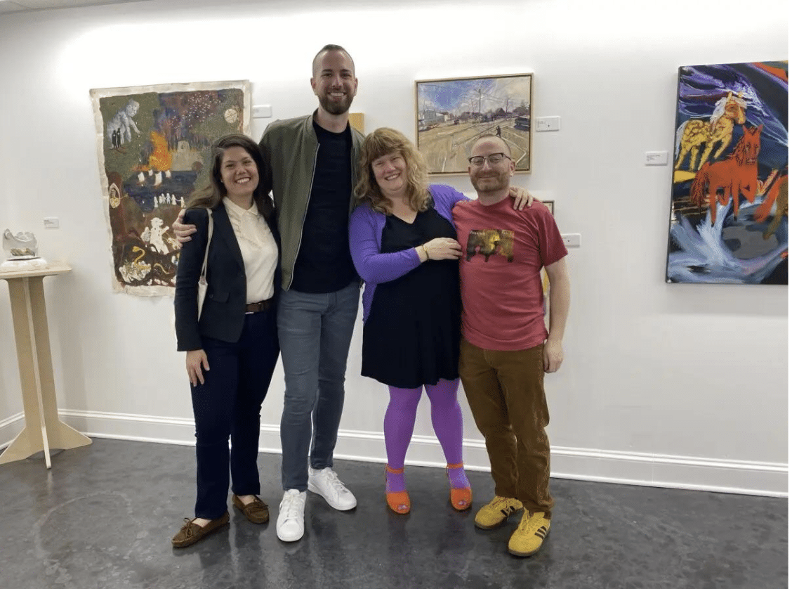
Left to right: RMFA curators Amy Regan, Matt Wyatt and Katzman Contemporary curators Julee Katzman and Eric Katzman.
“The paradigm shift for the space is very abrupt,” noted Eric Katzman, “but we wish to do well for the new space in the spirit of DIY that is emblematic of the current trend in showing art.”
Between them they have managed to produce the first independent exhibition in the former UNH Art Museum, titled NFS: Not For Sale. The exhibition will showcase works by nearly 40 artists, featuring pieces of personal significance, whether newly created or from the artist’s past. Each artist was invited to submit 3-5 works, fostering a diverse and introspective collection.
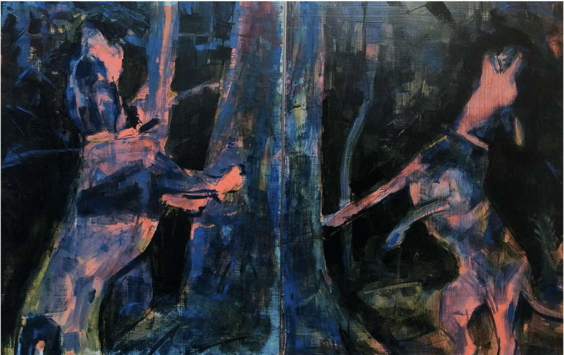
Dean McCrillis, Treed, Oil on panel, diptych, 32 x 22 inches, 2022, will be part of the “NFS: Not For Sale” show at the university art museum.
“The closure of the UNH Museum of Art … was a significant loss for the New Hampshire art community,” said an RFMA spokesperson. “This exhibition represents a hopeful new beginning, emphasizing art accessibility, community engagement, and sustainability.”
The art museum’s reopening speaks to the power of creative partnerships and innovative paths forward during difficult times.
NFS: Not For Sale will be on view from August 26 to October 11, 2024, with a reception on Friday, September 6, 2024, from 6:00 pm to 9:00 pm. At the UNH Museum of Art in Durham, New Hampshire.