Design, Design, Design!
Any drawing or painting is only as strong or as weak as its underlying abstract composition. Without strong design, you’re wrecking your paintings without realizing it. Even the greatest portraits by Sargent, Rembrandt, or Velasquez – paintings we tend to think about in terms of emotive content rather than form – rest on an invisible scaffolding of key geometric design decisions.
But you already know that without a strong design your paintings are dead in the water. The challenge is what to do about it. How do you learn good design? There are lots of great videos out there that will teach you the essentials.
You can also learn a ton by doing these two things:
- Get a feel for striking compositions by making small sketches and digital diagrams and
- Study striking paintings – such as portraits – in which composition is largely invisible or seemingly subordinate to the motif (hint – it never really is)
In part 1 of this write-up, we’ll do the first. I’ll save the second for part 2.
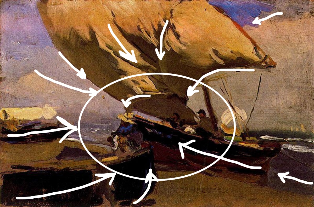
Dynamic Tension
In the small plein air painting above by Joaquin Sorolla (sa-ROY-ya), “the Spanish Sargent” has brought what to him was an everyday scene – fishing boats coming and going near his home in Valencia, Spain – to the level of high art. He’s done this largely through the work’s incredibly dynamic underlying composition.
Dynamism in composition consists in pleasing tensions between contrary elements – big contrasts, bold coloration, large and tiny shapes in daring relationships with each other, diagonal lines shooting off in a variety of directions forming intricately balanced asymmetrical geometries. As in Sargent, Sorolla’s ravishing use of light and color (see Thomas Jefferson Kitts’ video, “Sorrolla – Painting the Color of Light”) dazzles the eye. I’ve deliberately chosen a backlit, fairly flat work here because it’s easier to see the big shapes and underlying design, but try it on any painting and you’ll see it in play.
Look at that huge puffed up sail – how all its angles relate to each other and to everything else – how boldly that sail fills the space! In that sail’s powerful burst, all the gusty energy of the ocean gathers and billows!
At the level of overall design Sorolla literally connects that sail, through line and color, to the figures in profile. Dynamism happens in how the sharp, swooping triangular lines lines of the sail’s right-hand edges and the rigging relate to the vast curvature of the sail’s left-hand side; how the sail, which takes up so much of the composition, relates to the complimentary patch of sky in the upper right and the trailing clouds and the subtle “visual rhyme” between the sail and the wide, cuplike curve at the clouds’ crest.
When feeling out a composition, I like to tell myself that all lines in painting are directional lines. The lines of the picture literally point the eye toward the main event (where the human figures, boats, sails, sea and sky all come together) by subtly angling up toward the middle from the sides and corners and down from above.
Before we leave this painting, I want to say something about how design relates to what a particular painting is about. All of these “dynamics” we’ve been studying here will work to enliven (or resucitate, as the case may be) any painting, and the underlying principles are universal:
- you want to catch the eye from across the room,
- “move the eye through the painting” in a way that keeps the viewer from looking away, and
- maximize variety throughout.
And yet – beyond the technical aspects, composition contributes to meaning as well. I would argue that the dynamic rhythms of visual tension and release that Sorolla embeds here express Sarolla’s spontaneous feeling for the larger forces at work – the compressed, mighty energies where ocean, sky, and humanity meet. For me, that beautiful insight is what’s really at stake in this painting, and that’s what makes it great.


