
Well-handled color has emotional impact.
In Karen Margulis’s pastel painting “Frozen in Time), above, the artist takes a composition composed of predominantly cool-hues (a wintry sky and snowy foreground) and shoots it through with a blazing ribbon of orange and yellow light. In keeping with the title, the painting’s impact on the viewer is clear and strong.
The moment that is frozen (“frozen,” of course, references ice, snow, winter – the cool colors) is the interval suspended between dusk and dawn – into that hushed and subdued freeze the rising sun pours a stream of molten gold. The feeling is that of the held breath – anticipation, a quiet, intimate interior sense that something – perhaps something wonderful – is just about to happen.
It is important to learn the basic techniques of mixing and the theories about how colors relate to each other. But there’s more to color than “getting it right.”
Less talked about than theory and technique (presumably because it’s harder to teach) is the need for feeling to dictate:
- when to mix an observed color vs. when to create a modified version that works for other reasons (e.g. expression and color relationships)
- when a particular aspect of color theory can help you convey feelings and ideas.
Using color to convey feeling can often happen in the course of a painting – there’s an unexpected discovery, a new line of thought to follow up or enhance. But often it happens not during but before, as soon as you plan the work-to-be. I imagine that’s how Karen Margulis approached “Frozen in Time”; the basic conception was clear before she started.
In Expression, Feeling is First
In any case, you must feel an intention and apply the knowledge of how to translate that felt intention into color in order to use color expressively. Feeling applied is feeling conveyed. If you’re not conveying something (or at least trying to), just don’t expect your viewers to feel anything when they look at your work (beyond admiration for skill and technique).
The very first step in taking color to the next level in your work is remembering that color in art does, in fact, have an aspect of feeling to it. Feeling is supposed to dictate what you do with mixing and theory, not the other way around.
Let’s look at a few more examples.
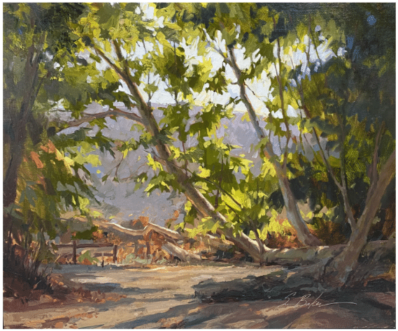
Suzie Baker, Sycamore Sun and Shadow, oil, 18×24 in. “Winner of Plein Air Magazine Award at LPAPA Plein Air Invitational 2021” – from Suzie Baker, Fine Artist
Suzie Baker’s plein air oil painting, “Sycamore Sun and Shadow” (above), uses color to convey the fresh feeling of being outdoors. The backlit leaves of the sycamore scatter hard-edged, angular flecks of high-chroma green-yellow and yellow-green across a muted and cool gray-violet and gray-blue background. The effect is to convey that enlivening surprise you feel when you’re out in nature and you turn a corner or look up at a particular moment, and the light catches something in a certain way, and you have to stop a moment and just LOOK and take it in with a long deep breath and think, “ahhhhh.”

DETAIL of a painting by Corot, showing his restrained use of high-chroma red. (c. 1847)
Corot, the famed 19th century French Barbizon painter, loved to add a tiny dose of hot, high-test color (often red) to the hats or shawls his figures wear in his predominantly cool gray-green paintings. Why? Yes, it “pops,” but there are other ways to make a painting pop. Why did Corot make this choice?
Look at the detail cropped from one of Corot’s paintings, above. Except for his red cap, the man raking leaves is dressed in the same colors as the landscape. Corot uses just enough high-chroma color to add life and emphasis without unbalancing how harmoniously integrated his figures are with their surroundings. This was not just an aesthetic or technical choice – Corot very specifically wanted to celebrate the “simple life” of humanity in harmony with nature, in contrast to the discord and imbalance associated with Europe’s newly industrialized cities. Now, I’m not saying any pre thought-out social or political philosophy had anything to do with this. Simply, the artist’s felt intention dictated the color choice.
Edward Hopper also used color quite intentionally, not just strategically but also to express feeling. In the painting Morning Sun (below), the flat fields of cool gray-blues and the aquarium gray greens make the warm strip of sunlit wall outside the window fairly glow in contrast. Hopper used a modified, lower-key version of the same yellow hue in the figure’s skin.

Edward Hopper, Morning Sun (1952). Columbus Museum of Art.
But look how he gives the highest-chroma color in the whole work to the brick building outside the room, way off to the side. The world outside this room is more colorful by far than it is within this interior (even though, significantly, what’s so colorful out there is nothing more than an impersonal manufacturing plant). Inside, where the focal point – and the life – is supposed to be, the woman’s garment becomes a faded echo of the bright brick red – the chroma’s been diluted with white. Again, felt intention drives these choices.
The relative lack of high-chroma color inside the room stresses the solitude and sense of melancholy clinging to the lone, half-undressed figure staring blankly into the sun while perched on a plain white sheet. The uneasy clash of complementary pink-orange and yellow-green makes for a queasy overall weirdness throughout the whole painting. These two hues at odds with each other duke it out on a microcosmic scale, writhing against each other within the sunlit patch of wall behind the figure.
(By the way, for all his lauded realism, for Hopper the depiction of the world was very much a projection of his own mind. He kept a quote from Goethe in his wallet and frequently referenced it: “The beginning and end of all literary activity is the reproduction of the world that surrounds me by means of the world that is in me, all things being grasped, related, recreated, molded and reconstructed in a personal form and an original manner.”)
Handling color with intention and strategy comes with experience and training. The two contemporary artists in today’s issue, Karen Margulis and Suzie Baker, do it exceptionally well. If you’re ready to dive into the world of finely tuned color handling, one of the following videos may be for you:


