
This article combines two posts by Carol Strock Wasson on exploring color harmonies in pastels, which can be found on her blog. Carol will be one of the professional artists demoing at this year’s Pastel Live online event September 17-19, 2025.
BY CAROL STROCK WASSON
My Lesson in Complex Color Harmonies: Wrestling with the 7th Chord
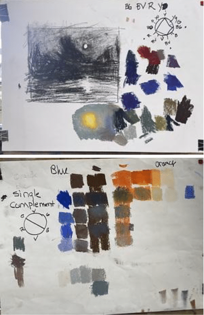
I began this painting (above) with the idea of using a complex color harmony—referred to as 7th chord.
For this painting, I chose a 2-3-4-3 spacing of Blue-Green (BG), Blue-Violet (BV), Red (R), and Yellow (Y). These colors came directly from my memory of a night scene, a photo reference and a plein air sketch. I thought they’d sit beautifully in the lower part of the value scale.
What Is a 7th Chord Color Harmony?
The term “7th chord” in color theory borrows from music, suggesting a layered, nuanced harmony. In painting, this often means using a sequence of hues spaced unevenly around the color wheel using 2-3-4-3 interval, to create complexity and depth.
My choice of BG (Blue-Green), BV (Blue-Violet), R (Red), and Y (Yellow) in a 2-3-4-3 spacing was my attempt to balance cool and warm tones with subtle transitions.
I thought this harmony would lead to delicate shifts in value and temperature, those quiet transitions that breathe life into a painting. I was excited by the challenge. But as I worked, I quickly realized how difficult it was to make the scheme function. The values were too compressed, and the temperature shifts I had hoped for were barely noticeable. The painting felt muddy, not mysterious. I kept pushing, studying, adjusting—but eventually, I had to admit it wasn’t working. I gave up and repainted the study with a clearer, simpler approach using a single complement of Blue and Orange.
What I Learned Through the Struggle
- Working in a low-value range is tricky. It compresses contrast and makes it harder to distinguish temperature and hue shifts.
- Trial and error is essential. Repainting wasn’t a failure—it was part of the process. It helped me refine my understanding and reminded me that growth often comes through frustration.
What I’ll Do Differently Next Time
I’ll probably do a small pastel study first—just to see how the harmony behaves before committing to a full piece.
I believe in the emotional power of complex harmonies, and I will continue to push myself to understand them by doing more studies before I start a painting.
COLOR THEORY SIMULTANEOUS CONTRAST
Simultaneous contrast is the theory of how colors affect each other when placed side by side, altering our perception of their hues, even though the colors themselves remain unchanged.
Below are some color exercises making one color look as two. In each pair, the square in the middle is the same color.
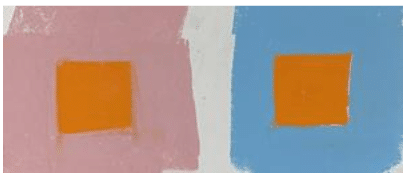
Orange surrounded by colors in Middle value range
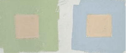
Orange surrounded by colors in Light value range
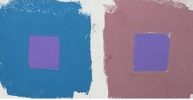
Violet surrounded by colors in a Darker value range
As you can see some of the effects of simultaneous contrast are strong while others are weaker, when I paint I don’t always want a eye catching contrast, I use value and chroma along with hue to strength or weaken the effect.


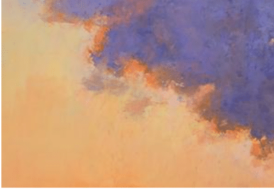
“Cloud Study”
I wanted a vivid blue sky, the subtle speckles of orange in the cloud and around the edges helps make that blue look Bluer!
This is a subtle effect using muted oranges and a few more chromatic oranges here and there.

“Sunset at the Ethanol Plant”
In this example I used a much stronger chroma of orange to make the Violet-Blue Cloud appear Bluer. You might ask “why not use a blue cloud” instead of violet blue? The answer is the eye pleasing visual interactions of the orange having an effect on the violet blue. If the cloud were actually blue, the orange might make it appear too blue and destroy the emotion and the visual effect I sought.
When you learn to master these color interactions, you can use color to evoke emotions, create striking visual effects, and elevate the impact of your art.
This is just one example of using colors opposite on the color wheel, some other interactions might be: dark against light, warm against cool, chromatic against muted.
Asking the important “What If” as you paint will yield beautiful results!
Carol Strock Wasson will be one of the professional artist instructors teaching during this year’s online Pastel Live event, September 17 – 19, 2025. Pastel Live is three days of premium art instruction from 20+ of the world’s best acrylic artists, something you can’t get in one place anywhere else. These artists will help you drastically improve your skills by demonstrating the methods and techniques that have taken them years to master. They share some of the key insights that have allowed them to rise to the top, garner respect and recognition, and build successful art careers. Pastel Live encompasses it all — from expert art instruction to career-level strategies and advice. Sign up now at Pastellive.com!.


