By Guest Contributor Todd Bonita
Stop me if you’re heard this one, but as they say, paintings live or die based on underlying abstract design. Composition, therefore, is among the most important challenges students face. The good news it’s fixable – check all, or even some of the following boxes, and your paintings will improve immediately.
- Correct for same-same shapes / even spacing.
Human sight evolved to detect contrast and variety; it’s what we notice first. As artists we need to work with that to keep interest. Too many “same-same” shapes or too-similar intervals between shapes kills your painting’s dynamism, creating static passages the eye skips right over.
Todd Bonita, “The Sweet Life,” oil, 8 x 10 in.
It’s all-too natural to concentrate on rendering while neglecting to vary your shapes and their spacing. That’s why it’s a good idea to stop once in a while, forget what you’re making a painting of, and consider how your big (and small) shapes are working (or not) in relation to each other.
2) Avoid a shallow value plan. The ability to see value apart from color is one of the most important of all foundational skills. Color aside, I think students sometimes struggle to judge values correctly because they’re looking at them in isolation instead of judging them in relation to one other.
Proper value relationships make the difference between eye-catching paintings and dull ones. Almost as a rule, the longer a student works on a painting, the closer to the center of the scale their values tend to move. To correct for this, you have to stay on your guard for it and consciously identify appropriate places to enrich your darks and brighten your lights. Strong value relationships ensure a painting will jump of the wall, as it should do, from all the way across the room.
3) Don’t include too many rendered areas devoid of a definitive focal point. It’s easy to forget when you’re trying to make things “look believable,” but vision doesn’t really work like that. We do not see the way cameras see.
Generally, we focus our eyes at one single area in front of us, while everything else (in our peripheral vision) stays vague or blurry. That’s what keeps us from being overwhelmed by what’s all around us. Don’t drown your viewers in too much detail all over the painting. Confine more carefully rendered detail to the focal point of the painting (and even then be cognizant of lost and found edges).

Todd Bonita, “Wishing You Well,” Oil, 6 x 12 in.
4) Prevent the eye from being led out of the painting. Design to create a “path for the eye” that keeps the gaze moving within it. In other words, none of your lines or shape-edges should lead or “point” the viewer outside of the frame. Correct for this with backgrounds and foregrounds that actively prevent the eye from leaving.
5) Don’t crowd the foreground. I call this the “close talker” syndrome. You know when you’re having a conversation with someone you’ve just met, and the person keeps invading your personal space by leaning in and talking at you instead of to you? Busy foregrounds are like that.
A good foreground, like a good conversationalist, should lead you further into the “dialogue” with the painting. Unless there’s a compelling reason, avoid calling too much attention to the foreground; don’t distract the eye or put up barriers in front of the “in” door.
The foreground’s primary job is to be the entryway into the space of the painting. Treating it as such enables you to consider subtle ways of using it for design purposes. If its uncluttered enough, you can divide and pattern the foreground with vectors and shapes that lead the eye toward the middle ground and wherever your strongest focal point is.
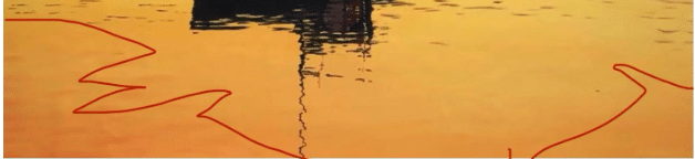
Subtle use of color/value shapes to close off the corners in the foreground. The corner shapes (outlined in red) contain more of the color red than the lighter orange areas outside them.
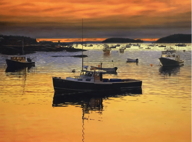
For example, in my oil painting of a Maine fishing boat at anchor titled “Harbor of Gold” (top of page), I tried to keep the foreground simple while utilizing it for certain elements of design, including understated diagonals and slight color and value variations in the foreground space.
I closed off the two bottom corners with a red-orange glow (discouraging the eye from leaving the picture). I corrected for same-same shapes by ensuring variety – the larger red-orange triangle in the left corner has more visual weight than the smaller one on the right, even though they’re roughly the same shape. Closing off the corners of the foreground creates a sort of bowl effect, quietly “cupping” the central area of the painting (see curved green line below).
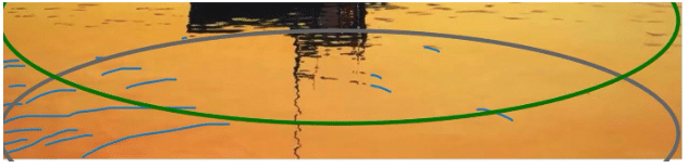
I added a few curving diagonals, “pointing” toward the focal point (the boat) via gentle wavelets of varied size and shape (blue accents and gray curved line above). I angled the waves to pull the viewer toward the main focal point (the closest boat and its supporting neighbors). I also maxed out the contrast between the sunlit water and the boat to ensure a strong value plan.
I know it’s easy to say “just do these five things” and your paintings will be awesome. It’s a lot harder to remember while you’re painting. It can be good to literally have a checklist of do’s and don’ts in front of you.
It’s much easier to go back and catch this stuff after you’ve stopped working. It’s never too late, with oils at least, to go back in with a few thoughtful changes that might make the difference between “just another painting” and a knockout.
If composition isn’t your strong suit, maybe you’d benefit from one of these videos.


