It’s a lot easier to tell that a painting isn’t “working” than it is to figure out why.
If you could just fix that one … elusive … THING … it would all come together…
Only it isn’t just one “thing,” it’s all the things – and, in particular, how they relate to each other. Representational paintings work best when there’s unity (or “harmony”) between their varied parts.
In reality, and here’s the “One Big Secret that painting teachers Don’t Want You to Know!” – the best practical way to learn sound composition is by making dozens of thumbnail drawings of strong paintings to get a feel for underlying geometries that work – and why.
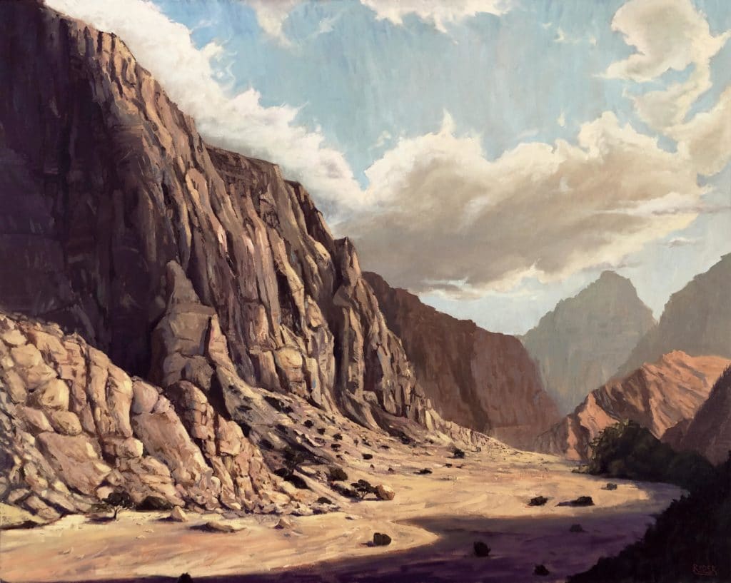
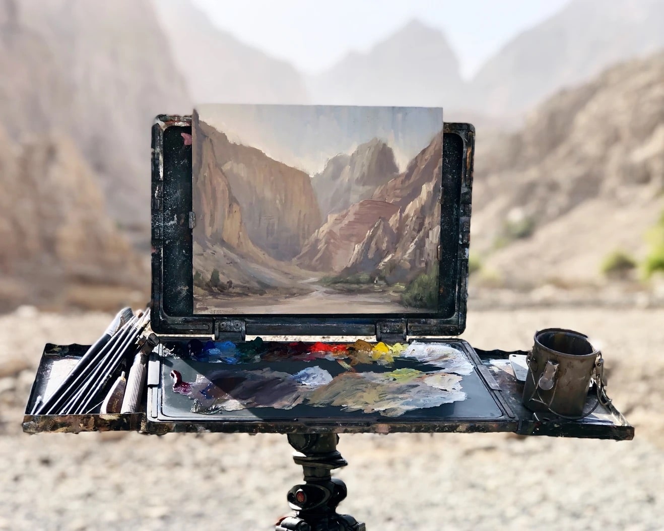
Matt Ryder, Jebel Jais Mountain Pass, oil on canvas, 152cm x 122cm.
(Matt Ryder, who painted the above landscape example, has written about his experiences and his passion for painting in the Middle East here.
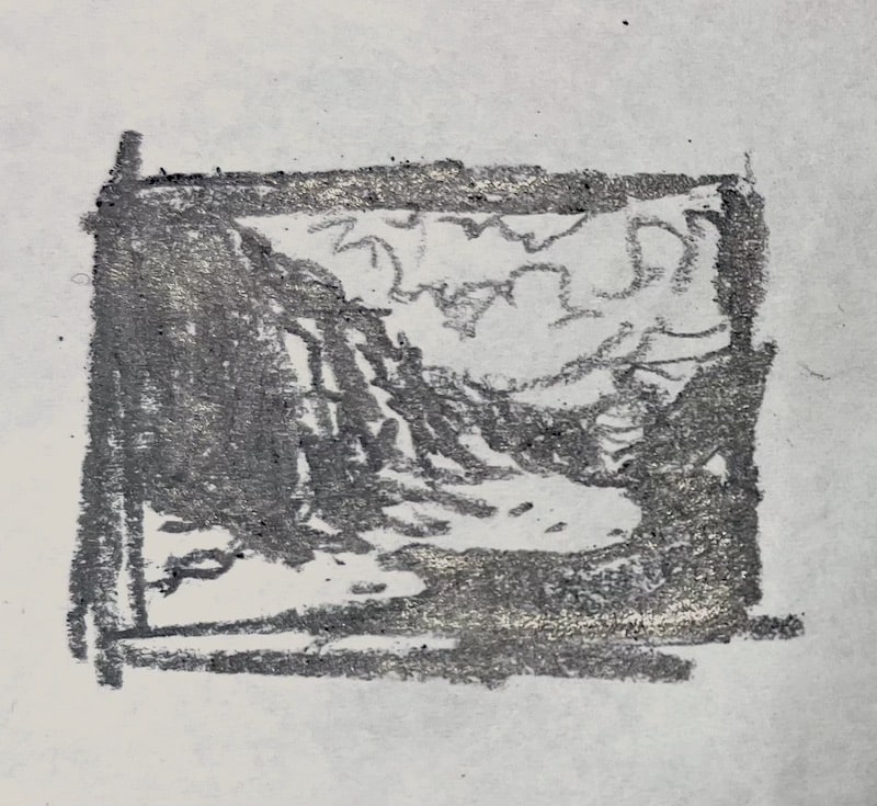
Thumbnail sketch of Matt Ryder’s painting, Jebel Jais Mountain Pass (above).
As thumbnail sketch in pencil, about the size of a postage stamp (or a thumbnail), distills a detailed and texture-rich painting like Matt Ryder’s Jebel Jais Mountain Pass to a few flat shapes. It lets us see the directional lines (and ALL lines in paintings are directional, whether you’re conscious of it or not). By lines we mean all of the edges of all of the major shapes – aka “leading lines,” they lead the eye in a particular direction. By making a thumbnail sketch, you case see how all those shapes relate to each other and fit together, like puzzle pieces.
Fitting those “puzzle pieces” of shapes together harmoniously comes down to just a few basics. When “something seems off,” check your painting for:
1. Drawing (inaccurate perspective is often the invisible fly in the ointment )
2. Balance (visual weight), including sizes of shapes and values
3. Variety (natural asymmetries) & Harmony (satisfying relationships therein)
4. Rhythm (movement, directional lines that create a smooth path for the eye)
5. Pattern (calculated repetition, call and response, visual rhymes)
In the painting by Matt Ryder above, perspective (so, drawing) plays a huge role in the overall effect. Note that there’s a subtle three-point perspective at work; there’s a vanishing point to the left and to the right of the red line, which represents eye level (one for the cliffs, one for the clouds). Everything above the red line we are looking up at, and everything below it we’re looking down upon. The fact that it’s so low in the composition helps create the crucial sense of height.
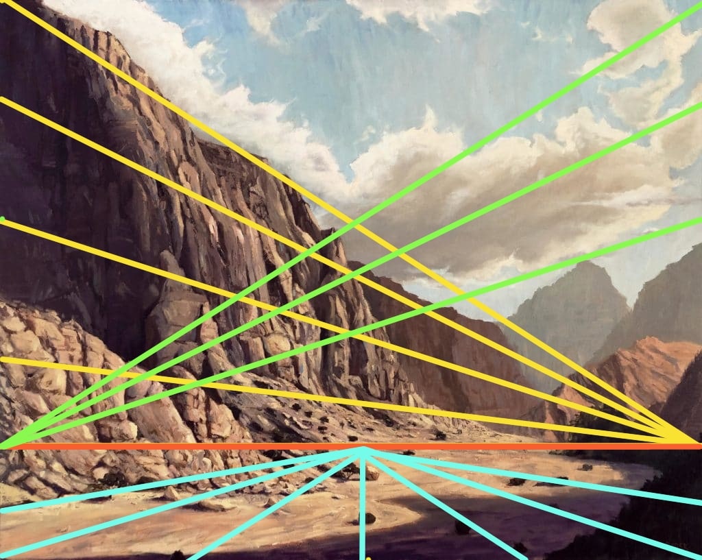
Note that there’s a subtle three-point perspective at work here.
After that, visual weight (#2 in the built list above) comes in (and now we’re no longer concerned with representation or with pictorial space but pure two-dimensional design). Size and value play outsized roles in terms of visual weight in Ryder’s painting; we can think of every mountain peak and heap of earth as having a different visual weight. What’s important are the relationships between them.
In fact, referring back to our list after perspective, numbers 2-5 are concerned only with what’s happening on the flat, two-dimensional “plane” of the painting. After drawing, composition is all about geometry and relationships. And every one of these items could (and probably will!) be a separate piece for Inside Art.
A representational painter’s first step in understanding composition and design is forgetting what you’re looking at. In other words, you have to get the drawing and put it aside: The barn either looks like a “real” barn or it doesn’t; if not, you simply have to take the time to make the necessary corrections until it does. Then you are able to clearly see things like balance, variety, rhythm, etc.
It takes a while to train yourself to see a painting FIRST as a flat surface consisting of more or less significant relationships between shapes, lines, color, and value (relative lights and darks). That’s step one of “making it work,” and yup, it takes practice.
Practice, Practice, Practice
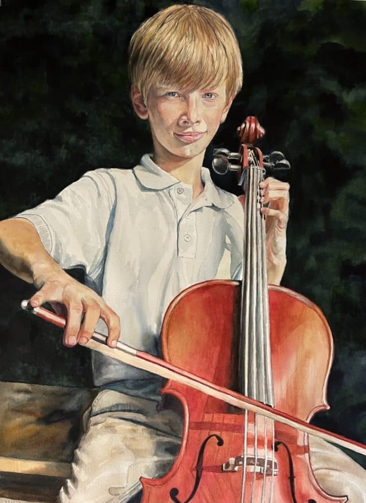
Wyn Ericson, Cello Practice, watercolor, 30 x 20 inches
Wyn Ericson captured the Peoples’ Choice award in the Plein Air Salon for her large-format watercolor (above) titled Cello Practice.
Plein Air Magazine’s salon is a monthly open competition that culminates in a lavish award gala with cash prizes for the best paintings overall in multiple categories. Visit the Plein Air Salon website for your chance to enter your work.


