Judging from how many times I hear people say it, the color green is the bane of the plein air painter.
Greens are tricky. They can easily “get away” from you and overwhelm the painted landscape to the exclusion of all that’s subtle, secondary, distinctive, and, in a word, interesting. In a landscape painting overrun with untamed greens, all you really see is THE COLOR GREEN. So what’s a landscape painter to do?
The artists’s I’ve talked to all say pretty much the same thing:
1. mix (don’t use straight-up tubed greens, mix your own to better control – and, crucially, to VARY them),
and
2. look (closer – in reality there’s NEVER just green out there – it’s always multiple greens and other colors besides.
Beyond those two things, it’s – all, mix, look, look, mix, mix, look, and mix. Emphasis on mix.
So how does that play out on an actual palette?
First, know that green in the wild is by nature deceptive. As experienced citizens of the planet earth, we know that fields and trees are green, so when painting them we reach for the green. And that’s why landscapes with poorly handled greens can look artificial and heavy-handed.
Close observation of nature reveals a mix of warm yellow-greens (in sunlit leaves, for example) and very different and cooler blueish greens (shadows in the grass, for example, or for a pine vs. a maple). But you can’t stop there. Nature’s greens are, in reality, a myriad of grays and reddish browns and purplish reds and a good deal of yellowish ochre-ish and orange hues too.
Now come indoors and look closely at any historical landscape painting and see how much pure chromatic green you can find. There’s suprisingly little. Even paintings that seem to be mostly green often turn out, on close inspection, to be partly green but mostly something else. Often you’ll find a modest assortment of warm and cool greens afloat in a scattered sea of tawny, ochre-ish, or reddish-orangish flecks and streaks of paint.
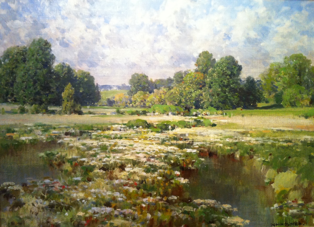
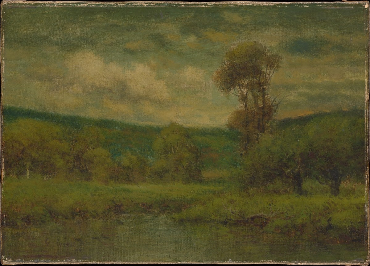
Take the painting at the top of this writing. When you first saw it, it probably registered on an unconscious level as “green landscape” or something along those lines. But look again and see just how many colors other than green make up that scene!
The Inness painting below, one of his more greenish ones, masterfully modulates the thin band of actual bright green in the middle ground with a bluer band on top and an ochre band beneath, while the foliage is a mix of green and an earth tone such as raw sienna:
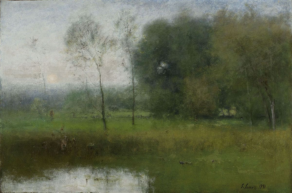
George Inness, New Jersey Landscape (also known as “Summer”), 1891
Most Barbizon landscapes, for example those of Corot, contain some green but far more muted blues, grays, and mauves than pure green hues. Have a look at these closeups of some foliage from Corot:
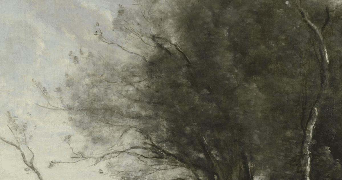
Corot’s greens are far from green
Where’s the green in this?
Closeup of Corot’s trees.
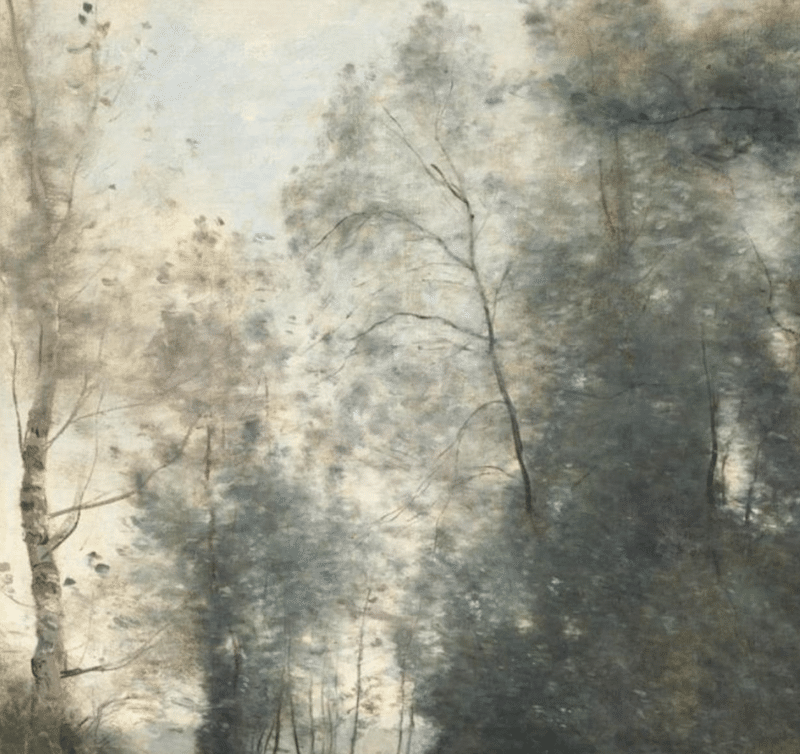
Even some of the greenest-seeming landscapes are more complex than they first appear. Here’s a very “green” painting with a closeup that argues otherwise:
One of the greener Inness landscapes online. Most are obviously modulated with tones of orange, red, and yellow – this one not so much until you take a closer look.
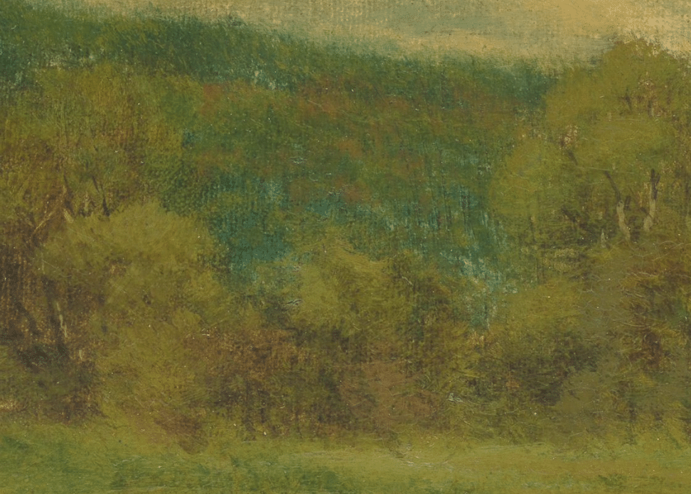
Detail from the above: How much green do you actually see here? I see blue and orange-brown sprinkled throughout.
One strategy for taming greens is to counter them with green’s color-wheel complement, that being red. Some plein-air artists pack just sap green because, being transparent, it’s easy to “sway” toward olive with red, or push toward an acid green by adding yellow.
Some landscapists tone their entire canvas with a reddish hue, such as burnt umber or sienna (this only works if you layer or “weave” bits of green on top of it without covering it up, by the way). Another strategy contemporary landscapists use is to block in “future” greens with a relatively warm color, such as an ochre or more orangish green, and (like teaching artist Michael Coleman, for one) work from “warm to cool,” layering, perhaps, blued greens on top of earthy yellow-oranges or other warm tones. You can watch a full hour of this four and half-hour video on the subject of painting greens in oil by Albert Handell for free right here.
Another strategy altogether is to change up the hues you use to make the greens to begin with. Of course, including a red (or a red earth, like burnt sienna) as you mix up your greens will do wonders in taming their intensity. More radical still though: Instead of making green with the standard pigments (quite often ultramarine blue and cadmium yellow), try simplifying the process by substituting black for blue (as this free video shows), or using, say, yellow ochre instead of the cad.
Now go forth, fearless artist, and don’t be afraid to go after those greens.
Hey, That’s My Painting! 
Just like your mother always told you, you have to be careful what you put on the Internet! Ask the President of the Philippines, Fernand “Bongbong” Marcos Jr., son of former dictator and “kleptocrat” Ferdinand Marcos. An video still posted to Twitter showing “Bongbong” celebrating his political victory last week at his mother Imelda Marcos’ palace brought what looks like a “missing” Picasso to the attention of the authorities (who nonetheless are probably not getting it back).
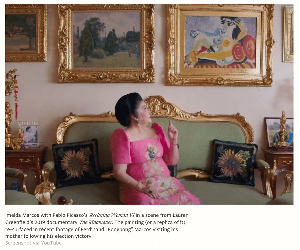
The painting appears to be Picasso’s Reclining Woman VI, one of many works of art Imelda and Ferdinand Marcos Sr. bought (along with jewels, palaces, and all the trappings of a loud and lavish lifestyle) with billions siphoned off from the people of the Philippine Islands during the family’s dictatorial reign. Some say it’s just a copy (a copy was previously seized from the family during a raid) while others say it’s the real deal and now is the time for the police to get it back. With young Bongbong bringing the family back to full power though, it seems rather unlikely to most that anything of the sort is going to happen anytime soon.
At least I guess you can’t fault Imelda for her taste in art – or for her taste in shoes for that matter.
-Chris


