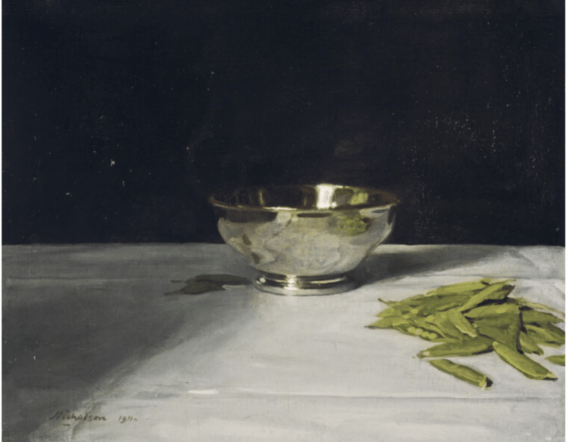
What is it about William Nicholson’s painting The Lustre Bowl with Green Peas that impresses itself on the imagination and memory? Somehow Sir William Nicholson’s “simple” still life transforms just three everyday items – a silver bowl, a tablecloth and a pile of unshelled peas – into a compelling images with a mysterious timeless quality.
Perhaps it’s the deep black background and the way the contrasting bowl and tablecloth seem to emerge from the darkness. But a black background was unique for this painter, and several of his other still lifes have the same quality. Maybe it’s the mix of high-class-splendor and down-to-earth humility; the silver bowl and white cotton tablecloth might recall a sumptuous dinner – or perhaps the chalice and altar in a Christian communion service – while the peapods in their little pile seem so ordinary, random, unremarkable and mundane. But again, not all of his still life have this quality either.
He’s not well known now because his paintings looked old-fashioned to mid-century audiences. Despite his modern interest in exploring the tension between representation and the physical reality of his paint, Nicholson rejected abstraction and painted on the safe side of the line – clear depictions of elegantly poised realities. And perhaps what’s so interesting about his paintings now, however, is precisely their tension between modernism and classicism.
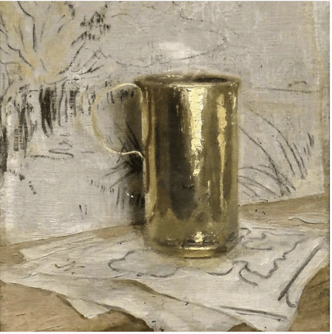
Sir William Nicholson, still life with brass cup, c. 1917
He has an originality that arises from loose application of academic technique combined with a general decision not to copy arrangements or subject matter from the European tradition. He deliberately broke from the time-honored formulas. And he often used combinations of objects that separated his work from the historical past.
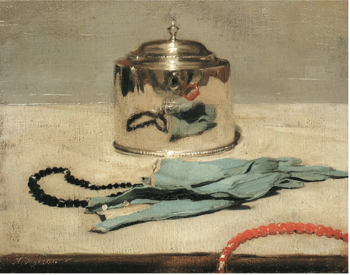
Sir William Nicholson, still life with gloves, c. 1916
To a contemporary sensibility, Nicholson’s paintings seem on some level to celebrate the artistic process in its purest form – painting from life with observation and originality. That’s what makes him a “painter’s painter” – he combines an impressive level of skill, including a certain looseness in the paint handling, with authenticity and originally, which lends the paintings the feeling of being exemplary of the “essence” of painting.
So how does he do it? Let’s have a closer look at that “Lustre Bowl” and tablecloth.
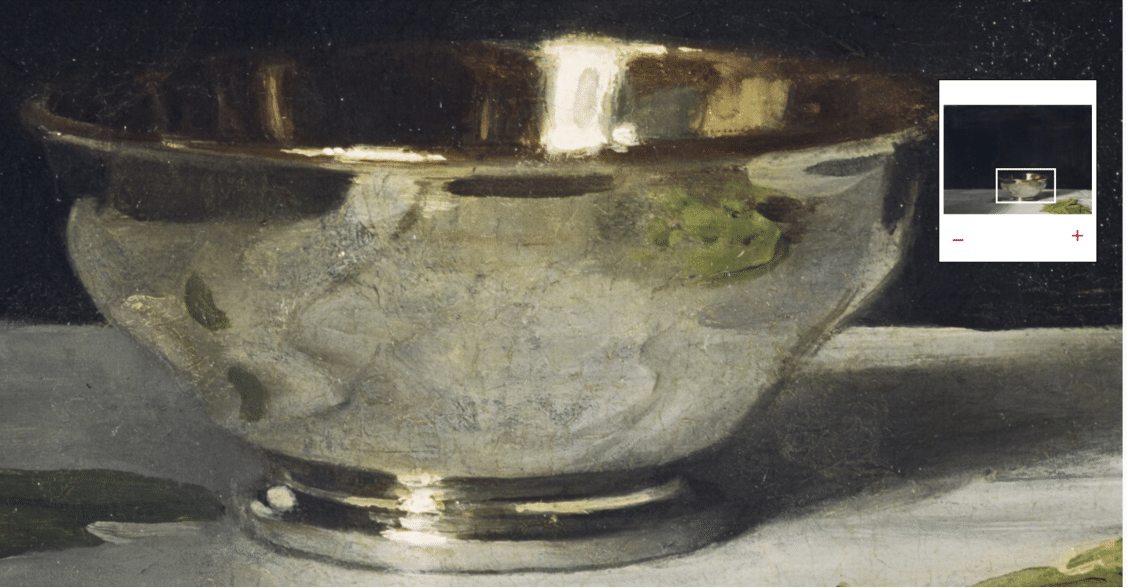
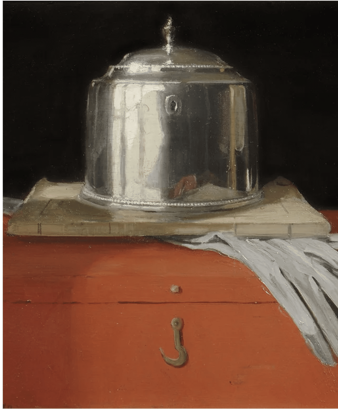
Detail the bowl. Note the strong contrast in the highlight and the painterly looseness in the reflections.
Here’s a closeup of the bowl – it looks like metal because of the reflections. Getting the reflections “right” comes down to the relationships between (in order of importance) 1. the light/dark values of the shapes and 2. the treatment of those shapes’ edges and 3. the colors, which have to match the surroundings while differing in, again, the all-important values and edges. Order of importance: values, edges, color.
The “luster” that convinces us the bowl is metal relies on two relatively smaller areas, just the ringed base and the rim/inside of the bowl. These do 90 percent of the work in convincing us we’re looking at a silver bowl. Below is a closeup of just the bowl’s base. As you can see, there’s a wide range of values involved – it’s mostly dark (warm black), then, rounding the curve, a bit of medium (probably yellow ochre and white added to the same black), with finally a smaller amount of light (white) concentrated at the highlight. The majority of the transition between the color-values are fairly abrupt (dark next to light without that much in between). The fourth square on the right samples an area that does get blended middle tones.
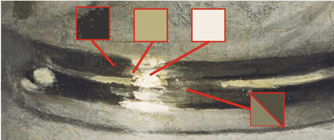
Detail of the base of the bowl showing color-values.
The next closeup (below) is the tablecloth. The only way we know it’s a tablecloth is because of the creases and folds in the fabric. Here, just two values are involved, but again it’s all about getting the values and their shapes and edges just right.
The simplified rule for fabric, based on this example, is a two-value combo – in any given crease or fold, a thinnish darker line runs alongside a lighter one. In the closeup below, the fabric at the crease in the foreground is darker toward the viewer because it tilts slightly down and away from us, while the area on the crease’s other side, further away from the viewer, catches the light.
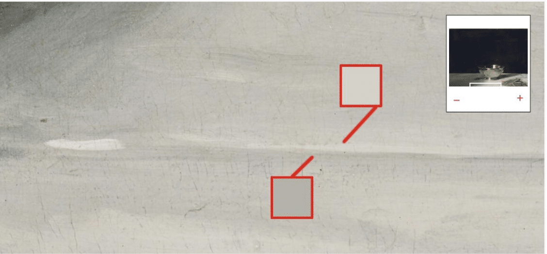
Detail of foreground fabric crease showing subtle shifts in the color-values.
Which side (closer or further away from the viewer) gets the lighter and which the darker line depends on whether the fabric is a crease “pointing down” (as in the example above) or a fold “sticking up” (as in the example below). All of this assumes, by the way, that the light source is behind the viewer.
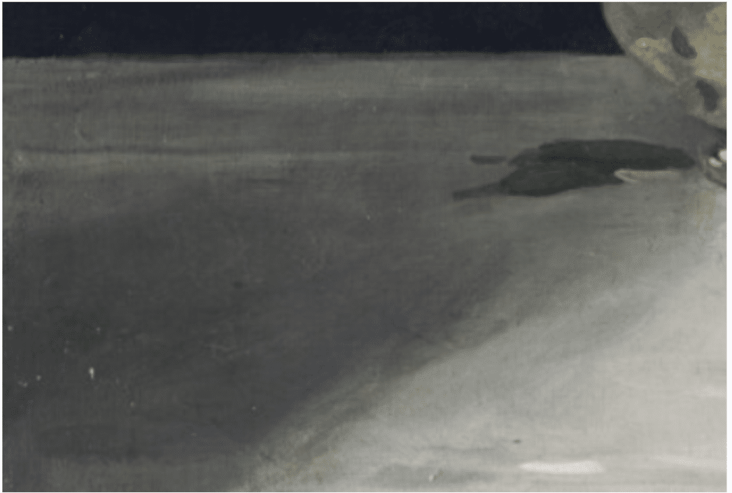
Detail of background fabric-fold.
It’s fascinating how, in loose paintings like this, one or two good creases or folds makes a cloth out of what’s otherwise a whole field of mild dark/light variations. Those “supporting actors” are made by dragging a medium brush with a little bit of darker or lighter color-value through various parts of the rest of the “cloth.” The secret to “painting loosely” without departing from realism is fewer (unblended) strokes of slightly thicker paint mixed to convincing color-values, given exactly the right placement. Checking all these boxes lets you “put it on and leave it on.”
Still, lest we forget, for all this technical analysis, the painting’s real strength lies in what the artist did before ever touching brush to canvas. It is the originality of the artistic vision, particularly the odd juxtapositions within the motif, that still ring true and keep us looking, thinking, and talking about this work.
Still life painting will probably never be out of style. If you’re interested in honing your own techniques, check out David Leffel’s video, Painting the Still Life Peaches with Delft Mug.