The pyramid or triangle design in painting offers a way to avoid composition problems like lack of movement, imbalance, “one for each eye,” or too much linearity or “stripiness” (obviously stacked horizontals).
“One for each eye” refers to compositions dominated by two objects of the same or similar dimensions. Picture two trees, each isolated and about the same height, equally distant from the center. The problem is that the viewer’s gaze ping-pongs between the two equally dominant forms instead of circulating around the entire painting. For its part, “stripiness” (picture a landscape with nothing but unvaried horizontals) leaves the painting flat, stuck in place, lacking in movement throughout the whole.
The pyramid design, like the circular composition, ensures the eye keeps moving within the painting instead of getting stuck somewhere or leaving it. At the same time, it can provide solidity and grounding, which the circular composition isn’t designed to do; being the most heavily weighted geometric form in terms of base vs. height, it’s said to evoke stability and a sense of assurance and calm.
How, and How NOT, to Use It
However, there’s a right and wrong way to use it. The wrong way is to create a dead-symmetric triangle with equal, same-angled sides, which plays right back into the “no drama” category of boring, undynamic paintings.
To avoid this problem, artists you need to vary the placement, angles, and proportions (think “skateboard ramp” instead of “pizza slice”). Combining a dynamic pyramid with other designs in the same painting goes even further and ensures it never gets old or obvious, no matter how often you use it.
Pyramid compositions work particularly well for still lifes, gabled houses and barns, maritime and waterfront paintings with boats’ masts, and figural groups. Really, you can use the pyramid composition to create a strong, balanced design for any kind of subject, portraits and landscapes included.
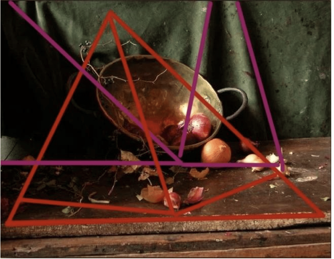
Sherrie McGraw uses what amounts to a pyramid composition in Still Life with Onions, which is the subject of a detailed teaching video that you can purchase here.
The classic example of a strong yet complex use of the device comes from French Neoclassical painter Gericault, who in turn was responding to Rembrandt’s Storm on the Sea of Galilee (stolen from the Isabella Stewart Garner Museum of Art in the 1990s). In Rembrandt’s earlier, off-kilter pyramid, the lifted point on the left gets spotlighted as the focal point, where the eye goes first before traveling up the mast (into the storm clouds) and back down the rigging to important figural group, where Jesus speaks of making them “fishers of men” before calming the storm for them. Tilting up the otherwise stable geometric base emphasizes the violent tossing motion and height of the dangerous swells as well as the contrasting enveloping darkness, while massing the figural group at the very bottom of the pyramid presages the stability that calming the storm will bring to the boat.
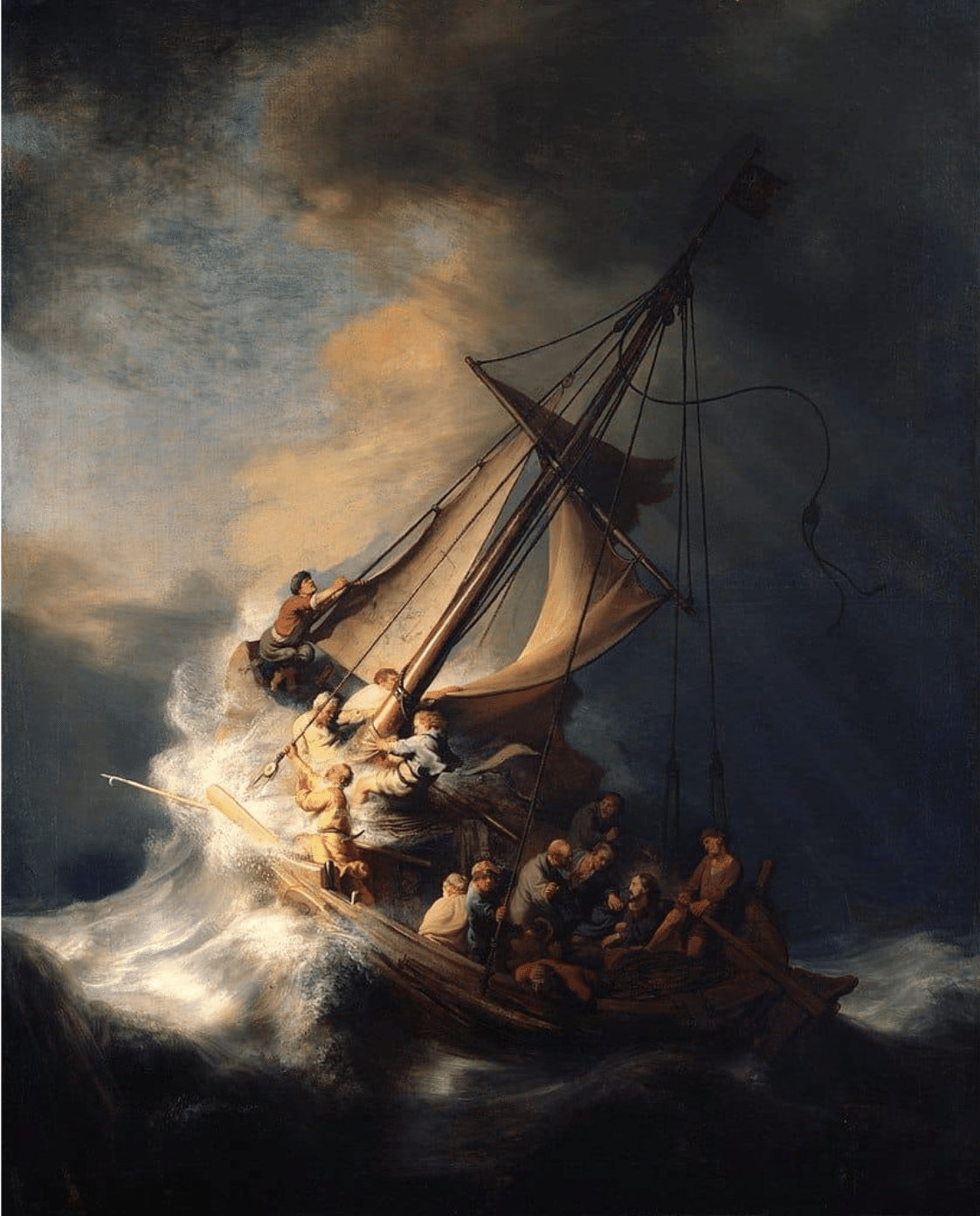
Rembrandt van Rijn, Storm on the Sea of Galilee, oil, 62″ x 50,” 1633 – an example of a classic pyramidal composition
It’s particularly unsettling for the viewer to see such a supposedly stable shape so skewed. Note that we are dealing with a pyramid in Rembrandt’s painting, a three-dimensional shape, not a flat triangle. The same is true for Gericault’s Raft of the Medusa, though here the composition is further complicated by the artist’s use of two, interlocking pyramids.

Both painters managed to simultaneously make use of and subvert the stability of the pyramid.
Gericault has literally one-upped Rembrandt by adding that additional, overlapping pyramid. While both artists skewed their pyramids for tension, Gericault effectively pulls one pyramid out of the other and points the two peaks in opposite directions.
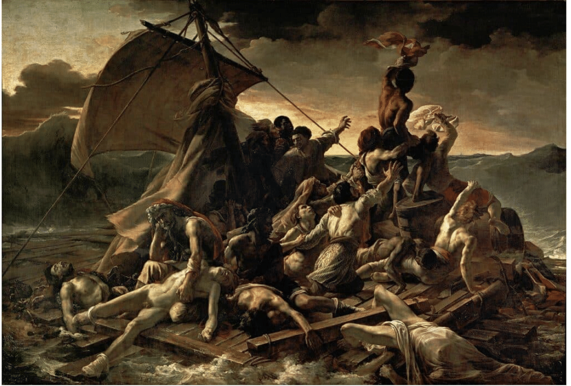
Jean Louis Theodore Gericault, The Raft of the Medusa, 1818-1819. Louvre.
But Gericault, likie Rembrandt, is a great painter as well as a clever composer. As in Rembrandt’s Sea of Galilee, in Gericault’s Raft, form and content combine with maximum impact. Look at how Gericault uses the three-dimensional aspect of the pyramid’s geometry to make it impossible for his viewers to ignore the grim fate of his shipwrecked sailors. Gericault puts his sickest, most suffering figures font and center, in the wide part of the pyramid, which constitutes the foreground.
He tilts the whole bottom half of the picture plane forward, effectively tumbling the dead and dying castaways right into the viewer’s space. The way he thrusts his subject toward us forces us to become part of it, as if we’re almost standing on (or falling off!) the projecting corner edge of the waterlogged raft.
Having three sides, the triadic composition seemed a natural choice for Christian art; in church commissions, the symbolism of the holy trinity or holy family motif found visible form in three-sided geometry. Furthermore, with its pinnacle pointed toward Heaven, the pyramid or triangle also suggested aspiration toward the Divine paired with the base’s evocation of the foundational stability of the Church on earth.
Renaissance painters like Leonardo da Vinci and Raphael and later history painters used it repeatedly for their Madonnas and Christs on the cross.
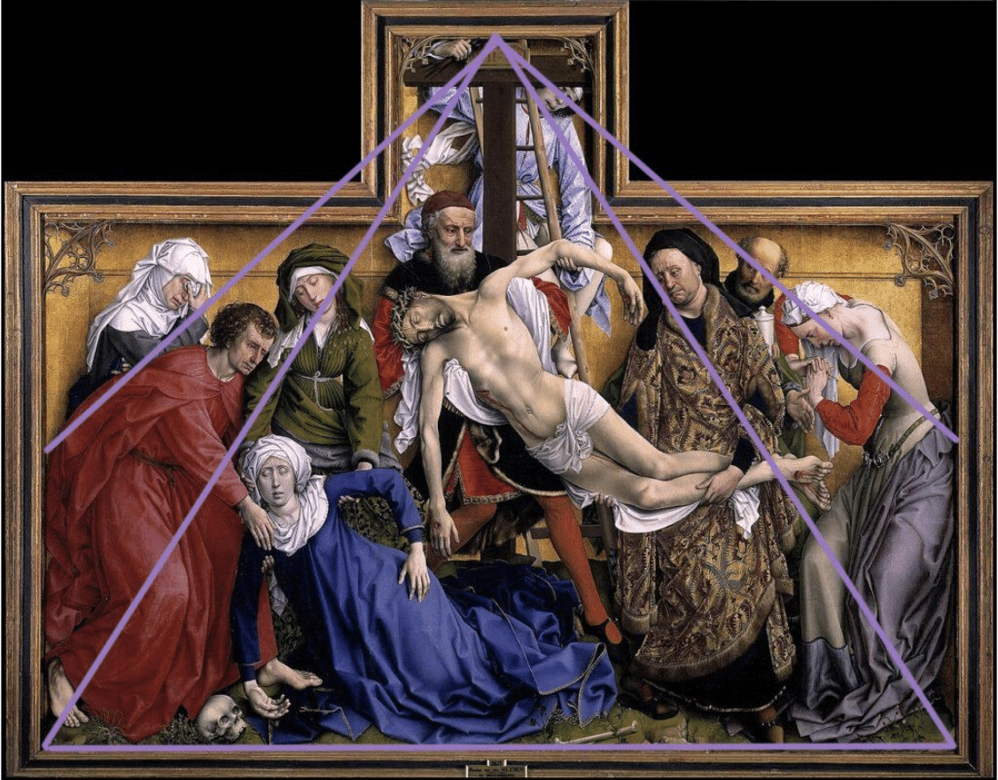
Van der Weyden, Descent from the Cross, 1430
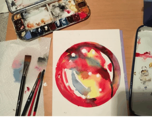
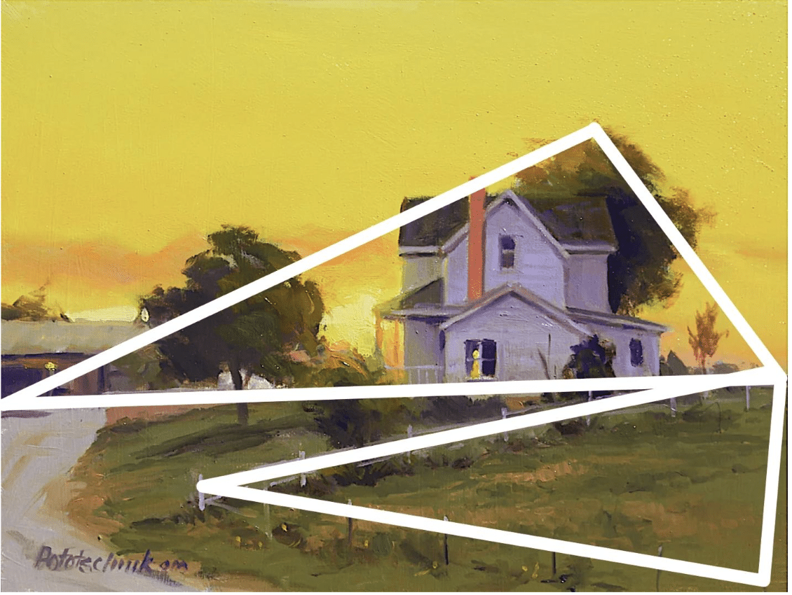
The painting below, by watercolorist Chien Chung Wei, is based on one-point perspective, with the vanishing point very close to the center of the composition (white lines on the diagram). However, the mountain’s centered peak and the stacked symmetrical diagonals arrayed in relation to it (as well as some subtle horizontal (base) shadows running across the canal) contribute to the sense of a pyramid structure in the lower half of the painting.
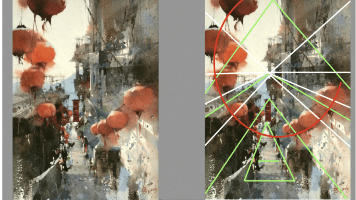
However, the stunning overlay of an expansive spiral (in the red paper lanterns) explodes the visual space and sets it all in motion. (To my eye, it creates an underlying structure that resembles a ferris wheel, but that’s beside the point.)
Chung-Wei treats making a painting like building a house; he starts from the structural design, moving on to the laying of the ground floor in a large area, and works on up toward the finishing details.
Author of the book The Intrigue of Form, he’s a master of using composition to shape the viewer’s’ experience of a painting. Yes, he has a distinctive command of light and shadow (and subtle color dynamics), but he insists, rightly so, that it’s what’s under the surface of the painting that really counts. “Light in a painting is like the sugar coating on a pill,” he says. “It makes it go down. But it’s the composition that is the real medicine.”
If you’re looking to boost your skills at composition (or watercolors, for that matter) dive into Chung-Wei’s video or one of these other titles on composition and design that will definitely improve your eye and go a long way to help you make your best paintings.