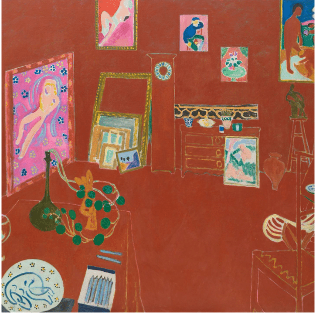
Henri Matisse’s revolutionary paining, The Red Studio, marks one of the decisive moments in the history of art in which free expression grew out of traditional representational painting.
Created in 1911, it’s an early and important abstract painting*, though it took a number of years for the world to catch up with it. Its super-flat, abstract quality and saturated field of Venetian red initially baffled art lovers and critics alike, even though it was far from the first abstract painting. Picasso and Braque were already on the case inventing Cubism, and decades earlier Kandinsky had discovered how to use paint non-referentially, treating form and color like the visual equivalents of music. Meanwhile, although no one knew it outside of a private group of spiritual seekers in Sweden, Hilma af Klint was quietly creating huge, colorful spiritual visions in a mystical visual language composed of biomorphic and geometric forms.
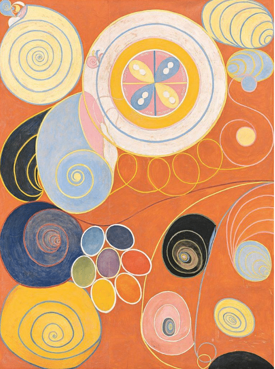
Hilma af Klint, De tio största, nr 3. 1907
But Matisse’s “Red Room,” or to use its proper titled, L’Atelier Rouge (“The Red Studio”), played an outsized role in the development of 20th century art. To take that measure, The Red Studio is currently the focus of an exhibition exploring the painting’s background and influence at the Museum of Modern Art, which owns the masterpiece.
I’ve always loved that even though it’s so emphatically, decisively RED, it was originally blue and pink. He did the same thing with another red painting, the famous The Dessert: Harmony in Red.
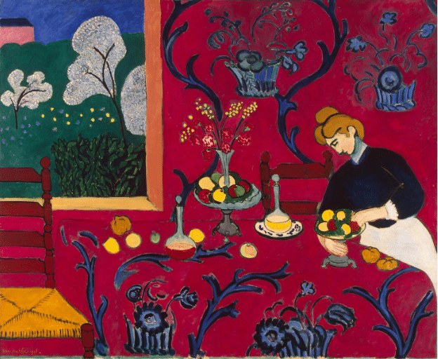
Museum staff positioning Matisse’s The Dessert: Harmony in Red.
The background of the painting was originally green, but Matisse changed it to blue before exhibiting it at the Salon d’Automne in 1908 with the title ‘Harmony in Blue.’ Still unsatisfied with the result, he painted over it again, this time with his preferred red. Artists, take note: the website Matisse.org deftly traces the development of this masterpiece through its predecessors (nothing happens in a vacuum):
Matisse was influenced by the “Post-Impressionists, Van Gogh, Gauguin, Paul Cezanne, and Van Gogh was an ardent admirer of Japanese art and motifs. Matisse developed his style using areas of flat, brilliant and often unnatural colour and invariably outlined his forms in a manner similar to Van Gogh. This Fauvist painting, like Impressionist Claude Monet’s, has no central focal point.” (See? Some paintings really don’t need a focal point.)
He did the same things with the painting of his studio, even the change from the blue color scheme to the red. He stopped working on The Red Studio canvas and left it alone for a number of weeks or even months, during which at some point he had the red revelation and overpainted several of its fields with the vibrant rusty Venetian red that floods it today. Matisse ended up painting another version of the studio interior using a pink and blue color palette the same year.
It’s interesting to look back from this more conventional version and compare it to the Red Studio to see what he chose to leave in and leave out in the latter.
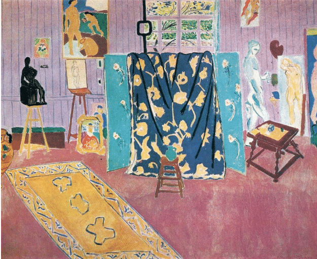
Matisse, The Pink Studio, 1911
In all three of these paintings by Matisse, what makes them look strange at first are the “fields” of single-hued color, the radical flattening of the picture plane, and the way Matisse drew freehand, deliberately not “cleaning up” what others would have seen as flaws and imperfections of draftsmanship (such as the free-hand lines in the carpet, the drapery and the view outside the window in the The Pink Studio, above).
Perhaps most influential of all is Matisse’s collapsing of pictorial space. The frank admission that a painting is color applied to a two-dimensional surface influenced the Abstract Expressionists of the 1940s and 1950s (especially Rothko and later Richard Diebenkorn), the Color Field painters who followed them, and even the 1960s Pop artists, such as Roy Lichtenstein and Andy Warhol, who further flattened the picture plane with fields of unbroken color.
About Red Studio, says the New York Times: “Almost since the day it was painted, that surface has been seen as the heart of the work. It was supposed to teach us to leave behind the deep space of old master pictures and love modern art’s flatness instead. Starting somewhere around 1900 — and partly thanks to Matisse — paintings started to be read for the colors, lines and shapes that are right there for us to see, rather than for any scene that we might look beyond them to understand…. Matisse himself originally titled the picture nothing more than “Red Panel,” as if color and flatness were its true subject.”
But here’s the thing that gets missed: that celebration of the “colors, lines and shapes” on the surface of painting was never meant to banish content. Although it’s rarely pointed out, The Red Studio (which Matisse painted to celebrate the completion of a newly built art space) is alive with meaning and emotion.
It’s obviously a celebration of the joy and excitement of painting, of moving colors around on a 2D surface to the delight of both artist and viewers. It is also, above all, a strong proclamation of the freedom of artists everywhere to rephrase the elements of the great paintings of the past in fresh new visual languages. (Why is our culture so strangely reluctant to discuss anything about art other than its purely physical attributes?)
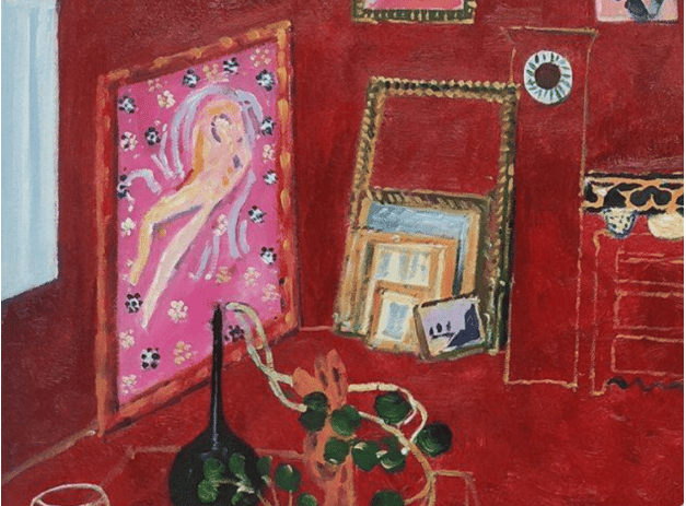
Matisse, L’Atelier Rouge, detail
The Museum of Modern Art in 2022 created an entire exhibition around this one painting, telling the story of its creation and sale. The show stayed about as much on the surface as the paint itself, divided into sections on Rebuilding the Studio, The Patron, and The Story. They even gathered and displayed the actual objects from Matisse’s studio (small sculptures, paintings-in-progress) that appear in the picture. Anything, apparently, to avoid digging into the actual poetry of it, to steer clear of exploring the painting as an experience or what it means when an entirely new form of beauty comes into the world through a radically original work of art.
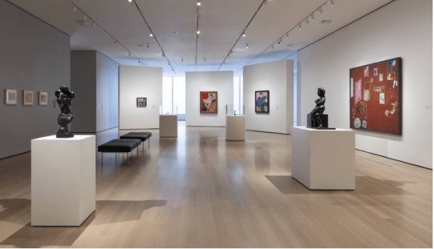
MoMA’s 2022 exhibition of the contents of Matisse’s studio when he painted “The Red Studio.”
In reviewing MoMA’s show, The NY Times found a scandal of sorts hidden in plain sight. Going by this reviewer, the painting’s got all the makings of a spy thriller: “A flowered dress. A naked teenager. A Russian millionaire. A fancy room that hides secrets.”
Evidently desperate to make the painting sound appealing to a superficial-media-saturated audience, the Times pointed out that the girl depicted in the “large nude painting” on the Red Studio’s wall is actually the artist’s daughter, Marguerite, who modeled for it the same year (1911) at just 16 or just 17 years old. (The Matisse family destroyed the original painting.)
The Russian millionaire is the patron who expects to enjoy ogling her on his wall when Matisse ships the finished work (ultimately the businessman decided not to purchase The Red Studio, for unknown reasons. Perhaps it clashed with the curtains – after all it started out blue). The flowers in the painting are daisies, an allusion to Matisse’s pet name for his daughter.
While some might have serious questions about the power dynamics at play here, Matisse was “just” following the Western figurative and Dutch interior traditions. By including the daisies, the artist can be seen encoding into it an affectionate gesture toward his daughter.
Teasing out the “hidden life” of paintings like this, even so-called abstract ones (and observing the artist’s thought process through actions and reactions) changes everything. It also helps us understand a little bit, from an insider’s perspective, how the greatest art gets made.
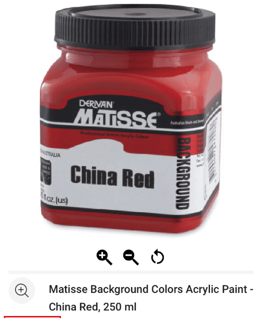
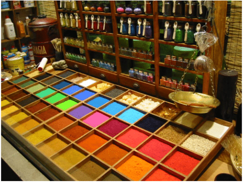
Oh an by the way, it seems that something very like the red pigment Matisse used in The Red Studio is available by the bottle, some 113 years after this painting surprised the world. Now you too can paint just like Matisse! Well if that’s not the pinnacle of fame and veneration, I don’t know what is.
*Fun fact: According to Wikipedia, in 2004, L’Atelier Rouge came in at No. 5 in a poll of 500 art experts voting for the most influential of all works of moder art, along with works by Picasso, Larcel Duchamp, and Andy Warhol.
If you’re interested in learning the “secrets” of creative color handling, consider checking out a professional artist’s video on it online, here.