Catherine Hillis’s paintings are visually compelling – they also “say something,” albeit in the language of line, texture, and color.
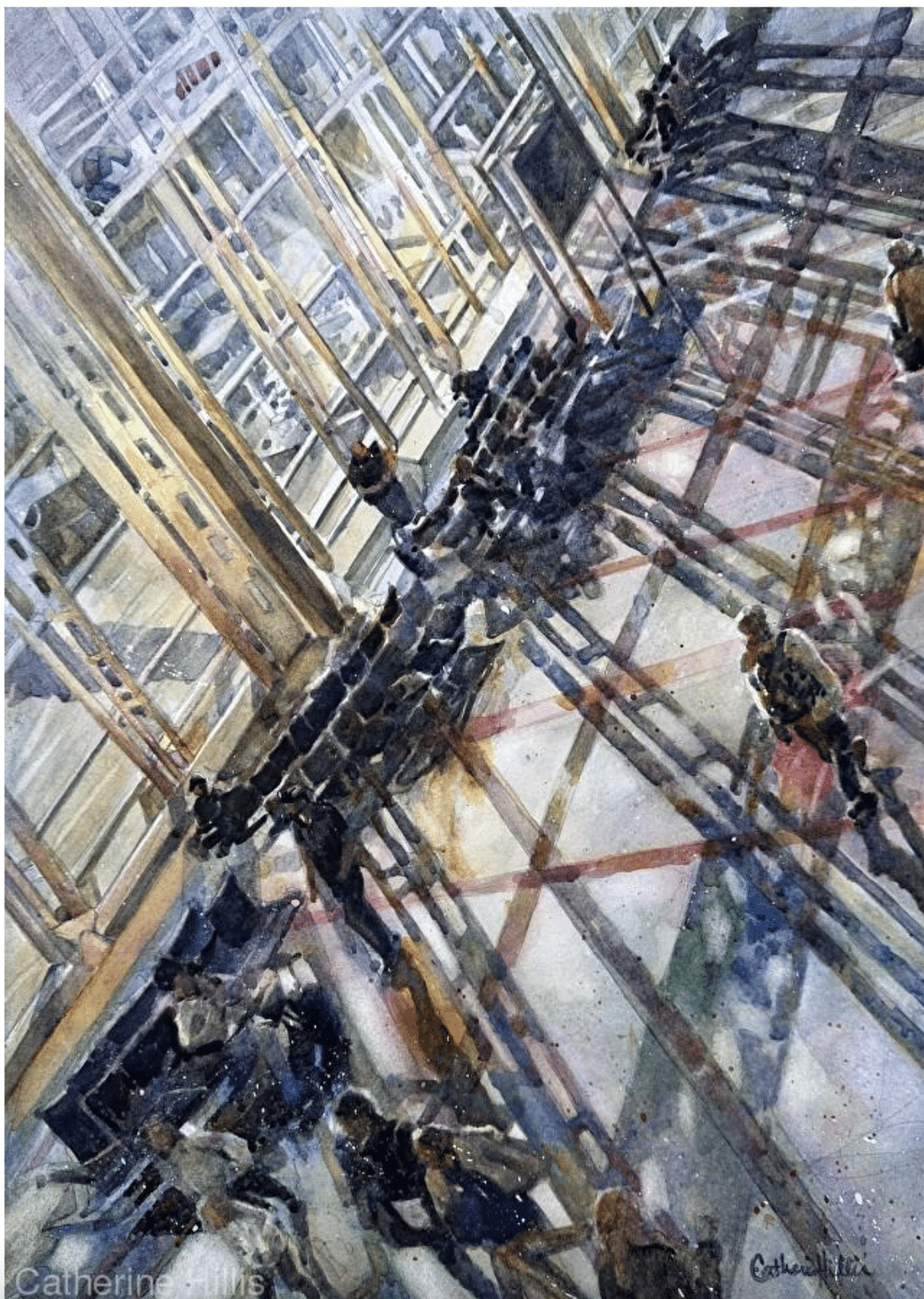
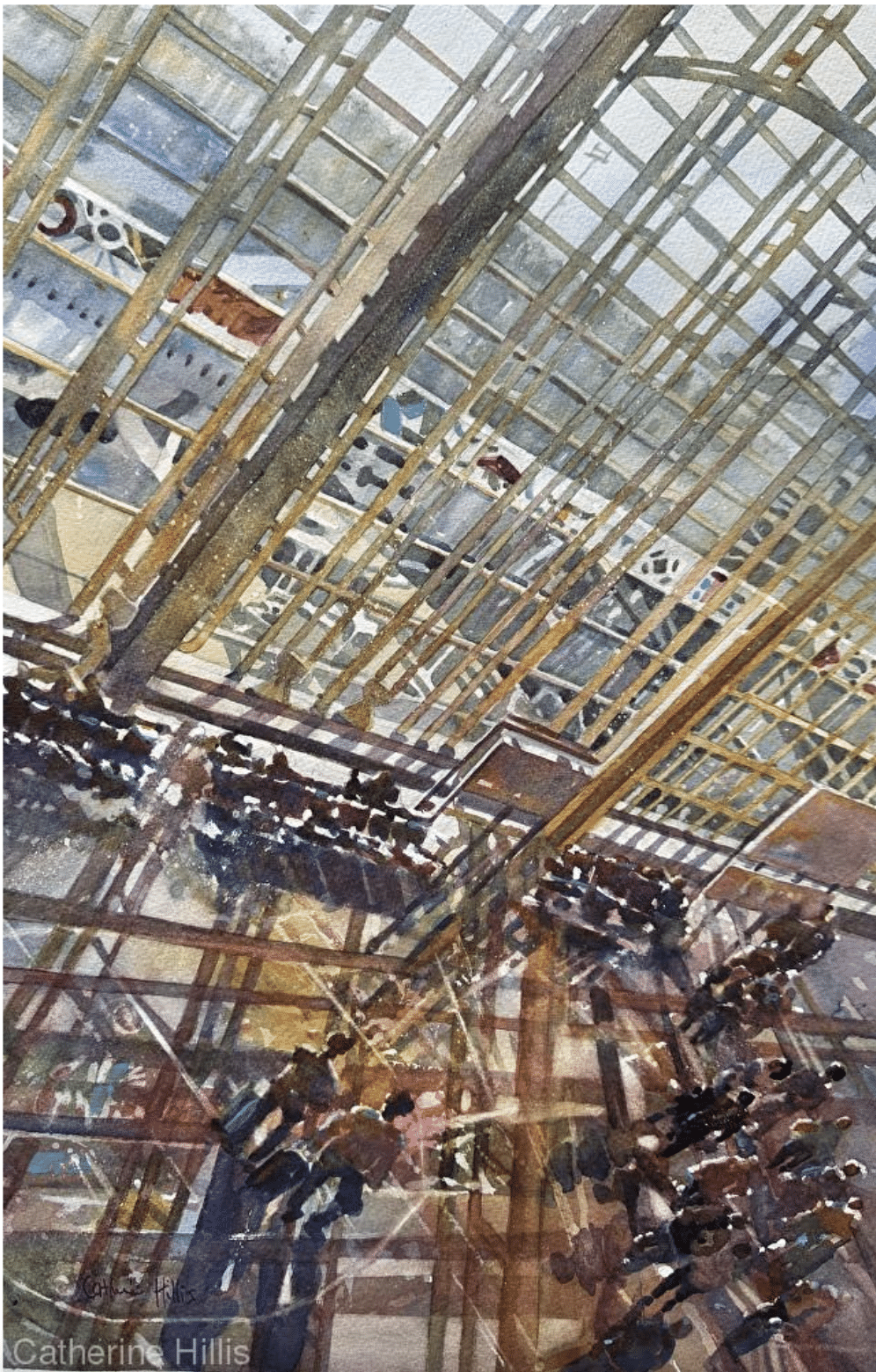
Hillis is an artist who paints from close observation of life. Her watercolor Morning Hustle at DCA, (above), which won the top award in the category of architecture in this past November’s PleinAir Salon, uses glass and steel architecture, light, shadow, and a very strong composition to speak volumes about the busy lives we live today.
Hillis describes her work as traditional “with a twist.” She often finds herself, she says, “incorporating humor or beauty whenever possible in unexpected places.”
Not unlike Morning Hustle, a painting like Master of Disaster (below) for example, hooks us with an unusual, dynamic compositional point of view that charms us into staying with its story: that housecat crouched in its sunny window could be a ticking timebomb for a cataclysmic domino-effect of broken glass – but who can tell, stonewalled as we are by that classic “try me” poker-face of feline mystery.
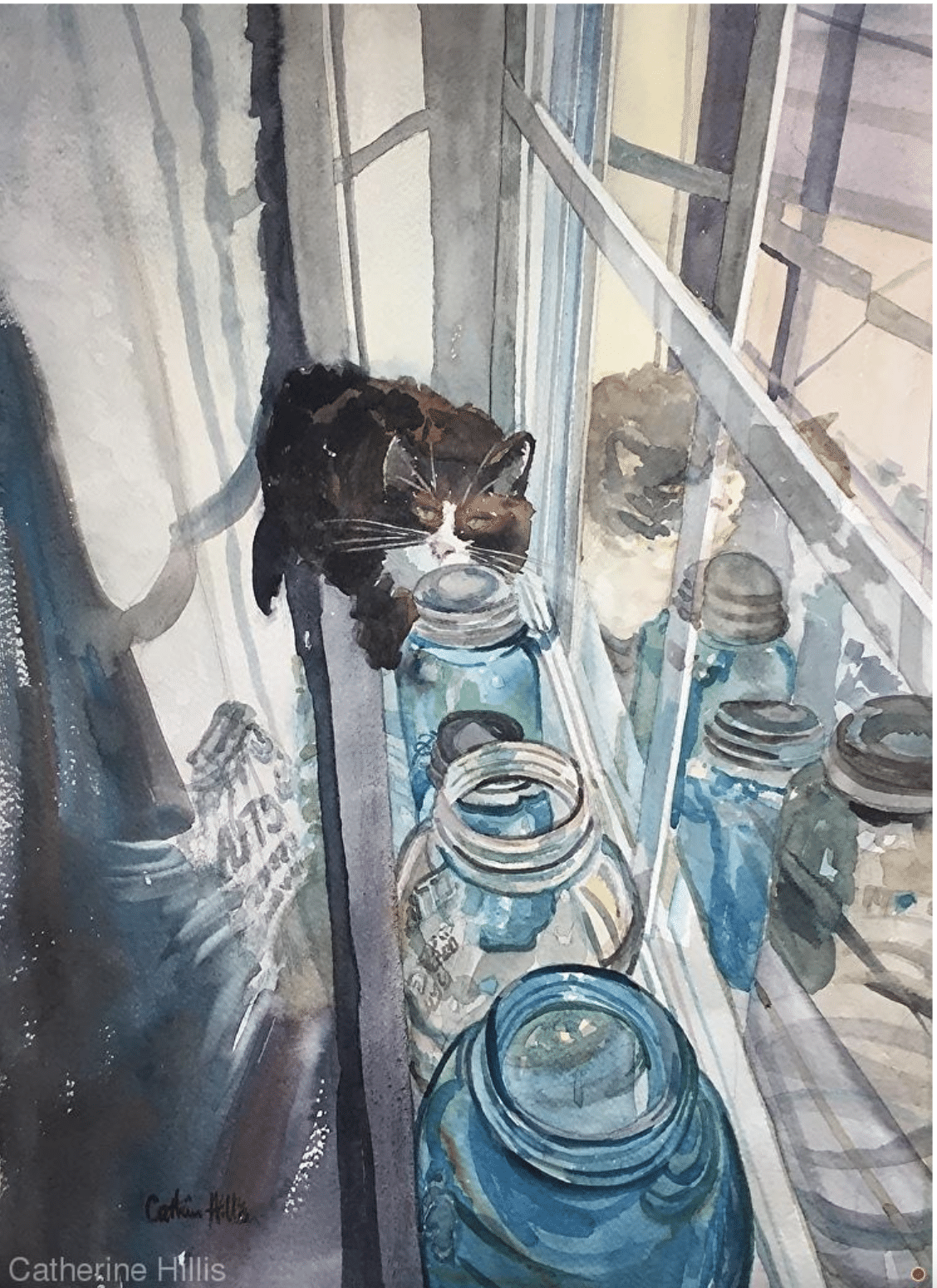
Catherine Hillis, Master of Disaster, watercolor 20 x 15 in.
Hillis’s Salon-winning painting of the Washington D.C. airport, Morning Hustle at DCA, is part of her series, “Ultimately Urban.” (Her work tends to organize itself into about half a dozen categories, including “Mostly Marine”, “Compelling Characters,” and “Beasts, Friendly and Otherwise.”) Although she lives in the country and enjoys painting its peaceful scenes, getting that “city fix” is integral to her journey as an artist, she says.
“There’s an energy in the city that I want to capture,” she says, “and that energy is almost always related to patterns of light, splashes of color and the linkage of figures in some overlooked location.”
The Human Element
“The human shapes help tell the story,” Hillis says. “The figures might be rushing, they might be relating to each other or to the light, or in some cases, the people may not be connecting at all and that might be the story.”
“In Morning Hustle at DCA, I wanted to capture the beautiful morning light coming through the expansive windows of Reagan National Airport. The architecture is stately and the light lovely. I couldn’t get the scene out of my head. The passengers were rushing to their destinations, oblivious to the magnificent light and color reflected around them. It was absolutely beautiful as well as chaotic and busy.”
Catherine Hillis, Lost in Space, watercolor, 21 x 14 in., a companion piece to Morning Hustle at DCA.
Hillis achieves her signature balance of complex geometry, intricate detail, and meaningful content drawing from multiple references. “I take a series of photos with my iPhone, capturing as many different angles as I can,” she says. “After a session of photographing, I’ll look through the pictures and catalogue the keepers in my computer file.”
“I’m not interested in being a copyist, replicating a photo exactly. I often make changes to my initial photographic resource or I may integrate several photos. I make simple value sketches in a sketchbook for initial plein air work but in this case, (and because this was a complex studio painting) I worked from a 5 x 7 black and white print made on my printer. I softened areas that weren’t important with white gouache and used neutral tint to darken areas where I wanted the viewer’s eye to linger. I took some shapes out to reduce the clutter.”
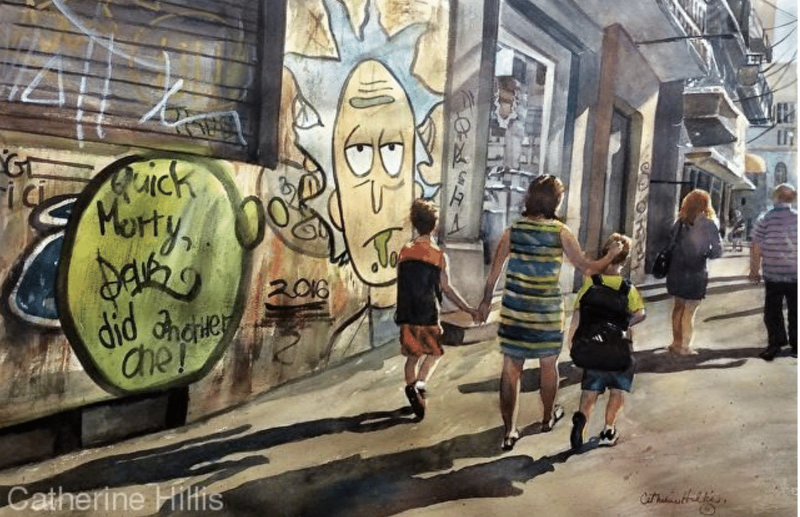
Catherine Hillis, Urban Canvas, watercolor, 20×27 in.
“Once I’m happy with my design, I produce a light pencil sketch right onto my watercolor paper. The drawing often takes longer than the painting itself. Once my drawing was done on Morning Hustle… I chose a limited palette of two yellows, 3 blues and rose. I splattered masking fluid and then painted an initial under-wash to set up the important pattern of light. I almost always paint an under-wash in the studio but rarely when I’m working en plein air.”
“Once a painting is ‘finished’ – I put it on a magnetic board in my studio and look at it. This is my “tweaking” time. I take photos after each adjustment, self-critiquing them on my computer screen. It can take up to several months before I consider a studio painting done or, in this case, a week.”
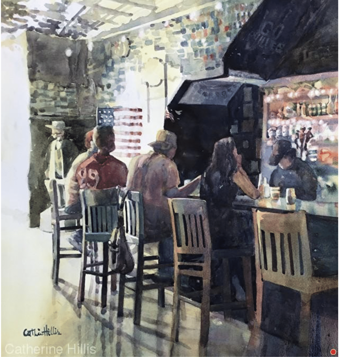
Catherine Hillis, The Good Old Days, watercolor, 19×18 in.
“I hope all my paintings tell a story,” she says. “For folks interested in painting urban scenes, it’s not just about buildings or architecture, brick, glass, concrete and steel. Look for the light and look for the story. There’s always a cat in a window or a child peeping through a door or someone standing alone amidst the crowd, and THAT is the tale worth telling.”
You can see more of Catherine’s work at catherinehillis.com.
Entries are now being accepted for the next PleinAir Salon. The monthly PleinAir Salon rewards artists with over $33,000 in cash prizes and exposure of their work. A winning painting, chosen annually from the monthly winners, is featured on the cover of PleinAir magazine. To enter your work, visit PleinAirSalon.com.
If you’re interested in painting the urban landscape, you may want to browse a selection of high-quality teaching videos by professional artists, here.
And finally, kicking off next week is WATERCOLOR LIVE, a three-day online symposium of demos and workshops attended by thousands of people online. The event runs January 24-26, 2024. Learn more here.
Does Art Imitate Life, or Does Life Imitate Art?
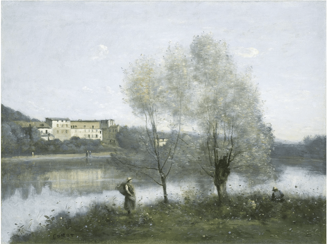
John-Baptiste-Camille Corot, Ville d’Avray, ca. 1867, oil on canvas. National Gallery of Art, Washington, D.C.
Can looking at art literally change the way we see the world? I have seen beginning landscape artists suddenly find themselves getting lost in astonishing cloud and sky effects no one would believe if you painted them. They’re literally seeing the world differently.
Once you really start looking, you begin to see how a backyard scene full of ordinary “green” leaves and grass is really made up of many shades of gray and green, not to mention subtle ochres, blues, browns, violets, even yellows and reds. You can literally see and feel the world differently once you begin really looking and understanding how artists use color. (Streamline’s PaintTube.tv offers several videos on understanding color, by the way, which you can check out here).
Certainly at this time of year in the U.S. anyway (but really anywhere, all the time), many of the colors we experience in the world around us could actually be described as varieties of gray. Someone once told me, “we live in a gray world,” albeit punctuated by brilliant hues, but I didn’t believe it until Corot (French landscapist, c. 1830s) made me feel and see it.
French Barbizon painter Camille Corot had a genius for creating powerful self-contained fantasy worlds in his painting. He painted his woods, grass, and foliage as gauzy, atmospheric veils shimmering with pearlescent grays composed of carefully toned neutral blues, ochres, greens, and violets … his foliage trails into sky-brightness like half-forgotten music. It’s a highly idiosyncratic interpretation of nature – total lyric poetry.
And yet, after viewing Corot’s paintings, I have seen the very same color harmonies – those beautiful, old-world grays – in New England, in woodlands and pond-banks and backyards that never looked like that before. Each time I’ve glimpsed a frost-silvered row of pines or a mist-muted orchard, I’ve felt wash over me some small measure of the emotion Corot seems to me to call forth in paint. To me it feels as though a new and beautiful way of experiencing the world has been permanently added to my life.
The world *is* how each of us experiences it. Art just inspires reality to be that much more interesting!