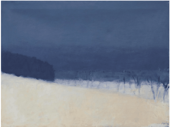
Today we look at paintings by oil painter and pastelist Wolf Kahn (1927–2020).
What You Should Know
Wolf Kahn began creating intensely colorful American landscapes in the 1950s, when abstraction was all anyone wanted to talk about.
When you think American landscape painting and big, bright colors you should picture a painting by Wolf Kahn.
He said he wanted his colors to be “surprising to people without being offensive.”
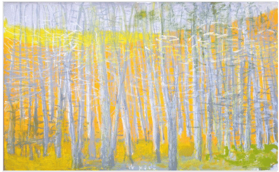
In his paintings, realism and non-representation converge. His large, saturated (“high-chroma”) day-glow colored canvases were planted in New York abstract expressionism, but the strange flowers that exploded from them merged the atmospheric qualities of American impressionism, the electrifying palettes of Matisse and Bonnard and the sweeping bands of color that Rothko and the color-field painters made popular in the 1960s.
Wolf Kahn, Pink Horizon, c. 40” x 60” (2015)
Why You Should Care
As a painter, like it or hate it the spectacle of BIG COLOR is something you need to experience, take in, and understand.
Kahn’s paintings can look garish in reproductions but in person they vibrate and emit energy before the viewer in a way 99 percent of the paintings of the world do not.
He used color as a stand-in for light in a way that extended Impressionism into abstraction and even Pop Art territory.
Wolf Kahn landscape (2004)
If they were merely “brightly colored,” Kahn’s paintings would be unpleasant to look at and therefore would not be remembered. Instead, they are complex mixtures of beauty and ugliness grounded in a philosophy of painting. In turn they reflect a whole philosophy of art and life.
What You Can Steal
Realists tend to shy away from intense color – close looking at Wolf Kahn’s unique blend of realism and non-representation teaches you how to use high-chroma color without it becoming glaring. The secret is subtle compliments and, almost always, a counterpoint of grays and neutrals, often right over top of the color fields.

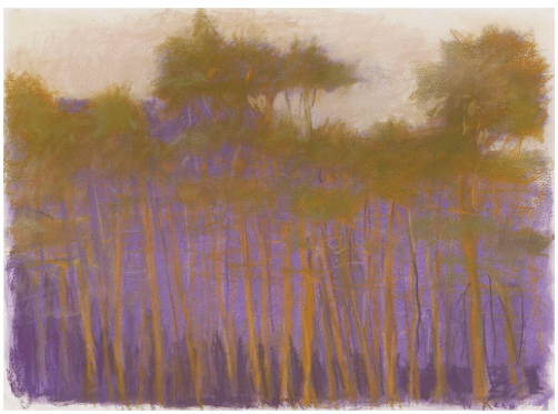
Wolf Kahn, Yosemite Pines, Pastel on paper, 10 x 8 inches (1993)
Also, Kahn defied the rule about mixing color on your palette not on your painting. He used his oils aw if they were pastels, referring to his palette as a “warehouse” for colors that went into the painting straight out of the tube. Why not try it?
Something to Inspire You
When he died at 92, Wolf Kahn was producing the most energetically confident paintings of his long (70+ years) career. He always thought of himself as “a working man” and proved it by spending 10-14 hours a day in his studio. And despite the apparent uniformity of his instantly recognizable work, he continued to open new territories to mine within it until the end.
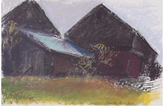
Wolf Kahn, Million Dollar Barn, pastel, 2007
If he’d listened to critics he would have quit. An eminent art historian visiting his studio once told him to his face, “There’s nothing here that Monet hasn’t done already.” His wide popularity (his wife, the painter Emily Mason, was savvy enough to market his work on commercial notecards and calendars) made critics wary. Said the New York Times, ““Can art this ingratiating be taken seriously?…. His popularity with a broad public and the unclouded loveliness of his landscapes give rise to grumblings that he has not earned his keep.”
Keep doing what you’re doing.
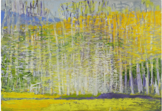
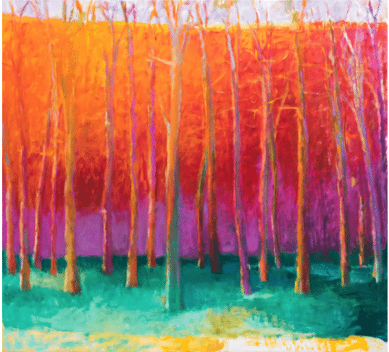
Wolf Kahn, Trunks the Color of Orange, pastel on paper, size 21 1/2 x 29 1/2 in.
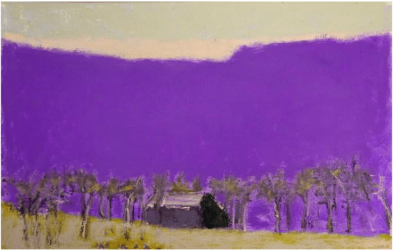
Wolf Kahn, November, 2014, Addison/Ripley Fine Art
Wolf Kahn, Upper New York State, c. 1960