“There can be no knowledge without emotion. We may be aware of a truth, yet until we have felt its force, it is not ours. To the cognition of the brain must be added the experience of the soul.” – Arnold Bennett
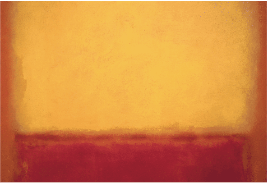
For years, American abstract expressionist Mark Rothko’s reputation, while secure among art historians, endured mockery and misunderstanding from the public. Finally, it seems enough time has gone by that people are no longer blinded by outrage, disdain, or other knee-jerk reactions. Whole generations can now see and appreciate Rothko’s daring, profound, and very moving work for what it is.
People who didn’t see the paintings in person or didn’t understand why Rothko made them as he did wrongly assumed they were intended to insult, radicalize, or at best sidestep the grand history of Western art. Such biases blinded them to the simple truth – Rothko and his peers (e.g., Jackson Pollock, Robert Motherwell, Joan Mitchell, Willem de Kooning, Franz Kline, Helen Frankenthaler) were maintaining art’s relevance. They were simply using the elements of art (the oldest, in fact – primal color and the foundational geometric shapes) for the same purpose great art’s always had: to foster deeply moving experiences by using the traditional materials in new and surprising ways.
Turner did the same thing in his lifetime. His dissolution of the image in atmospheric light helped pave the way for Impressionism, modernism, and the abstract expressionists, particularly Rothko.
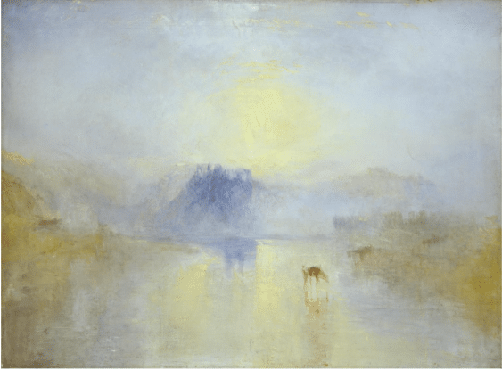
Joseph Mallord William Turner, Norham Castle, Sunrise, oil, c.1845
The great abstract expressionists, building on the insights of Turner, Monet, and most directly Modernism, discovered how to use art’s most primal and ancient elements – color and shape – to directly affect the viewer’s feelings without the distraction of a particular picture of this or that. They said as much but no one could hear them. As Pollock put it, though few were listening, “I want to express my feelings not illustrate them.” Rothko for his part plainly said what his work was about:
“I am not interested in relationship of color or form or anything else…I am interested only in expressing the basic human emotions – tragedy, ecstasy, doom, and so on – and the fact that a lot of people break down and cry when confronted with my pictures shows that I communicate with those basic human emotions. The people who weep before my pictures are having the same religious experience I had when I painted them. And if you, as you say, are moved only by their color relationships, then you miss the point.”
The impression is generated as much by the viewer, their experiences and their environment, as it is by the artist. The artist attempts to create a mood and a feeling that resonates with the viewer, providing a purely emotional evocation rather than a descriptive image.
That means that, with art like Rothko’s, the viewer must participate more than is usual. Also, you have to see it in person – it’s done in transparent layers, so elements of it appear to move imperceptibly in front of you, the air becoming charged with dancing particles of energy and emotion. This is work that you must take on its own terms before it will work on you. You have to let go of assumptions about what “good art” is supposed to look like before you can fully see – and experience – what is actually in front of you. Now, with the passage of time since the 1950s, that’s just what people are doing.
“More crying has been done in front of Rothko’s paintings than before any other 20th century artist, with Picasso’s ‘Guernica’ placing a ‘distant second,’” says critic Judith Kay, commenting on Pictures and Tears, a book by art historian James Elkins. “Presence, representing attachment, or emptiness representing loss, are both abstractly communicated through Rothko’s art, moving the viewer so innately and so deeply, that they weep.”
Paris’s Fondation Louis Vuitton’s is currently showing the first Rothko retrospective in France in almost a quarter-century, and probably the best Rothko show in any of our lifetimes. Writing in the Washington Post, art critic Sebastian Smee describes experiencing it in a way that many artists would probably understand: “floating rectangles – their edges wispy and broken – fuse and fizz, their underlayers alternating warm and cool beneath a thin but chromatically steady top layer, the whole emulsion working on the eye in gently pulsing waves that are like sighs, like tides, like emanations of bliss and selfless love.”
Critics compared the indeterminacy in his art to Turner’s seascapes, Whistler’s “Nocturnes” and Monet’s late work. What made Rothko different was that there was nothing to recognize. Nothing to decipher. A painting by Rothko, from 1950 on, was a thing in itself, and not a representation of any other thing.
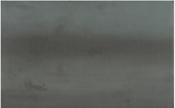
James McNeil Whistler, Nocturne, Blue and Silver: Battersea Reach, Gardner Museum Boston
These days, true to the cyclic nature of these things, realism and representation are back in contemporary painting. For that matter, representation never left painting, of course, and never will. Nor will the best artists, whatever their chosen styles, ever forsake such things as “tragedy, ecstasy, doom, and so on.” For, it’s not about the controversy du jour, but the big stuff that makes us truly human that we go to art to experience to begin with.
Waves and Winds Sweep Top Two and Three Salon Slots
Paul Kratter and Emily Olsen swept up Second and Third Place overall in the monthly PleinAir Salon that wrapped up a the end of this October.
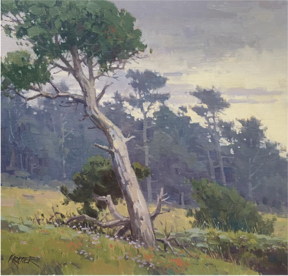
“Bends in the Wind” by Paul Kratter (Moraga, CA), Oil, 15×16 in.
Kratter’s “Bends in the Wind,” oil, 15×16 in. exemplifies this artist’s well-known mastery of trees, both near and far. The composition of this painting features an unusual juxtaposition between the major left-to-right diagonals of the fore-and middle-grounds, counterbalanced by the wind-swept right-to-left leaning of the trees, grasses, shrubs and flowers. Kratter teaches the mastery of trees in his video
Third Place Overall went to “Music of the Waves” by Emily Olson of Superior, CO, Watercolor, 24×18 in.
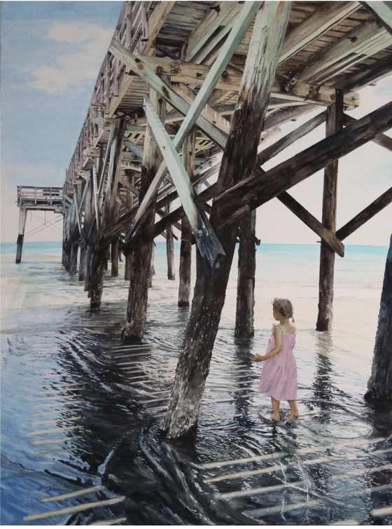
Olson presents us with a striking design – a girl in a pink dress wades in shallow water (at first glance it might look as though she’s walking on it), while the majority of the painting is dominated by the detailed and intricate rendering of the underside of a pier.
Enter the PleinAir Salon Today
The next round of the PleinAir Salon has begun so hurry, as this competition ends on the last day of the month. See the rest of this month’s winners and enter your best art in the PleinAir Salon here.