Design is arguably the most important tool in your box. However, knowing the elements of good design and making a painting that employs them are two different things!
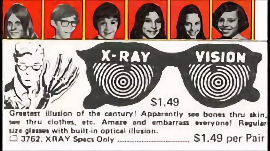
Simplifying as much as possible, there are really just two (interrelated) elements at play in “reading” a composition: the edges of shapes and movement. Making a habit of looking for how these two things are or are not working together immediately reveals underlying design. Together they’re like a pair of “X-Ray Specs” for seeing below the surface.
It’s not really about seeing below the surface of course; it’s about seeing what’s happening on the surface once you wee past whatever it’s a painting of. Proportions (shapes and the location of big stuff vs. little stuff), are primary but they all have edges (hard vs. soft or “lost”), and that means movement.
Movement animates the composition. It’s what keeps the eye engaged as the viewer moves around and through the picture. It may seem obvious but it’s hugely important to note that movement is always directional; every major element in a pointing points in a direction that the viewer’s eye will follow. Edges and lines are always directional, and even a single prominent brush or knife stroke implies movement.
Movement can be direct (connected lines and edges pointing this way or that) or implied (when separate elements visually relate and “call” or “pull” the eye, like a connect-the-dots drawing). Good visual composers know to harness movement, reining it in and directing it rather than giving it the run of the rodeo.
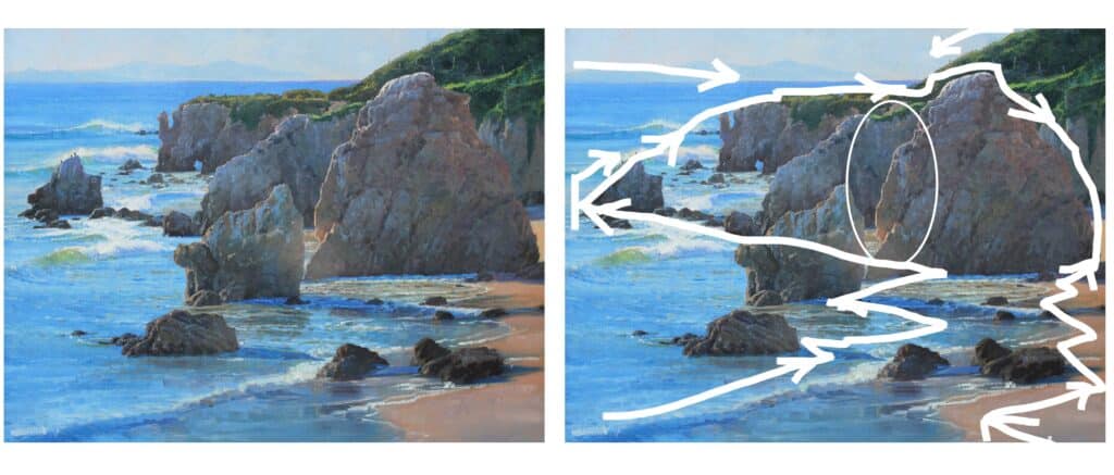
Amery Boehling, Matadore Beach
Keeping it Invisible
Good compositions get the job done behind the scenes; a well-composed painting “feels right” without our necessarily being aware of how the design subtly guides our viewing. In Matadore Beach by Amery Boehling (Seascape Painting Secrets) the foreground diagonals move us firmly into the main point of interest, the rocks, where we get the payoff of a subtle focal point in the warmly painted sunlit edge (indicated by the ellipse).
Direct movement carries us in a zigzag out toward the lefthand rock, which far from being stranded out there is literally connected up this point. There’s a kind of “dotted line” of small rocks to the upper right of it that brings us, through implied movement, to the land mass jutting out in the back, which by direct motion routes us back to the foreground to start the circuit again.
The way to see this is by asking of a painting where are the lines and edges pointing my eyes? Notice where your eyes naturally go when you disregard what it’s a painting of and look at the work solely in terms of its shapes and edges and how and where they move your eyes.
The more you observe and analyze composition in other peoples’ paintings, the easier it will be to see and judge it in your own.
Portrait of the Artist as an Amazing Instructor
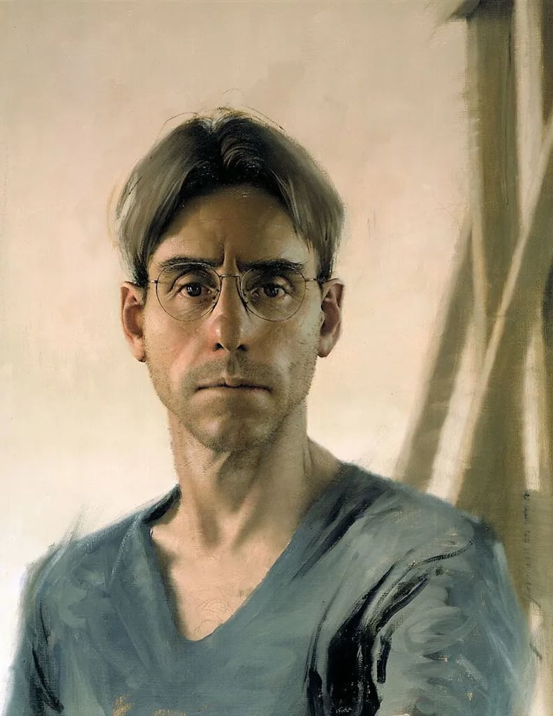
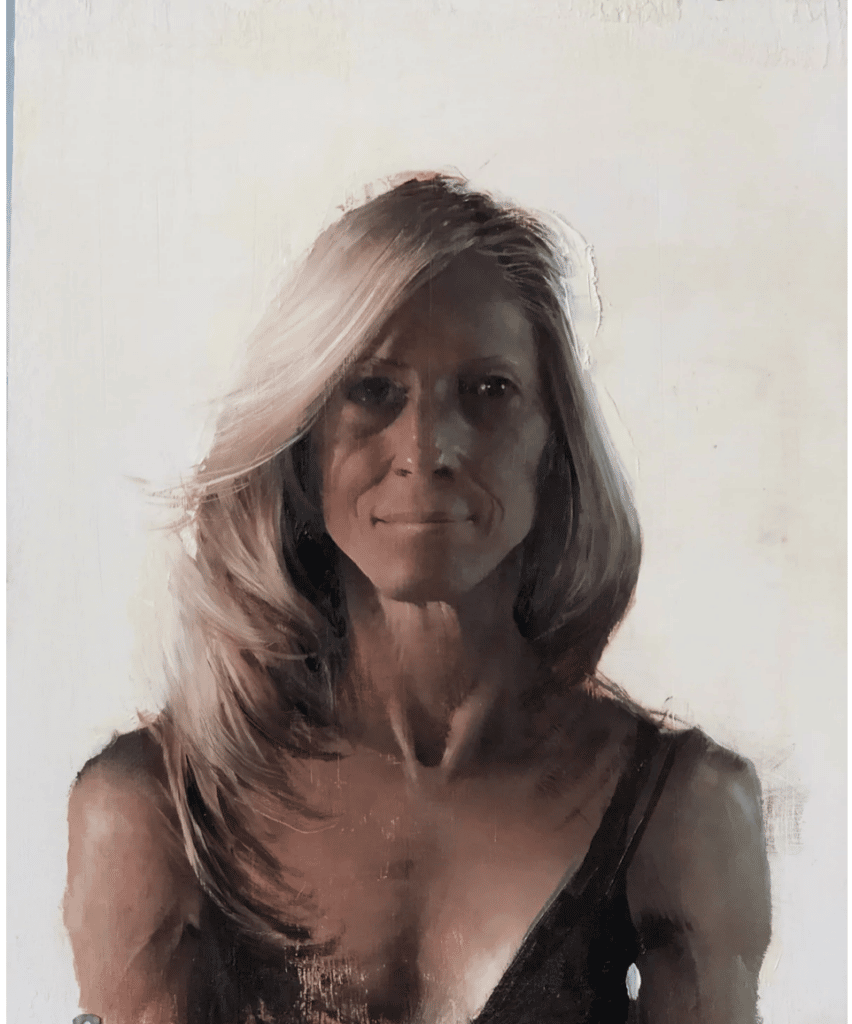
Daniel Sprick, Self Portrait
In-demand realist painter Daniel Sprick uses an array of unusual and subtle devices to move the eye through his portraits. In the self portrait above, the wooden bars of what’s presumably an easel stabilize the subject and might have provided an untimely exit out of the picture; however, the seemingly offhand brush-mark in the extreme upper right acts like an arrow to point us back down to the center of interest (the face). There’s another diagonal brush mark doing the same thing (pointing us back to the center of interest) on the figure’s right-hand shoulder (on our left). In the video Portraits, Sprick explains how to cut through visual noise in order to see underlying shapes and directional and implied movement, and with composition taken care of, to concentrate on revealing the “esoteric secrets of the soul.”