
“Don’t give them too much to look at right away. Keep some things hidden, vague or obscure. Reveal them only after they search a while.” This advice comes from the recent post “On Painting,” and it’s one of those general rules a painter can internalize and apply in multiple ways to all kinds of work.
The idea is to scatter numerous points of interest throughout your painting, keeping some more subtle than others. As if following a breadcrumb trail or a scavenger hunt, the viewer will go from place to place in the painting, delighted by one discovery after the next.
For an example, let’s take a close look at this seascape by early 20th century painter Frederick Judd Waugh.
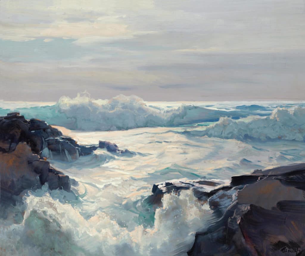
Frederick Judd Waugh, Curling Waves, 25 x 30 in
This seascape at first appears fairly straightforward. The more you look, however, the more you see, which is precisely the point. Waugh loads this “simple” scene with subtle interest. Let’s track down some of the non-obvious visual goodies an intrigued viewer will notice one at a time.
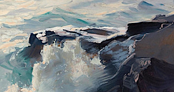
Those rocks may look pretty conventional but they don’t “do” what you might expect painted rocks to “do.” First of all, they’re full of carefully modulated colors (flashes of red, violet, lilac, and orange); one rock face on either side of the painting tilts toward the viewer, catching and reflecting amber late-afternoon light like fire in a clouded mirror.
The rocks would do this because they’re wet, of course, and all of them are painted with varying light effects due to different degrees of wetness – but you don’t see that right away. It’s something “revealed” to you as you contemplate the work.
And the more you look at these rocks, the more variety emerges, with irregular edges and varied surfaces in cool blue and purple shadow and others in warm orange-yellow grays. Waugh reserves still other water-soaked rock-faces and shelves for water fully running over them and reflecting the light.
And speaking of the water, it too is full of multiple colors reflecting the late, setting sun. Waugh has painted us an ocean at sunset, we realize; this didn’t fully register at first because he’s shown the clouds only dimly reflecting the setting sun instead of emphasizing the solar light display; he deliberately does not paint the part of the sky where the sun’s actually going down.
The leaping waves and bursts of spray offer another whole side-plot to the ongoing drama. There we discover several unexpected colors in various interplays of light, shadow and transparency; the light creates some wild green-blues as it shines through the walls of various waves, placed carefully in an asymmetrical relationship to each other throughout the composition.
Loading a painting with “hidden” features and qualities like this is “learned behavior,” something you wouldn’t do if you hadn’t deliberately done it multiple times and conditioned yourself to remember. You could call this “next-level painting” – beyond, or within, or around (?) the all-important drawing, color relationships, quality of representation, paint handling, composition and everything else: It’s another tool to pack that much more in your paintings for the viewer to love.
By the way, if seascapes are high in interest for you, you might want to have a look at the new video, Painting the Sea, available from nationally known artist Lisa Egeli.
Attention Getter!
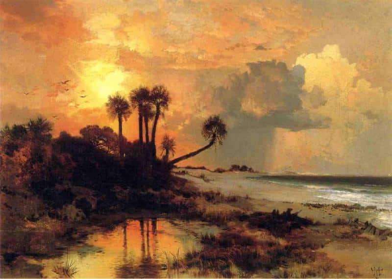
Thomas Moran, Fort George Island, oil, 11 x 16 inches, 1880
After yesterday’s post, First Get the Viewer’s Attention, several readers took up the challenge to send in images and ideas about paintings that pull you in from across the room.
David G. sent an image of Thomas Moran’s 1880 landscape Fort George Island. This one is such a stunner in person that he never forgot its impact.
“Years ago I saw it in an exhibition in the Florida State History Museum in Tallahassee, Florida,” he wrote. ” Although not a large painting (it’s only 11 x 16 inches), from across the room it dominated all the other paintings in the exhibition.”
A site of human occupation for over 5,000 years, Native Americans feasted here, colonists in 1736 built a fort to defend Georgia, and the one-percenters of the 1920s came for vacations. There’s a state part there now.
If you have more ideas (images not necessary) for paintings whose power is in their immediate impact, please email them to me!


