Color is about more than just accuracy – it’s about harmony, mood … so much more. But there are times when you do need to match a color. When you go back into a dry painting to keep working on it, for example, it’s nice to have a working system for getting as close as possible, as quickly as possible, to the section needing more work.
Breaking it down into steps makes the process manageable (even a fun challenge, once you get the hang of it). The real key though is confining your colors to just the three primaries.
Step #1
Start with the primary it’s closest to. The most complex colors have SOME mix of RED, YELLOW, and/or BLUE, so pick the one you think it’s nearest of the three. Force yourself to identify the hue that you see as a starting point.
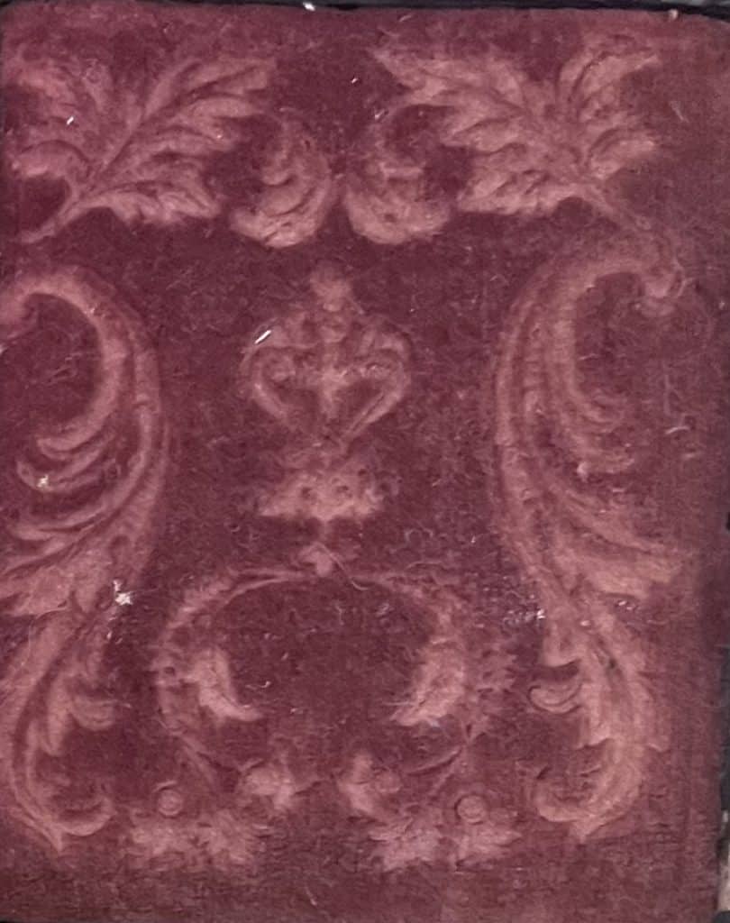
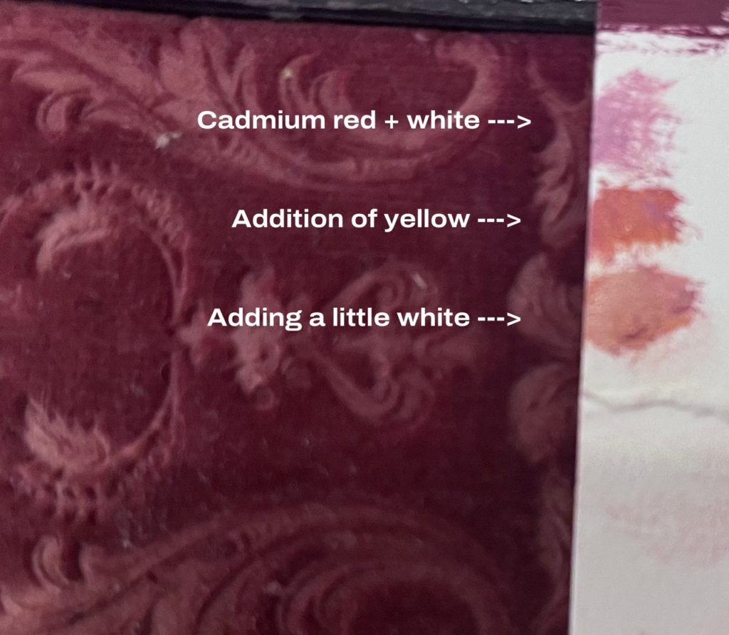
Say we wanted to match the two colors visible in this piece of antique velvet – the warmish mulberry color of the faded fabric itself and the lighter, indented scrollwork.
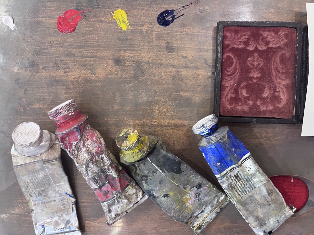
In this example, our weapons of choice are standard cadmium red, cadmium yellow, ultramarine blue and titanium white – so we’ll start with the closest of the three, which is red. It’s “too red” out of the tube of course, but it’s a start.
Step #2
Ask if it needs to be more or less like which of the other two primaries… E.g. if you’re matching an odd cranberry like this one, you’d ask, does it need more blue or more yellow to get to this particular orangey wine color? You might think yellow, but another way to ask yourself this is to ask if it needs to be warmer or cooler. Warmer? Go with the yellow. Cooler? Grab the blue.
Once you have that mix, ask yourself if it needs more or less intensity. Where is it on the spectrum between a super-saturated pure and bright red-orange and on the other end, a grayed-out, muted, murky-complex version?
First stop on the line here was adding a bit of blue (with a dab of white) but the mix was too cool.
Adding a minute amount of yellow – and then a teeny bit more white to calm the intensity -then a whisper of blue to bring back the depth – yielded a decent match.
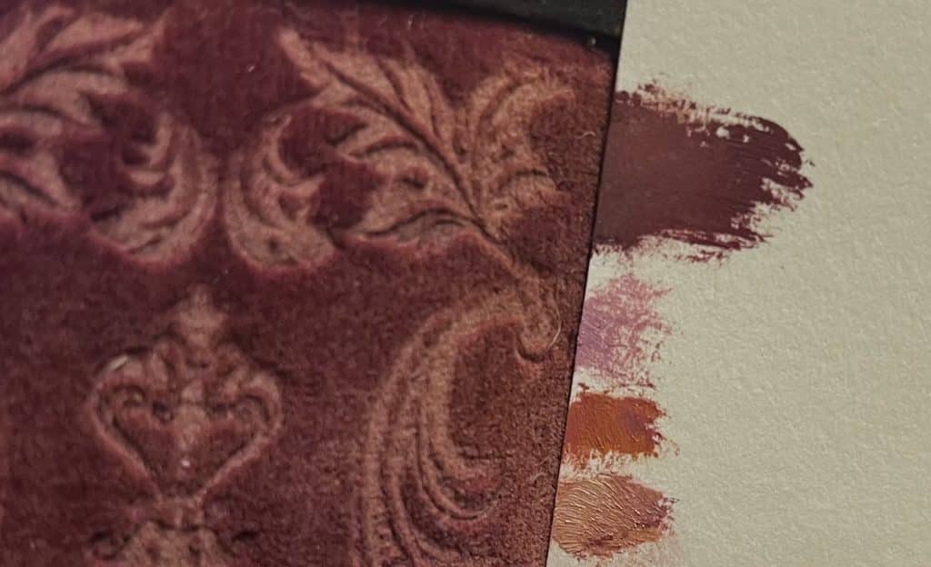
And you just keep doing that… a little yellow to warm it up … a little blue to gray it down… a little red to bring back the lost intensity … and so on until you’ve pretty much nailed it.
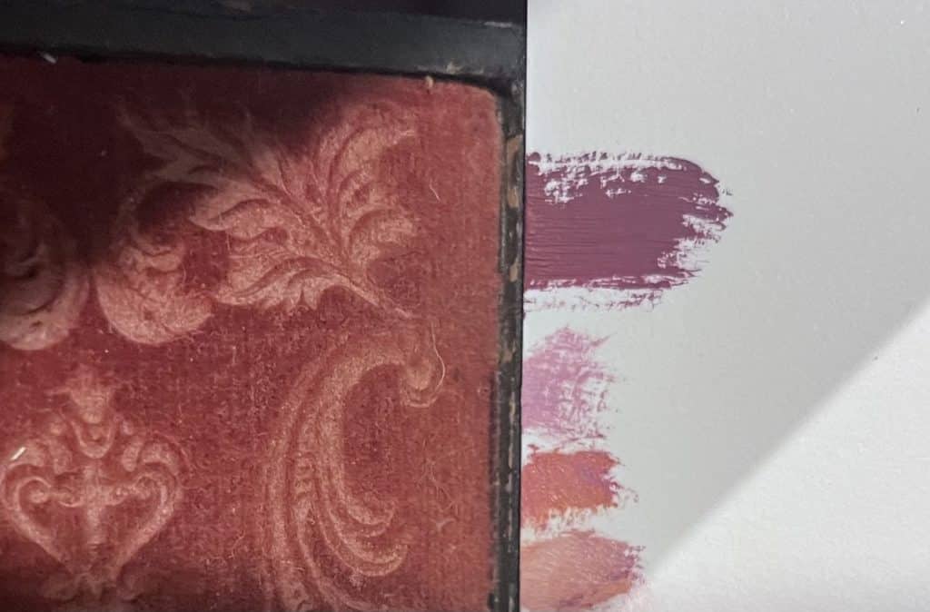
Now to get the color of the scrollwork. This is just a fancy pattern pressed into the velvet by a machine, so in theory its color is just a lighter version of the main color. But would adding white to my last mix nail it? Nope. Not at all. I have to adjust it with additions of the other colors, so I decided to just start fresh to mix this one.
The first step is putting out some red and adding a little white. As you can see, it was too pink, otherwise thought of as too cool. The value was close, but it needed to have a little yellow to warm it up. Adding cad yellow made it “too orange” – basically too concentrated (intense, or “chromatic”) so I added a little white, and that made it more orangey but also too dark (that is, in technical terms, the yellow got it to the right temperature but messed with the value). So adding again a little white got it closer again. It probably still needs one more dab of white and maybe a whisper of red to get back a little of the pink, but this is where we stopped.
Demystifying Color Theory
Notice I didn’t use a warm or cool version of the color (red) to adjust hue or temperature – in each case, I stuck just to the other two primaries – I tuned the red with bits of yellow and blue and adjusted for value and intensity with with white.* (If you want to be technical, the yellow and blue were actually creating green, the compliment of red, which aligns with color theory about always using complements to modify your colors. But it seems so much easier to forget the theory and simply adjust the main primary with bits of the other two primaries. Works every time).
*This illustrates why white isn’t considered a color in painting – it’s best thought of as a tool for adjusting colors.
If the alchemy of color turns you on, you might want to browse through these two-dozen-plus master class videos in color mixing, color theory and more.
Q&A with CW Mundy
|

|


