Sometimes design is so subtle that it acts almost invisibly. Last time, we looked at Sorolla, where design was obvious. We looked at one of his plein air compositions not in terms of compositional formulas (e.g. the rule of thirds) but in terms of dynamism – investing a painting with active, lively and potently expressive energy.
Resonant design demands pleasing tensions between contrary elements. When you’re thinking about design, remember that lines in painting are lines in motion. And “lines” very much includes not just literally drawn marks but the edges of all your shapes.
Again, these active “dynamics” are meant to fulfill three main underlying goals for any painting:
- you want to catch the eye from across the room,
- “move the eye through the painting” with directional lines and
- keep interest with a harmonious arrangement of diverse elements throughout.
What Makes It Great
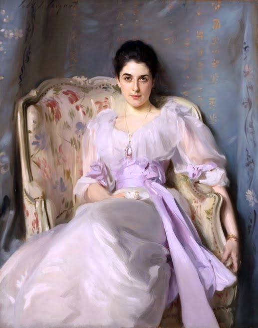
We have to look hard, but similar forces are at work in Sargent’s Lady Agnew of Lochnaw, 1892. You have to admire the color harmonies, above all the light and the masterful texturing of everything (the frilly chiffon dress, silk sash, gold bracelet, the loosely painted yet fully believable pattern on the upholstery). And again, there’s a whole video devoted just to this aspect of Sargent’s work.
In this portrait, Sargent vivdly coaxes Lady A.’s personality out of her expression as well as out of design. He paints her with one slightly raised eyebrow, a calm and level gaze, and one side of her mouth lifted in a half-smile suggesting a self-assurance, suggesting this is someone who knows how the world works. To reinforce this, Sargent also made three major design choices:
1. He positioned his model slightly off center, sitting sideways against the angled chair, so that her posture, and thus she herself, seems casual, even inviting – but far from passive.
2. Lady A. gazes without hesitation directly at the viewer from a position ever so slightly above our angle of vision (even though her eyes almost appear to be looking up, Sargent has subtly used the perspective to position us subordinately, beneath her. Okay, I might be stretching this a little here, but this is a common strategy, especially in classic old master portraits, and I do think there’s a touch of it going on here).
3. He both illuminated the figure and muted, even in places dulled, the gray Asian drapery behind Lady A, so that by contrast she appears super healthful and radiant, like a pearl that outshines the faded velvet lining of its box.
As a result of all these choices, everything – not just Lady Agnew’s expression – everything in the painting comes together to conjure before us an amazing, irresistible presence, strong and quietly assertive, in command but not commanding, dominant without being domineering.
In my view, the whole thing rivets us to life – like all great paintings, Sargent’s portrait of Lady Agnew wakes up our sleepy senses and makes us want to engage with the places and people in our own lives with a heightened intensity of attention and insight. No wonder Sargent’s elite society sitters clamored to see themselves immortalized by his brush.
And all of it by design.
It’s said he could paint a good likeness too.


