Kathryn Stats has developed a keen eye for the landscape and nature. She wandered the Utah countryside on her horse until her early twenties and later studied with artists in the Salt Lake City area on a continuous basis for about 20 years.
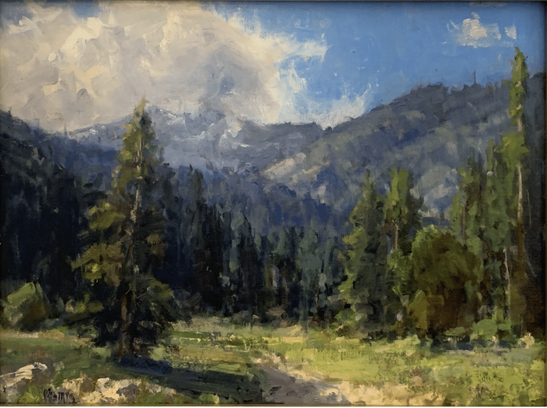
Her direct approach and eye for contrast make her mountain scenes feel solid and vibrant. Her mountainscapes can feature deep, richly colored darks overlaid by highlights added in last stages with a swift, painterly touch. Spontaneous-looking highlights (such as in the foreground grass in “High Mountain Valley” (above) are applied in a single quick, light stroke or two; the brush must be loaded with enough paint of just the right value and hue.
That may sound intimidating, but if you aren’t a master like Kathryn Stats and you don’t nail it the first time, don’t worry. At least if you’re using oils, you get second and third chances to remix and reapply: brighten the color’s intensity and lighten its value and go for the “bravura” single-stroke finish (however many times it takes!).
Whether observing and representing nature directly, like Kathryn, or else from memory or a reference, you can do a lot for your final painting by deliberately making the darks (really) dark and the lights (really) light AND balancing out the two in a way that designs for the eye. That’s not as easy as it sounds, perhaps – but look at “Paradise in West Glacier” (below) and ask where your eye goes and moves through the painting and what part that value plays in that process.
Kathryn Stats, “Paradise In West Glacier,” oil, 18” x 24”
One of Kathryn’s keys to keeping a fresh eye for color and design is to keep challenging herself with new motifs and new locations to paint in. She has traveled to and painted the coastal areas of California and Oregon as well as locations in Alaska, Russia, Spain, Italy, France and Portugal.
“I try not to get too comfortable working in a particular size or subject matter, because I feel that comfort leads to staleness,” she says. “For that reason I’m always looking for fresh territory.”
In an instructional video on mountain painting, Kathryn Stats teaches her alla prima method using a previously painted, on-site study and a computer monitor for references. She demonstrates her unique style using both palette knife and, mostly, bristle brushes.
She clearly describes her palette of colors – key to producing the realism of her impressive mountain scenes. Kathryn also discusses and demonstrates the importance of aerial perspective in creating the three dimensional form, while maintaining the loose nature of the painting. Watch as she looks, then corrects, to maintain optimal color and value relationships.
Tim Deibler – Energy and Light
You could think of Tim Deibler’s style as excelling in a second aspect of plein air painting, that of capturing the freshness and energy of nature as the light changes. There’s sense o movement in his paintings, where the landscape’s beauty and rhythms wash over you.
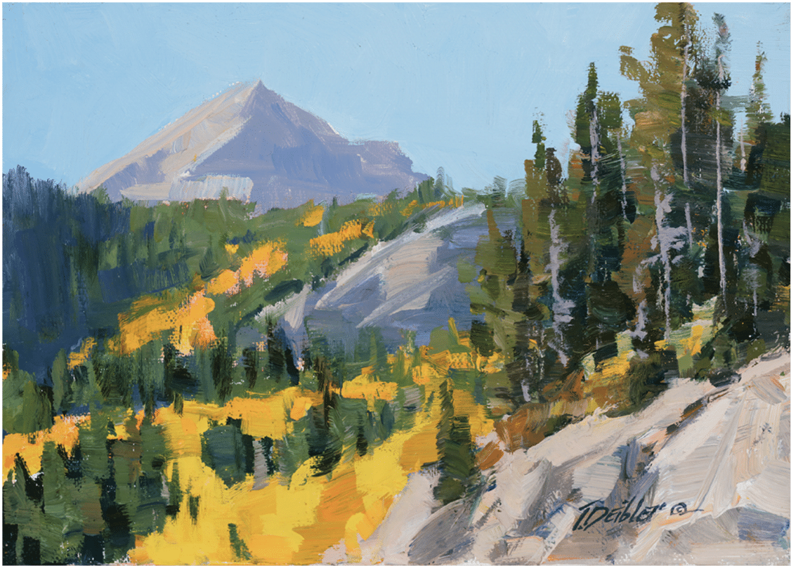
Tim Deibler, a 5×7 inch plein air appreciation of color, light, and the energy of the outdoors
Tim Deibler works quickly, allowing his brush to be especially expressive of the moment. His approach has everything to do with what the light is doing – but so does his feeling for the time of day, the time of year, even the elevation of what he’s seeing and how he paints it. His domain is the energy of the stroke; directional brushstrokes (each stroke has a direction, depending on where it’s “pointing”) dance across the canvas, jostling and pushing against each other, creating a dynamic counterpoint of tension, movement, and release.
“Every time I look out the window or walk outside I’m in the mountains, making it much easier for me to observe the constant moods and nuances of nature,” he says. “My goal is to portray what I’m experiencing in nature, I want the viewer of my work to say, ‘I’d like to be there.’”
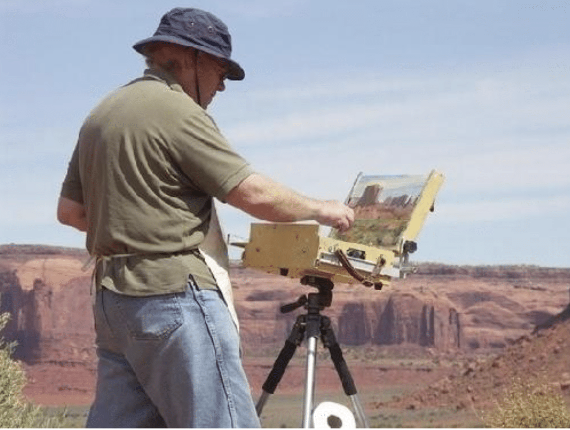
Tim Deibler at work.
Born and raised in Oklahoma, Deibler’s passion for landscapes, mountains in particular began after seeing the 1956 movie The Mountain as a young boy. His aspiration to be a landscape painter started at age 13 after receiving a copy of the 19th-century mountain climber Edward Whympers’ book Scrambles Amongst the Alps. When opportunity allowed, Deibler moved his family to southern Colorado in 1999 where the mountains became his constant inspiration.
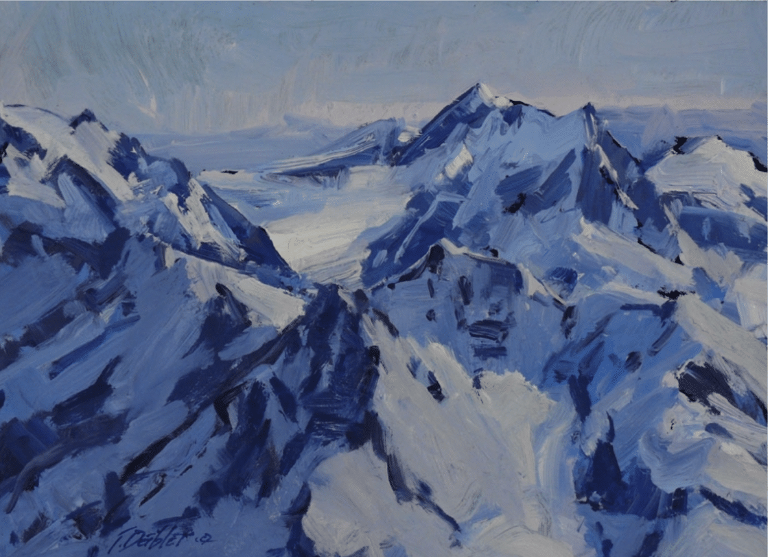
Tim Deibler, Among the Glaciers, oil, 9” x 12’
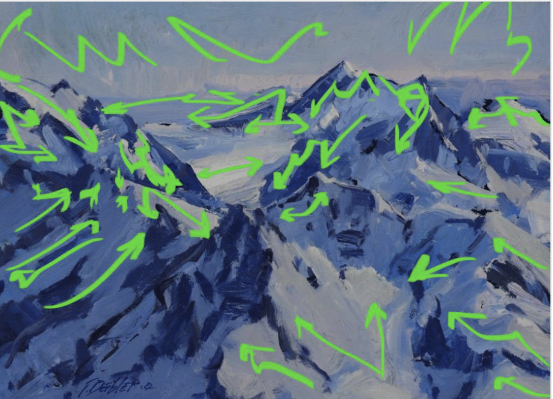
In a painting such as that above, it’s the lights and shadows that give dimension to the mountains and the lines of shadow, mostly, that lead the eye. BUT! The diagram below shows the movements and counter-movements created by Tim’s brushstrokes alone – the green lines roughly trace only the trajectories of the visible brushstrokes, not the linear composition. And it’s lively indeed! This is a strong example of what’s known as an activated surface.
Deibler’s sharp eye and rapid brushwork not only impart a fresh and spontaneous feeling of motion and energy. His ability to work quickly makes it possible for him to make several paintings at the same site on the same day, capturing the changing light all the way from morning to nightfall, should he choose, in a small series of compact plein air paintings.
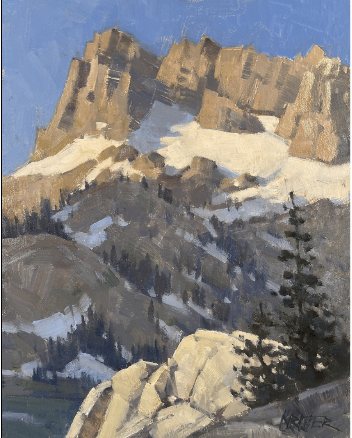
Paul Kratter – Design
There’s another aspect of painting the mountains that’s easy to overlook, and it’s because we’re mostly thinking about those big, silhouetted shapes and peaks. The oft-forgotten ingredient is design, and it’s as important to a strong mountain painting as any other aspect of the process.
Paul Kratter, “Sunrise!” Oil on linen, 8” x 10”
Especially strong in design, Paul Kratter’s paintings skillfully compose light, atmosphere, and expression of emotion. Paul comes from an illustration background that instilled strong drawing and design skills and a robust belief in graphic shapes and storytelling. His compositions are always dynamic and often unique.
Take “Sunrise!” (above). This painting, by placing the perspective’s horizon line particularly low in the composition, makes the mountain come into its own strength and glory. Though the directional brushstrokes in the foreground rocks bring us in, the pockets of snow direct our eyes toward the summit, where the rising sun strikes the rockface like an echoing refrain.
His secret? He takes the time to make a series of sketches first. Most artists completely skip the sketching phase, but in his video titled “Landscape Painting & Design,” Paul demonstrates how “sketching your way to success” ensures a strong painting at the end of the session. Read more about it here.
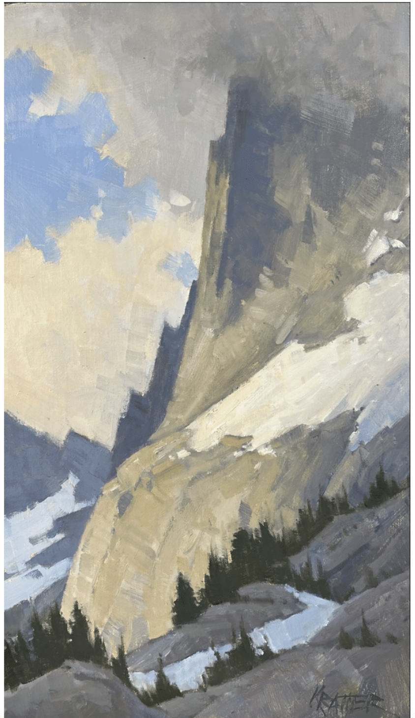
Paul Kratter, “Head in the Clouds,” oil, 14” x 8”
If you’re game to paint the peaks, this year’s Plein Air Convention and Expo (PACE) will convene in the Smoky Mountains. Called the “Woodstock of Plein Air” PACE annually draws hundreds of the world’s most enthusiastic outdoor painters eager to learn painting techniques from the world’s top artists. They come to see what’s new, what’s hot, and what’s working RIGHT NOW in art marketing. It is the largest gathering of plein air painters on the planet and there is no other event like it. Every year there are artists at PACE who are, or will become, some of the greatest of our time… and you get to meet and mingle with them. Learn more about PACE!


