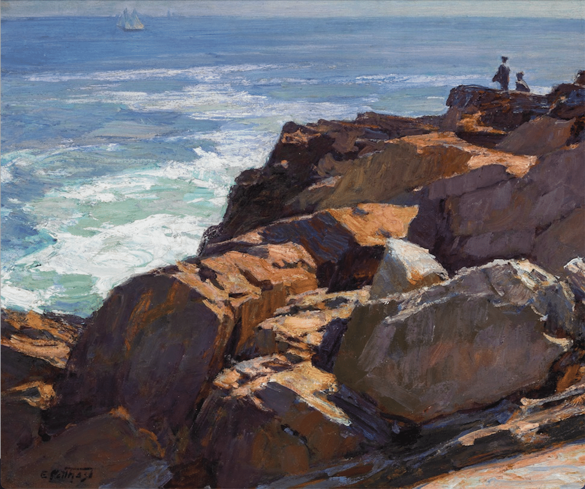
Everyone has a hard time with rocks, at least at first, especially plein air painters. Maybe it’s because, beyond general outline, each rock’s character is usually the result of multiple angular planes coupled with numerous tiny details – too many to paint while chasing the light.
Or maybe it’s that rocks are more believable when they have sharp edges, and our relatively soft brushes work against us (which is why many, many a plein air painter paints rocks with the edge of a palette knife).
Whatever it is, there are a few overarching general rules to keep in mind that can make the task a little more manageable right from the get-go.
Gimme Three Steps
- Simplify. Don’t paint every rock or every detail of a single one of them. Combine groups of rocks into masses, starting by blocking in the shadows. Then break them down in patterns and individual rocks. Breach each rock or cliff into box-like geometric forms. Be brutal – use the potato test. If any of your rocks look like a sack of potatoes, get out your palette knife and flatten that sucker.
- Randomize – but also think in terms of directional planes. That sounds contradictory, but the devil’s in the details here. Rocks are all about geometry. But when including them in a landscape, you need to work as much in terms of composition as in terms of geology. Don’t feel obligated to paint your rocks where they really are, or you’ll have passed up a golden opportunity to direct the viewer’s gaze through your painting. Use rocks as compositional devices. Geology can help here too, because often the rocks we see are the deposits of once-moving glaciers or the outcroppings of larger veins of minerals that run in a particular direction underground.
- Darken. Rocks are rarely lighter than the sky. This may sound like obvious or throwaway advice, but next time your rocks aren’t working, ask yourself if you’ve gotten the values right. Adding sharp-edged highlights boosts believability, but try darkening your darks first.
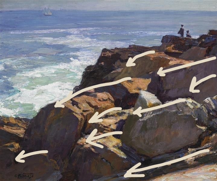
Here’s that Potthast from above with the directional lines coming in from the right overlaid. Notice, though, how many smaller counter-directional lines coming from the left hand side of the composition there are too!
Despite directional thrust, variety is KEY. You need variation to make your rocks convincing. Individual planes need to be getting different degrees of light and shadow. Your rocks need to be various sizes (no two rocks alike!) and they have to have at least the suggestion of variety within each one (every rock needs to be a little chaotic in its on way – see #2 above).
As always, when finishing a painting, don’t neglect to go back for one more pass and see if you need to deepen the shadows and lighten the lights. The brushstrokes you use should suggest the texture and the “direction” of the rocks, as covered above.
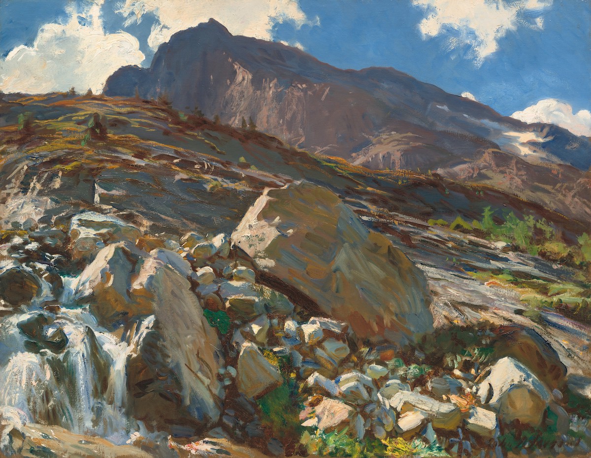
John Singer Sargent, Simplon Pass, 1911. National Gallery, Washington D.C.
Thankfully, there are many tutorials on painting believable rocks out there, one of the top of which is Albert Handell’s thorough how-to video Painting Rocks & Water in Oils.
Cozy Up to The Goldfinch
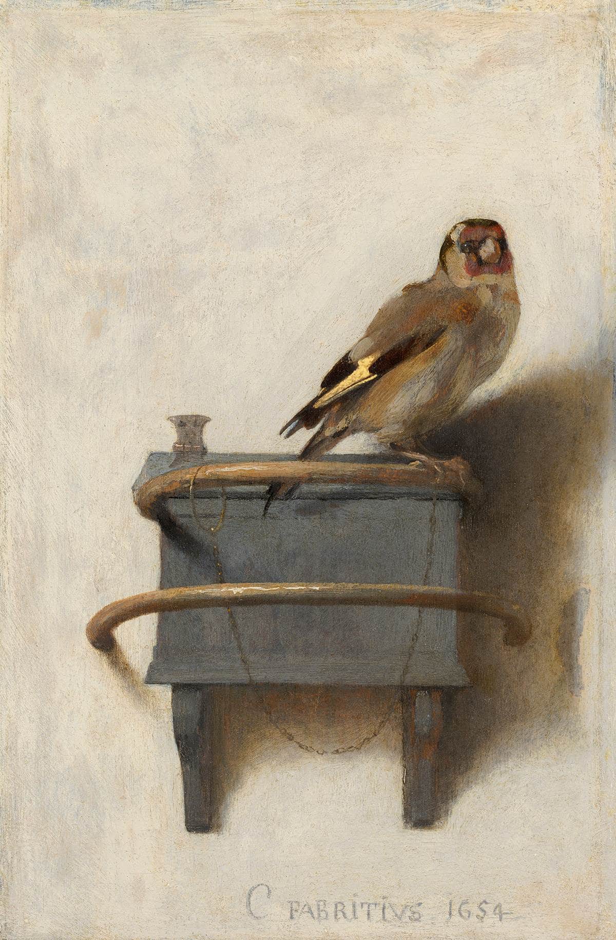
Carel Fabritius, The Goldfinch, 1654
The museum housing the striking little 17th century painting The Goldfinch has posted a nice high-res picture of it to the Web. It’s a great way to get up close to the brushstrokes, which are one of the things that make this little masterpiece remarkable.
“Fabritius uses a minimum of quick strokes to portray the house pet’s downy body,” remarks the curators at the Frick Museum who had the work on loan from The Hague for a while. “Such expert manipulation of paint to suggest form and texture may have been assimilated from Rembrandt, with whom he studied.”
The panel’s initial purpose is unknown, but I suspect what haunts us about this one has less to do with the trompe-l’oile effect that the Frick goes on to highlight than it has to do with two related things: First, that we’re seeing such a common garden-variety bird chained to the wall (it was fashionable in Renaissance Europe to have a caged wild songbird or two hanging around the villa but today it just looks weird), and second, that, strangely to us, there’s no cage. The wall all around the bird is so bare, and there’s so much of it and so loosely painted, that we get this intriguing feeling of both confinement and expansion, concentrated detail and empty space.
To my eyes anyway, the mix of familiar and unfamiliar is uncanny.
-Chris


