Painting Cityscapes: Capturing a Busy Urban Scene Without Getting Lost in the Details
Just as you wouldn’t explore a new city without a map, don’t start your next cityscape without a plan for where you want to go and how you intend to get there.
by Nancie King Mertz
As a pastel and oil plein air painter, I feel very fortunate to live in a truly beautiful city — Chicago, which hosts a limitless array of wonderful painting sites, from Michigan Avenue to the river, with its many varied bridges; Millennium Park and its expansion overlooking Lake Michigan; as well as the restored historic buildings that dot the city landscape.
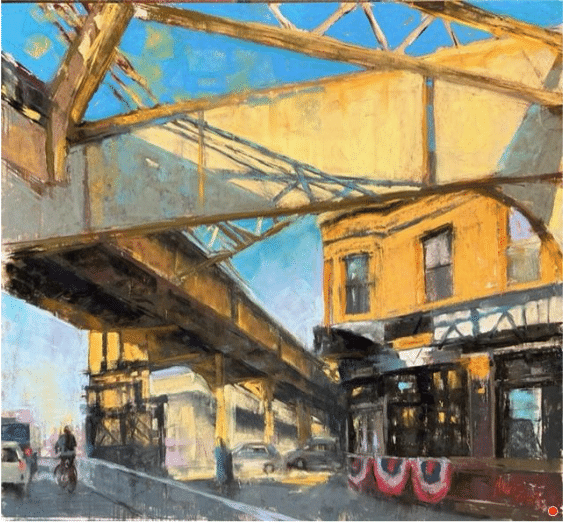
Of course, a favorite subject of mine, and an iconic part of Chicago that has existed since its infancy, is the “L,” the city’s rapid transit system. The elevated tracks create challenging value patterns on the ground and silhouettes in the sky that beg to be painted.
Nancie King Mertz, “Clark Crossing,” oil, 18 x 20 in. Private collection, Plein air
RIVERWALK REDUX
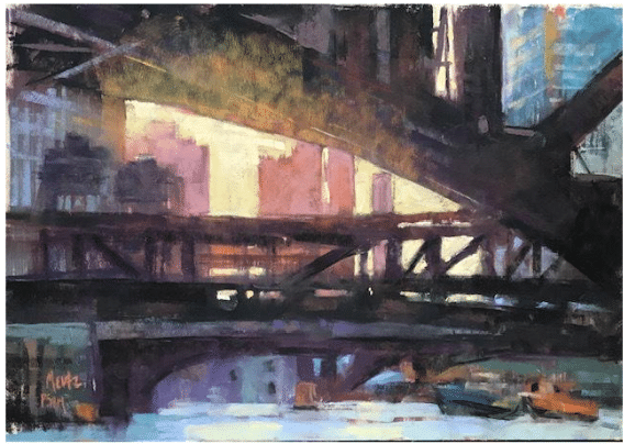
Most Saturdays, the Plein Air Painters of Chicago (PAPC) gather to paint in or near the city. In July, we met along the popular Riverwalk, under the Wabash Avenue Bridge. I painted from the top of the bridge, with the plein air medium I find most forgiving and fast — pastel. Since pastels are made with the very same pigments used to create oil paint, just compressed into dry stick form, my approach to both mediums is similar: transparent darks to start, value shapes that connect, and the buildup of mid-tones as the painting moves toward completion.
The essential difference between working with the two mediums is that oils require mixing time and pastels are “grab and go.” Follow along as I demonstrate the steps I took to create my follow-up painting, “West From Wabash.”
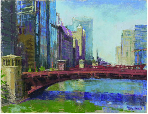
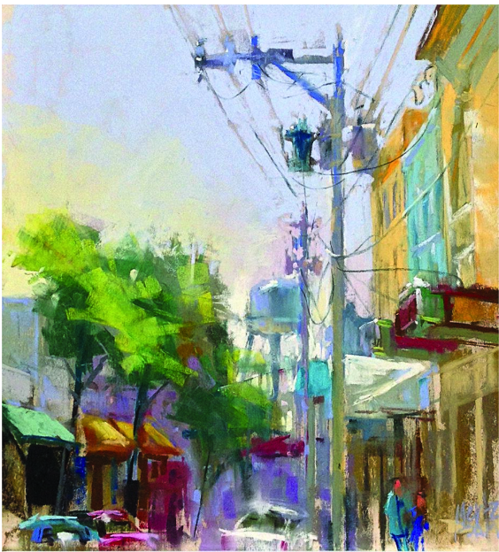
Nancie King Mertz, “West from Wabash,” 2018, pastel, 13 1/2 x 17 1/2 in. Private collection, Plein air
7 Tips for Painting Cityscapes
- Before setting up, observe how people move through the area in which you want to paint. If possible, place your easel near a large object that pedestrians naturally flow around, to give yourself some space.
2. Map out your composition with tick marks to be certain you include all the elements you intend to paint.
3. Edit and simplify. Omit the bits that are awkward or distracting.
4. Squint to get the values correct. Our eyes fatigue much more quickly during a plein air session due to changing light, and squinting helps.
5. Don’t overdo windows in a multi-story building. Let the darker underpainting, combined with a few verticals, create the suggestion of windows.
6. Rarely are windows black in a building. The glass reflects the sky, the buildings across the street, and the city lights.
7. Review a book on perspective. Getting your drawing right is the key to successful cityscapes.
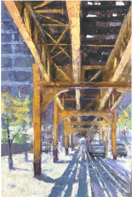
Nancie King Mertz, “Slipping through the Shadows,” (demo) pastel, 18 x 12
I’m fascinated by Chicago’s “underbelly” — the structures and bridges that make our city unique. I painted this piece during one of our PAPC Saturdays. The thundering noise of the “L” overhead encouraged me to finish in record time!
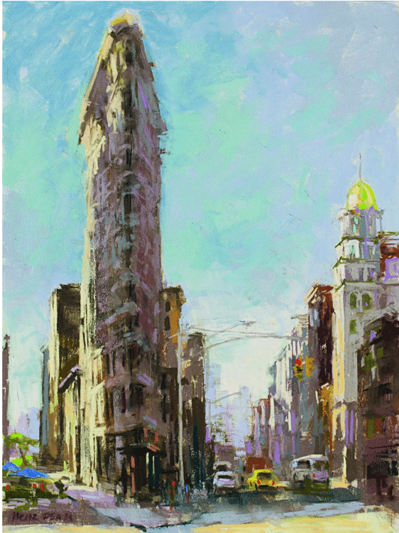
Nancie King Mertz, “Flatiron,” 2015, pastel, 16 x 12 in. Private collection,
Plein air. Prints available.
Painting my favorite building in New York City (the “Flatiron,” above) provides a great perspective challenge and the opportunity to be included in hundreds of selfies with tourists.
ARTIST’S TOOLKIT
Pastels: My home studio is filled with many wonderful brands of oil paints and soft pastels, but for plein air or travel painting in pastel, I rely solely on the two Richeson sets of 80 that they asked me to hand-select — the Nancie King Mertz Urban Set and the Nancie King Mertz Atmospheric Landscape Set — along with 18 of Richardson’s hard pastels. I’ve merged the two sets into 80 cools on one side and 80 warms on the other, leaving them in their protective boxes.
Misc.: Around the two boxes of pastels, I constructed a coroplast table, reinforced with duct tape and metal corner angles, with a thin board on the bottom that accommodates my quick-coupling camera tripod. A separate easel (one for tall people!) is what I use to hold my mounted, sanded papers, most often by UArt. My setup is quick to assemble, lightweight, and everything slides into a vertical rolling cart that fits comfortably in a plane’s overhead bin.
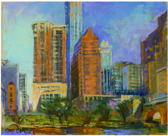
Nancie King Mertz, “Austin Angles,” 2018, pastel, 16 x 20 in. Collection the artist, Plein air
I created the dark areas in this one with my initial alcohol wash-in, indicating the windows without actually painting them. Often, the vertical runs from the dark wash can help create the final verticals in the painting. Simply suggesting the lighter areas with a lighter value can keep the work loose. Windows tend to get lighter and more reflective the higher they are in the building. Rarely are they ever black.
Nancie King Mertz, “Sunday in Stuart,” 2018, pastel, 11 x 10 in. Private collection, Plein air
A cityscape can feature a small town or layers of urban sprawl. This piece was created during a two-hour quick paint at the Lighthouse Plein Air event in Florida. During these types of competitions, my energy is pumped up and I get a prickly feeling in my stomach. My goal is to transfer that energy onto the surface of my painting.
About Nancie King Mertz
Although Nancie King Mertz (nanciekingmertz.com) has traveled to nearly 20 countries and all around the United States for inspiration, Chicago remains her favorite city to explore and paint landscapes and cityscapes. She shares what she’s learned about simplifying complex structures in her Urban Pastel Painting DVD
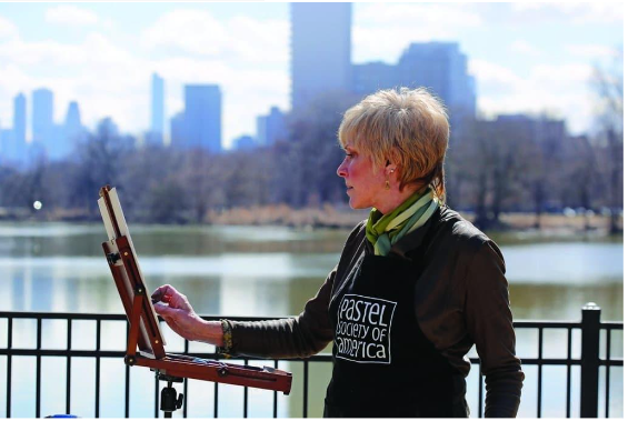
Nancy King Mertz in her element (photo from Arizona Pastel Artists Association).
Click here to subscribe to the free newsletter, Plein Air Today
> And click here to subscribe to PleinAir Magazine so you never miss an issue!
Is This the Greatest Painting in the World?
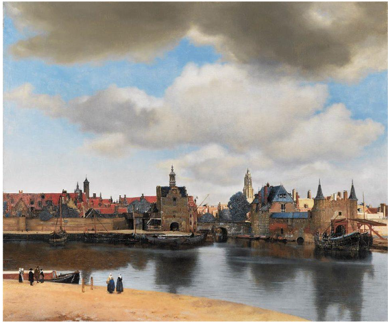
Johannes Vermeer, View of Delft – 1660-1661 – Oil on canvas, The Hague, Mauritshuis
It must be asked periodically!
Vermeer painted this realistic view of his hometown of Delft in 1660, when pure landscapes were still relatively rare in European painting. It’s been called “the most beautiful painting in the world,” and it’s certainly a decent candidate for the prize. Vermeer’s color and design make View of Delft beautiful as well as unique.
It’s arranged in a series of broad and irregular horizontal bands (sky, city, canal and foreground) but they are so skillfully integrated with one another that you don’t notice. There isn’t a hint of “stripiness,” even though it’s a largely a “stacked horizontals” compositional strategy. Somehow it works together like a delightful piece of classical chamber music.
The central horizontals of foreground and middleground act like deep bass notes punctuated by the staccato assertions of numerous smaller verticals – present in the delightfully varied city spires and their reflections in the water and the two prominent figures in the foreground. The graceful rhythmical divisions and subdivisions subtly unify the scene in an organic wholeness so natural looking we forget it was meticulously composed by the one of the greatest painters of European art history.