“Now, to consult the rules of composition before making a picture is a little like consulting the law of gravity before going for a walk.”
~ Edward Weston
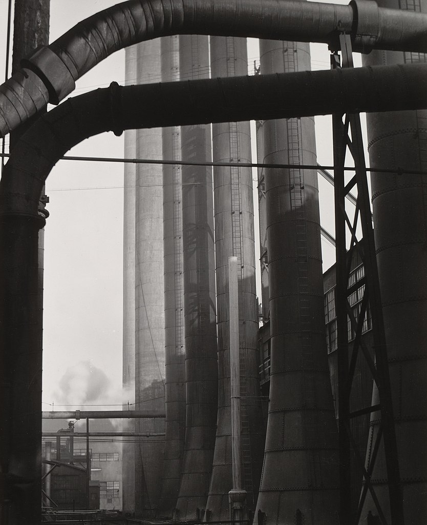
Ask of any composition, Where does the eye go first? There may not be a definitive answer for everyone; this is a tool for design, not a foolproof tool for analysis. In the Edward Weston photograph above, my eye is drawn first to the large area of light. It’ usually contrast that calls our attention. Here, the big area of open air (#1) stands out because everything else is so busy. Also, it’s light surrounded by contrasting darks.
Where does the eye go next? Weston has something to say about that too. Instead of leaving that area open so the eye can slide right out the top, Weston uses that horizontal black pipe arching across the white of sky to direct our
vision across from the left over to the right side of the composition (#2). This would be called a function of line. The eye is also pulled toward the right (and stopped and held there) by the next most significant area of contrast, the smaller, parallel dark/light slice of light with its contrasting lattice of steel and pipe (#2). That concentration of smaller dark lines and an even higher value high contrast than on the left pulls and keeps us there with its visual weight (we’ll unpack that phrase in a minute).
From that point (#2), again we are kept from leaving the picture, exit stage right, by strong vertical lines hedging us in and leading us down toward the bottom right of the composition – pulled as well by the visual weight of the relatively large mass of shadows amid the pipe’s thicker lines at the bottom (#3). From there, between the uniform dark of the shadows, the curve in the pipe, the pipe’s subtle directional horizontal lines, and the visual weight of the contrasting area of wide open light (#1), we’re pulled back to the left side (instead of falling out the bottom). Note that we’re kept from leaving the left side by the repoussoir of that far left black pipe – only to be pulled right back up and carried into the circuit again.
The Holy Grail is the ability to do this intuitively: each move leads to “discovering” what comes next. “One compositional element suggests and asks for another,” said the painter Robert Genn. “That’s what makes the activity interesting.”
But artists aren’t born with the ability to feel how compositional elements “ask for” or even relate to each other. It’s learned. It begins with deeply appreciating that every move you make takes its place in relation to the four edges of the picture (which is why periodically you step back and view the painting as a whole while painting it). The four most important lines in any painting are the four edges of the canvas.
From there in my experience, intuitive composition relies on one overarching principle: Unity through variety in harmony. All the parts have to be varied, balanced against each other, AND keep the eye circulating within the painting. Develop intuitive composition by thinking in terms of variety and cohesion – aim to vary everything! – yet do so in a way that all the elements cohere and create a “path for the eye” that keeps the eye moving through and around within the painting.
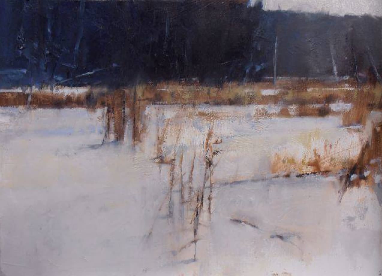
Landscape by John Henry Twachtman
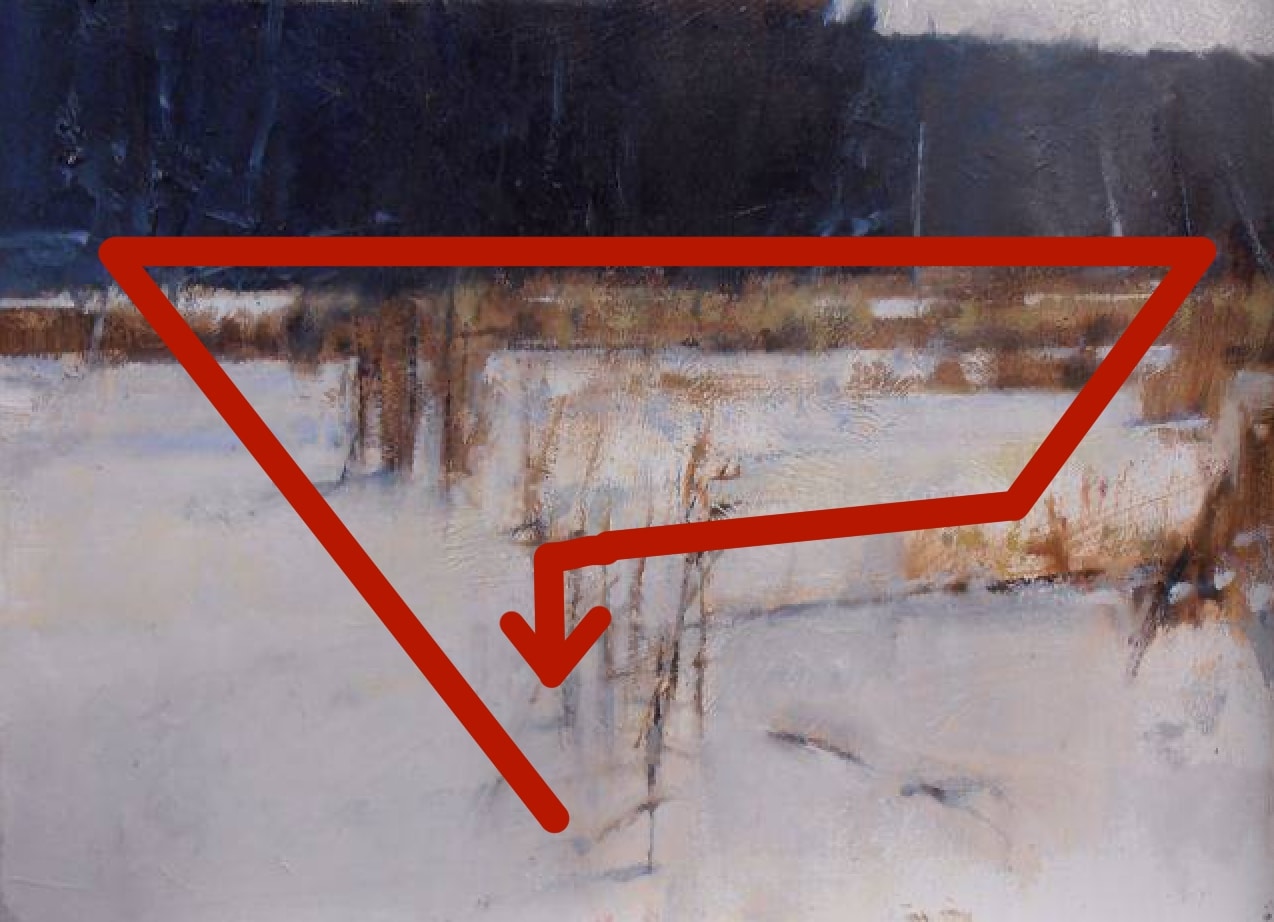
Landscape by Twachtman showing clear path for the eye.
This does not happen before you start painting (as in “consulting the rules of composition before making a picture”) but by actively putting it in – by looking for it, and making adjustments as the painting progresses. You have to consciously move things around – step back from the painting, forget about everything else and focus only on whether you have created clear path for the viewer’s attention to move through the painting, from one spot to the next, without ever being allowed to leave.
This kind of editing clarifies for the viewer. Ruthlessly eliminate areas that don’t contribute. Balance areas of active and quiet.
You only need to know two ways of doing this: DIRECTING LINES and VISUAL WEIGHT.
- Directional LINES are like arrows pointing the viewer where to look, from one thing to the next. Pro tip: Think of ALL lines in a painting as directional.
- VISUAL WEIGHT has to do with relative “weight” or amount of attention a part draws to itself – thought of in terms of “pulling the eye” from point to the next within the painting.
Lines means the edges of shapes as well as actual lines and possible knife or brushstrokes. Visual weight is particularly helpful in abstraction, where there might not be just one “focal point” but a series of “points of interest” to which the eye is called, ideally in a definite, self-reinforcing order. Notice in both cases, the eye isn’t just being pointed or pulled randomly to one thing and anther; there’s a hierarchy, an order to it, so that one thing points or pulls the eye to the next thing.
Once acquired, the feeling for using lines to direct attention and the ability to distribute visual weight to form a pathway through the painting becomes an intuitive process. We’ll look at both of these ideas in greater detail in upcoming editions of Inside Art.
General principles for creating harmony in variety
- Asymmetry (unequal visual weight: dominant and subdominant shapes, large and small lines/shape edges, larger amount of darks than lights or vice versa (ie values), one or at most two dominant colors and the rest as supporting actors – think no two of the same or even too similar anything)
- Simple shapes but varied in size and position
- Varied marks (lines, strokes, knifings, etc varied in weight and direction)
- Strong contrasts (contrast is king!) and subtle passages
Here Be Monsters
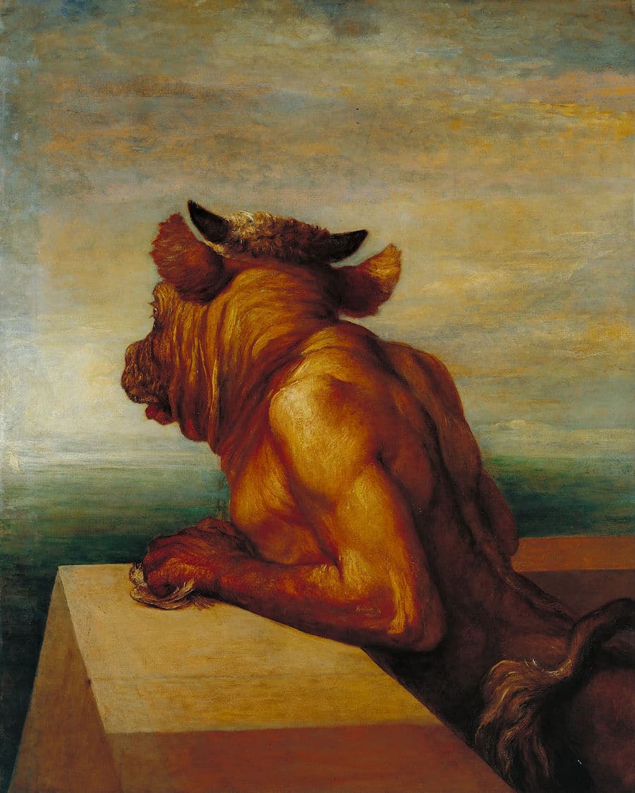
George Frederic Watts, The Minotaur, 1885.
The Minotaur is an 1885 painting by the English painter George Frederic Watts. It depicts the minotaur from Greek mythology (a creature half man, half bull) as he waits for his “tribute” of young sacrificial victims to arrive by ship.
Although it isn’t obvious in this tiny reproduction, the minotaur’s fists leaning on the parapet holds a small, crushed bird, a symbol of youthful innocence and purity destroyed. Watts said at the first exhibition of The Minotaur that he wanted to “hold up to detestation the bestial and brutal.”
The painting has been in the collection of Tate Britain since 1897.
In the paint,
Chris


