“Color was not given to us in order that we should imitate Nature. It was given to us so that we can express our emotions.” – Matisse
Color is a perceived fact, even if we have no way of knowing if the red I see is the same exact red that you see. But science and physiology aside, color has another aspect, a “secret side” that artists know is wholly subjective and of the mind and heart as much as the eye.
Color can be representational – it can also be expressive. Why settle for one and not the other? Color is a way to get feeling – to get yourself – imaginatively into the work. The process is one of exaggerating and en-visioning – re-imagining the qualities that make a thing worthy of painting to begin with.
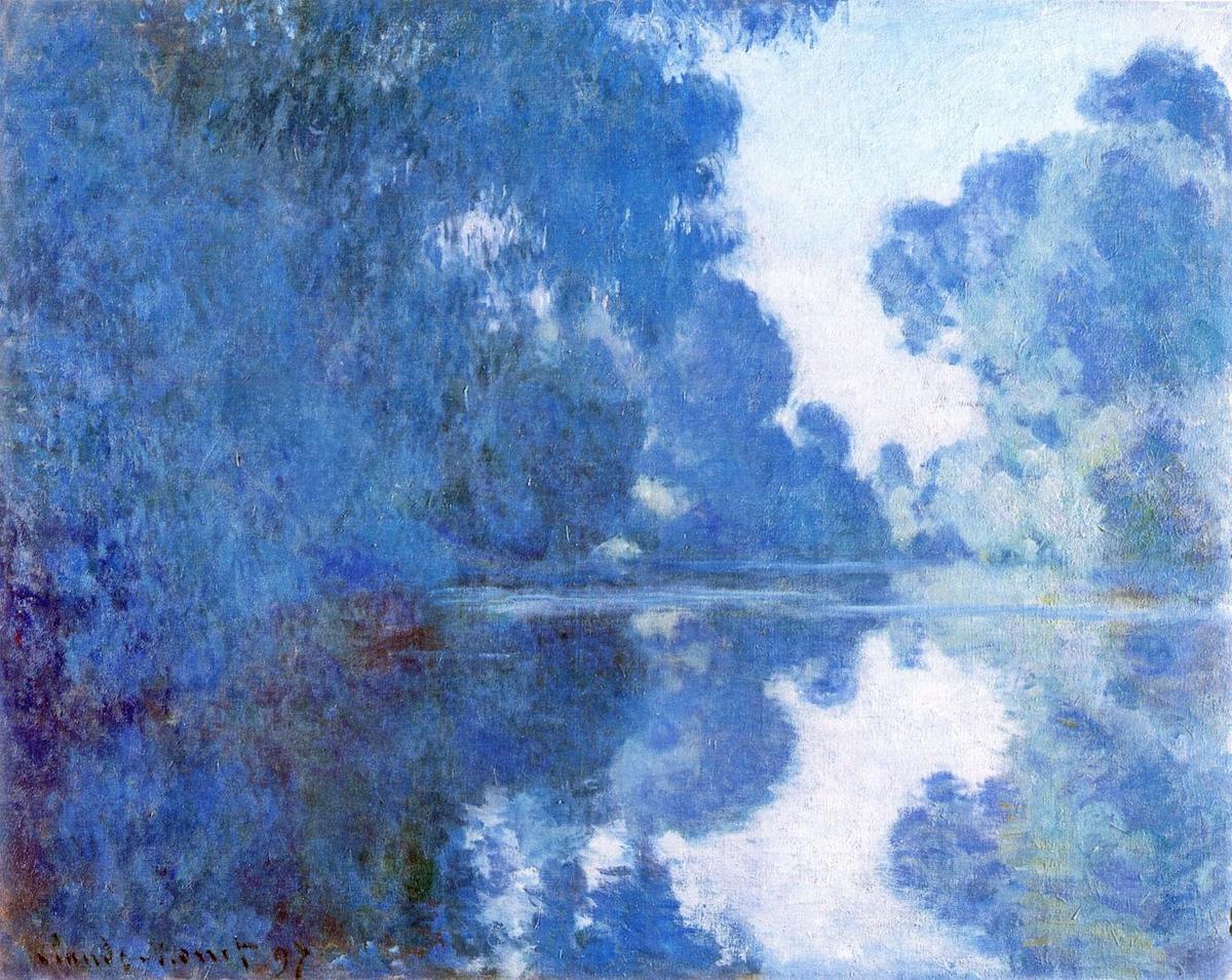
Let’s take one of Whistler’s paintings as an example. Whistler titled an entire series of moody, foggy, watery landscapes “nocturnes.” In doing so, he was referencing music (Chopin composed a series of equally moody solo piano works under that name) as well as mood. In color, they all stayed in the blue, green-blue, blue-gray family. Many think of them now as among the early forerunners of abstraction.
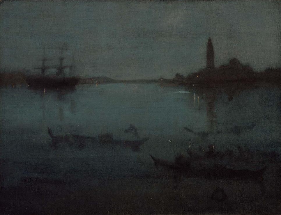
James Abbott McNeill Whistler, Nocturne in Blue and Silver: The Lagoon, Venice, 1879/80. Museum of Fine Arts
Compare Whistler’s Nocturne in Blue and Silver: The Lagoon, Venice, with a recent photo of the place – the scene is different but think of the difference between the two images mainly in terms of color.
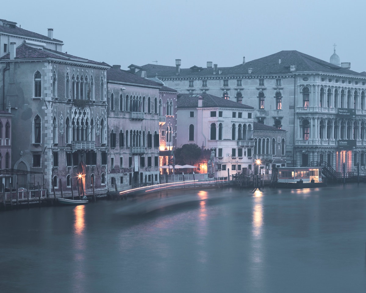
Venice, the Lagoon. Photo by Geoffroy Hauwen on Unsplash
Whistler’s choice of veiling his “Lagoon” in swaths of green-blue-grays corresponds to how it felt to him. The painting expresses a feeling, a “vision.” Whistler imbues a common-enough sight – Venice in fog – with a world of mystery, mood, and intrigue.
Or let’s go in the opposite direction and take an interior by Vuillard.
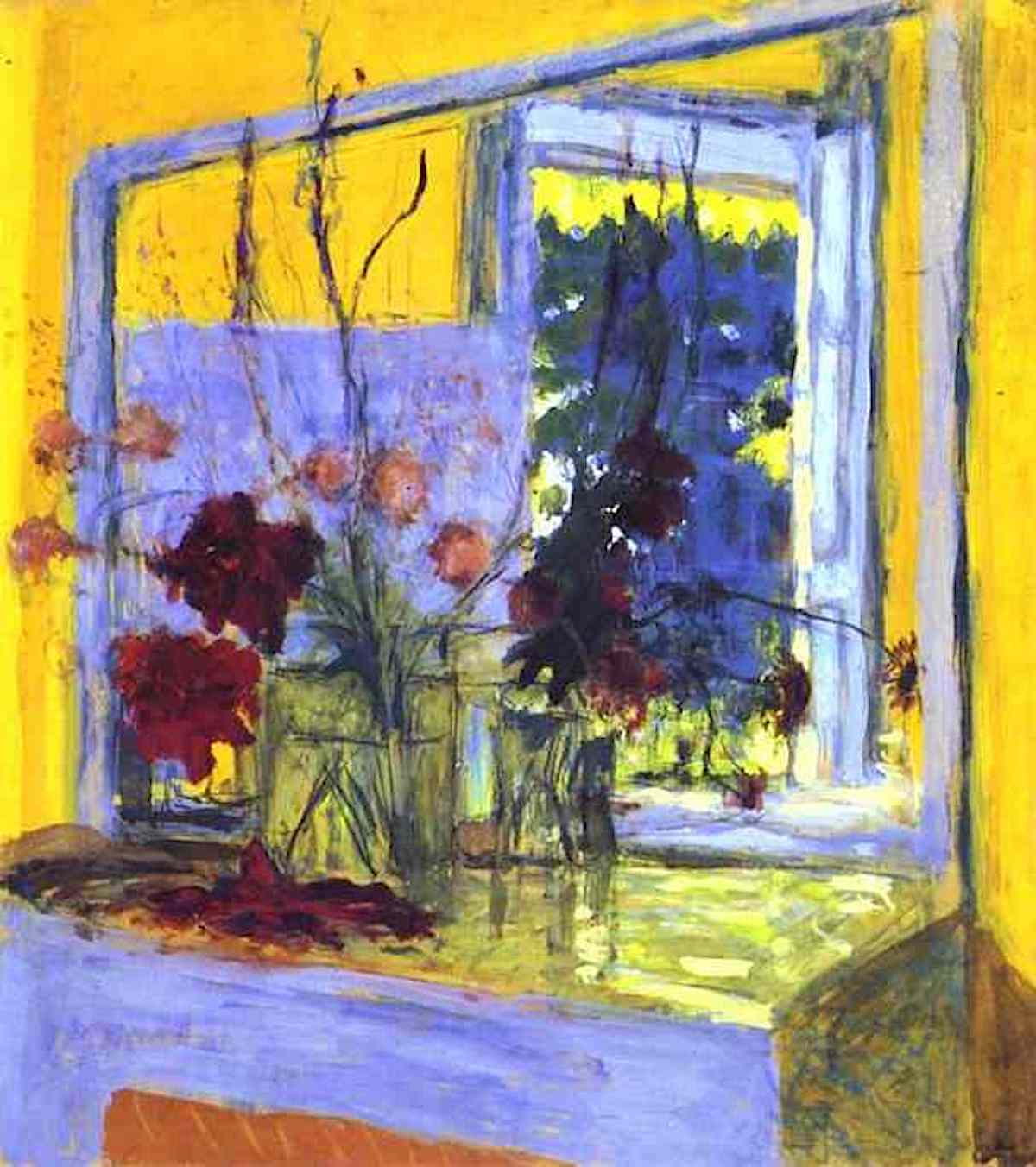
Eduard Vuillard, Flowers on a Fireplace in Clayes, 1935
Compare Vuillard’s Flowers on a Fireplace to this photo in somewhat the same spirit – a similar arrangement before a mirror on a fireplace mantle.
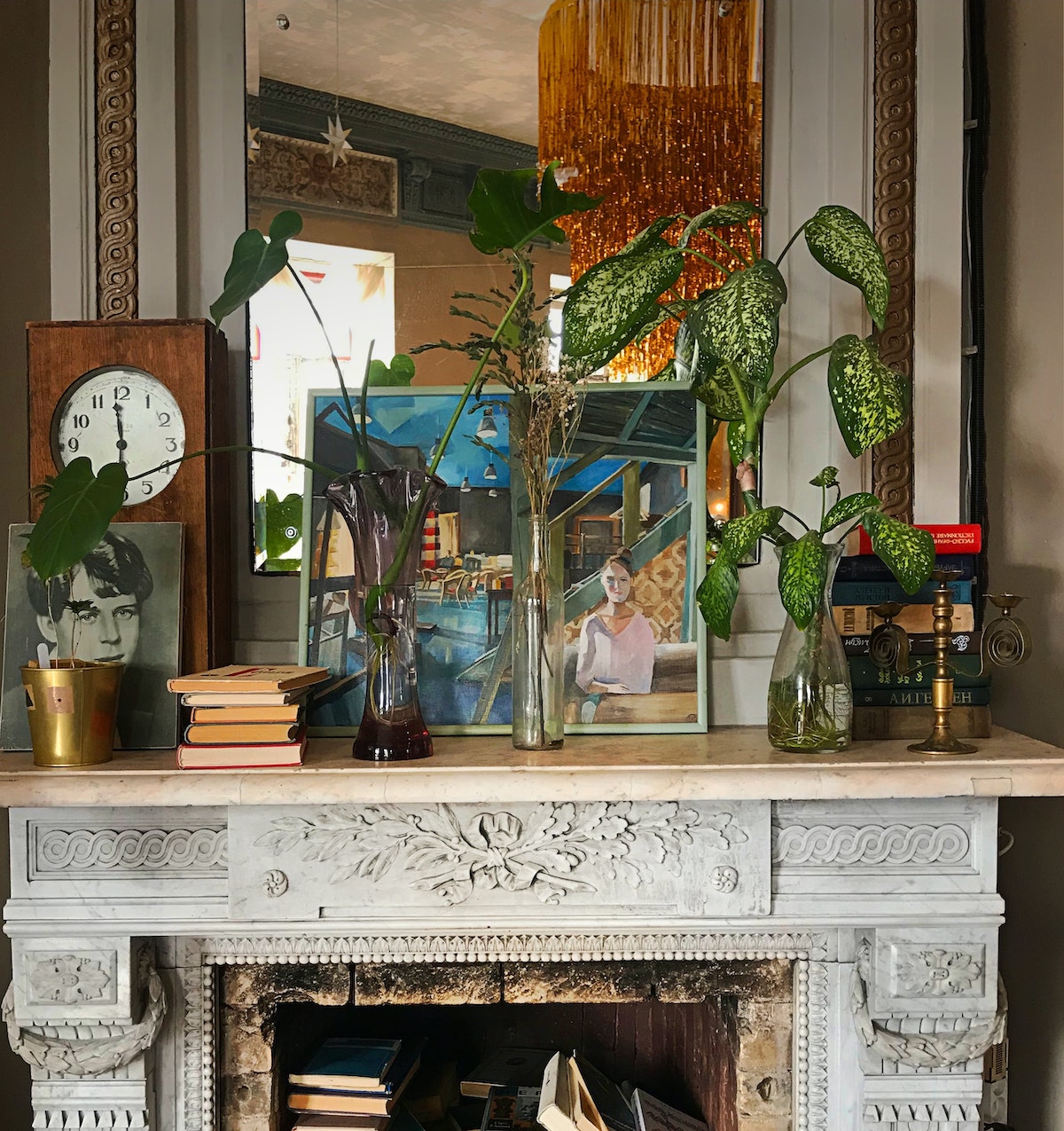
Photo by Gaelle Marcel on Unsplash
The photo has plenty of interest, and yet the painting positively radiates feeling and mood. That’s because it leads with feeling through Vuillard’s choice to fill his canvas with exuberant yellows and golds and golden-greens vibrating against complementary violet-grays and purple-blues. Instead of a faithful image of a mantle, the painting expresses (through color!) the liveliness of a light-filled room.
To grossly oversimplify, predominantly cool colors, such as the blues and blue greens in Monet and Whistler, might be said to betoken a feelings in a lower register, such as calm, whereas hot colors, like the vibrant yellows and golds and reds in the higher key of Vuillard, tend toward excitement.
There are many, many ways to be expressive when you resolve not to copy recognizable space but to show how a place feels through the qualities of color.
Perhaps an instructional video can help as you get your hands around color and color mixing.
Beauty, emotion and community at the Dallas Art Fair
Keer Tanchak’s NK Catherine (2022) is one of ten works from the Dallas Art Fair that were aquired by the Dallas Museum of Art
According to a story in The Art Newspaper, the Dallas Art Fair this year distinguished itself from other events of its kind by shedding some of the usual pretension and bringing beauty and emotion to the forefront of the contemporary art conversation.
“There is a true relationship with beauty and emotion and the art here in Dallas,” says Dominique Toutant, the director of Galerie Blouin Division. “People are looking at the art itself and are not so concerned with the name, the brand or the investment. And that is okay.”
Sounds good to me.
-Chris


