John Singer Sargent had a secret weapon. He had an extraordinary determination to mix a brushstroke’s worth of exactly the right color and (more importantly still) the precise value he wanted – whipping each piece of paint into shape on his palette before applying it to the canvas. That unusual precision for individually applied dabs of paint allowed him to place his strokes cleanly on the surface and leave them there, without blending, when needed.
Nowhere in his work is this uncanny skill more evident than in his many paintings in white on white. He seems to have delighted in the challenges of white-on-white paintings, reveling in his ability to mix (for each stroke!) exact and subtly varied colors, values, and in this case temperatures – the relative warmth or cool of colors containing more or less chromatic blues or yellows.
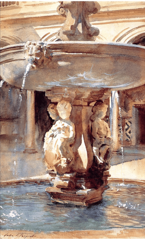
Take Sargent’s remarkable watercolor of a Spanish fountain (above). Areas of sunlit stone, stone in shadow, stone receiving ambient (reflected and dispersed) light, and even light bouncing off the surface of the water, which itself is a reflecting light, sky, and stone. And you can see each wash and dash of the brush. Just getting the values right would be difficult enough.
But Sargent used intricately varied warm and cool coloration as well. To greatly simplify what’s happening here, the artist nails myriad variations of light and shadow through alternating warm for sunlit, cool for shadow. But beyond that, it’s really about picking out select edges and shapes and handling them with just the right relative lightness or darkness. For the most part color is beautifully restrained by a considerably limited palette. The values are dead on.
Or how about his marvelous painting alternately known as “Incensing the Veil,” “Smoke of Ambergris,” or just “Ambergris” (below)? The title(s) refers to ambergris, a rare and precious substance derived in small quantities from the bodies of whales. Master perfumers throughout the ages have prized it for its exquisite and indescribable scent, said to be at once potent and soft (at the time of this writing, the current price of a pound of ambergris on the open market hovers around $10,000).
Sargent’s picture shows a Moroccan woman in white beneath white stone architecture perfuming herself by capturing the fumes of burning ambergris with her garment.
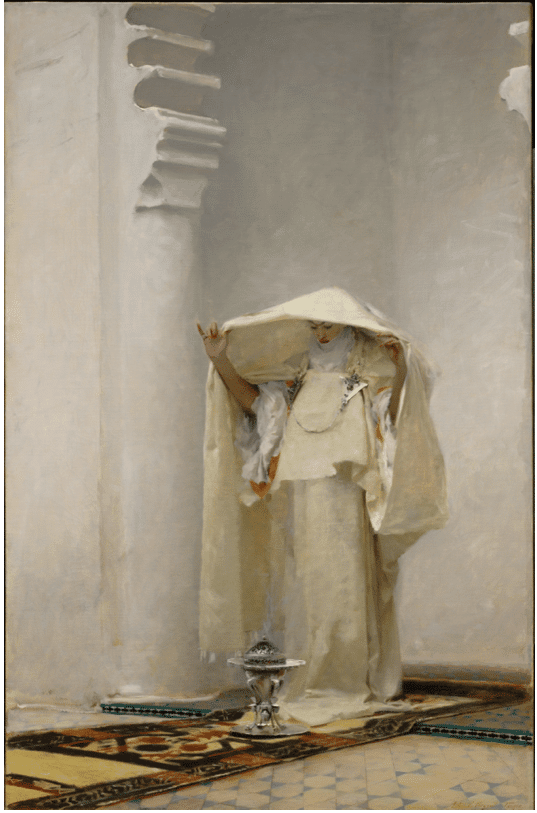
ohn Singer Sargent, Fumée d’ambre gris (Smoke of Ambergris), 1880, Oil on canvas. Acquired by Sterling Clark, 1914. The Clark Art Institute, 1955.15.
Below is the preliminary watercolor, presumably made en plein air or shortly after seeing the scene in real life. The rendering in the final oil painting (above) is imaginative and masterful – but comparison with the watercolor study (below) shows Sargent is largely “making up” all that amazing white-on-white handling of the warm/cool lit and shadowed architecture and drapery.
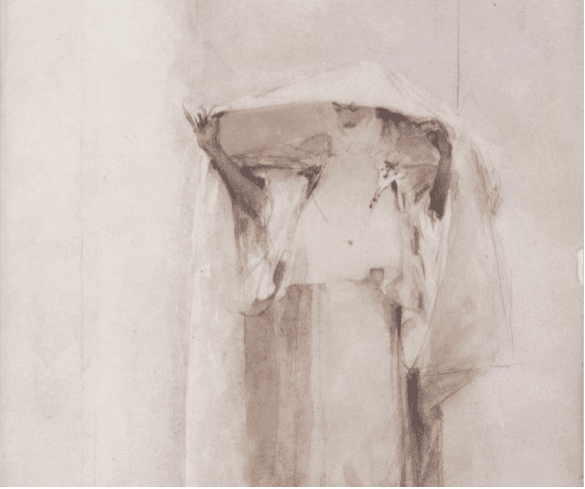
This is the top half of the plein-air watercolor sketch. The watercolor includes some of the same details – but not the architecture. That’s how we know Sargent constructed the larger oil’s white-on-white, warm/cool light and shadow in the architecture through some mix of imagination and memory.
Sargent’s secret weapon was an absolutely precise eye for values. Getting the values dead right enables a free-spirited play of colors and temperatures, and that’s what carries such remarkable work over the finished line.
If you’d like to go beyond theory and delve into actual how-to technique, this video may be for you: Thomas Jefferson Kitts, Sargent: Techniques of a Master
Handling Architecture in Watercolor
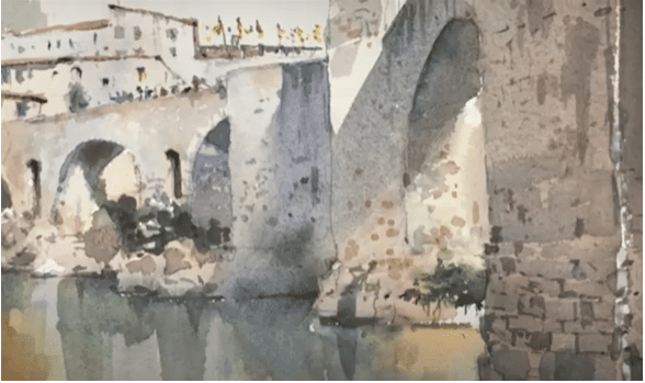
What holds many painters back from taking architecture as their subject is forgetting that “the main reason for painting architecture is painting the light,” says renowned watercolorist Stewart White, who’s especially known for his masterful and elegant architectural watercolors, including plenty in white on white.
Painters looking to create great renderings of beautiful architecture would do well to look past the intimidating prospects of challenging details, geometric angles, and proportions in perspective, he says, and simplify the visually complex by concentrating on the quality of the lights and the shadows.
Stewart demonstrates the surprisingly straightforward and relatively easy methods he uses to the correct geometry taken care of so he can allow the light to make his paintings shine in his video Painting Architecture in Watercolor.
Visit EricRhoads.com (Publisher of INSIDE ART) to learn about opportunities for artists and art collectors, including: Art Retreats – International Art Trips – Art Conventions – Art Workshops (in person and online) – And More!


