In realism, getting the drawing right matters, but sweating over the precision of “scientific” two-point perspective – depending on your style – is probably overkill.
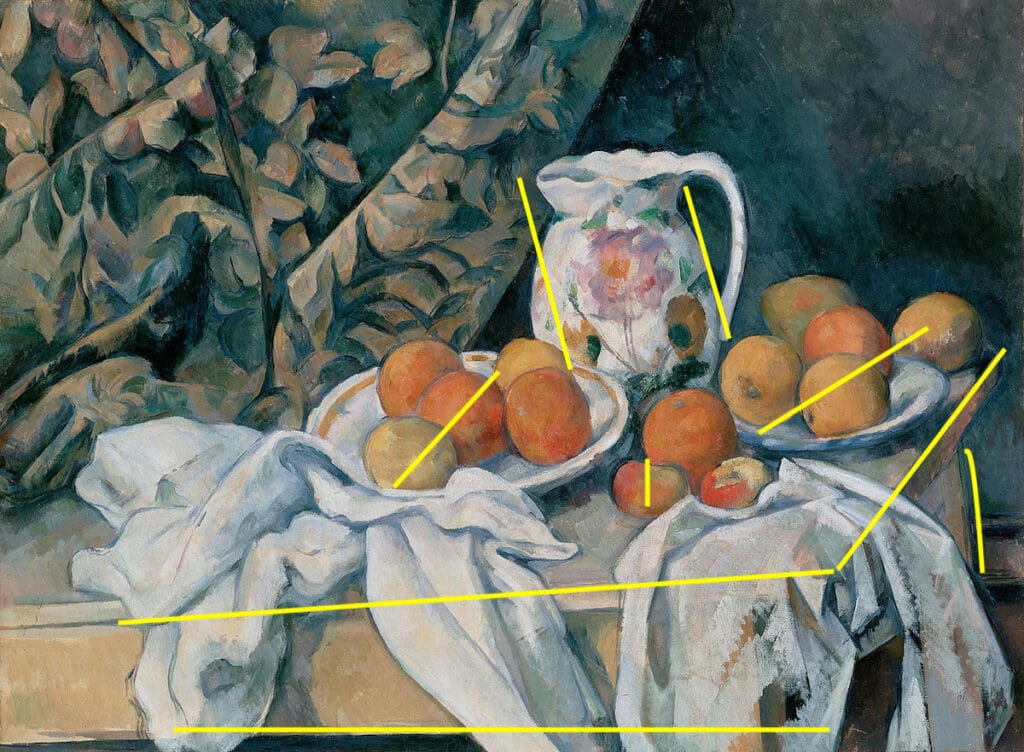
Cezanne still life showing multiple perspective relative to the picture plane in the same painting
Cezanne proved as much by deconstructing the rules and warping the picture plane – it’s not that he didn’t know how to draw, it’s that he drew in a highly original manner. Cezanne created beautiful and arresting paintings in which he used multiple perspectives for each object or group of objects. It’s thought he wanted to capture what he saw (as he shifted his position between painting sessions) rather than what he knew was supposed to be there. In the resulting paintings, perspective is a bit like a net from which Cezanne sets his subjects’ energy free.
“Perspective is just a tool that the painter can use if it helps tell the story at hand,” says watercolorist Thomas Schaller. “All you really need to remember is that since you are drawing on a flat sheet of two-dimensional paper, perspective is just an illusion of the third dimension — depth. From there, it’s common sense. If you consider two things of equal size, the one farther away will tend to look smaller than the one more near. And things that are at a distance tend to look less distinct than those that are closer to us. It can all become far more complex of course, but it really doesn’t need to.”
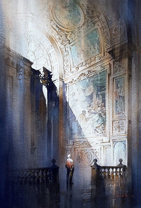
Thomas Schaller, Afternoon in Rome, watercolor
That said, of course drawing or painting architecture is where perspective becomes truly important. The perpendicular and parallel lines of buildings need to enlarge, diminish, and skew at angles relative to an imaginary viewpoint and to each other.
You can internalize the basics of scientific perspective with a YouTube tutorial, a pencil, and a ruler. If going all the way in is more your style, you can’t beat a thorough tutorial such as Carl Dalio’s Sketching in Perspective.
Besides draughtsmanship, the other available tool to hand is value. Aerial perspective, something Leonardo established in the background of the Mona Lisa, establishes dimension, and value is a key aspect of it. Objects further away from us have more atmosphere between us and them, which means objects closer to the viewer are darker. You actually have four variables to work with here: value, edges, temperature, and chroma, aka saturation or color-intensity.
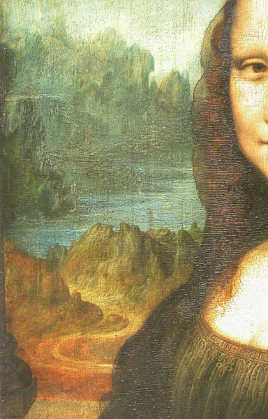
The background from the Mona Lisa – progressively lighter, blurrier, cooler airier and less saturated.
Make objects recede in space by keeping them lower in value (fade them out), cooler in temperature (skewed toward the blues rather than the reds), softening their edges, and lowering their chroma (in oils this means “graying them out” either by adding whatever you’re using in the sky or background, a complementary color, or an earth tone, such as burnt umber). But that’s the deep dive. As Schaller says, 90% of the time, it doesn’t have to be that complicated.
“There are two primary ways of establishing perspective in a painting,” Schaller says, “the mathematical way of setting lines and vanishing points, and the more expressive and communicative way of layering three basic values. If areas of light, dark, and mid-tone are composed effectively, the illusion of depth and dimensionality appears almost as if by magic.”
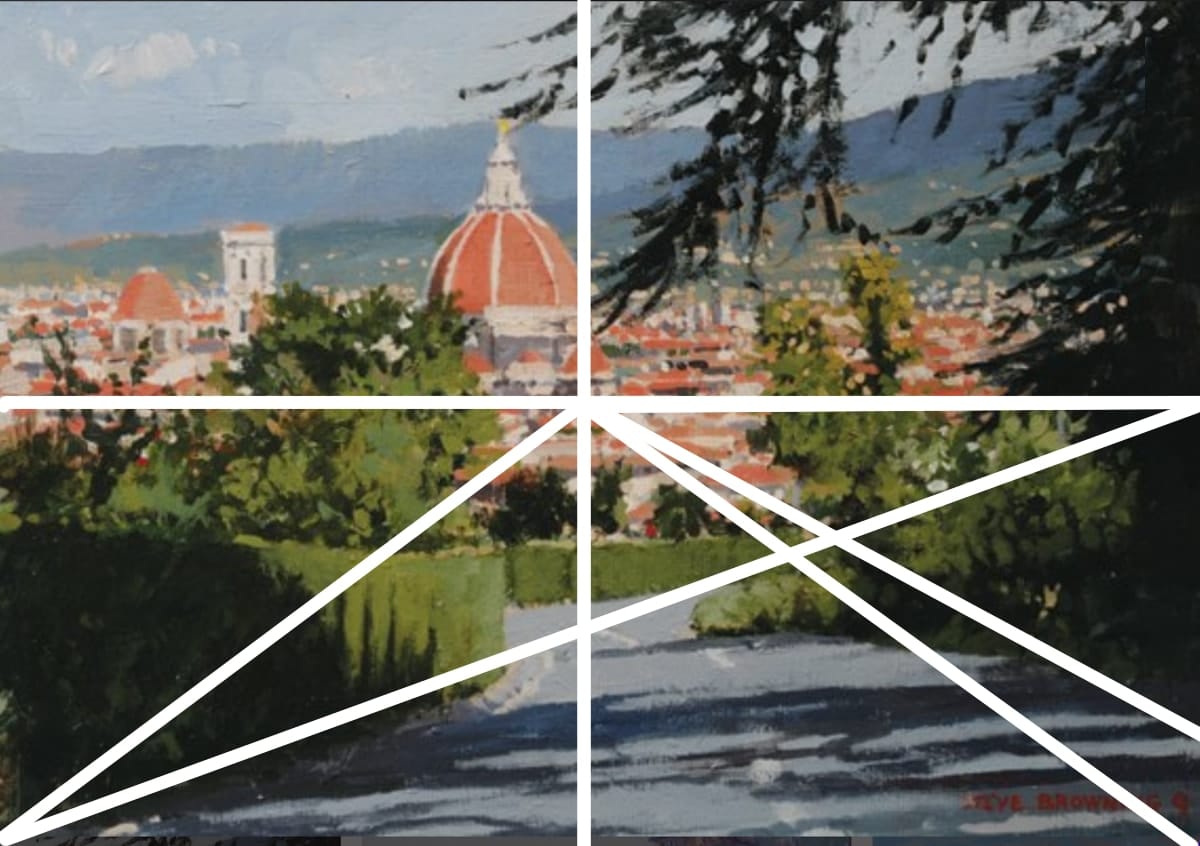
Painter Steven Browning, who won this year’s Plein Air Salon competition in the acrylic category provides an example of how minimal, yet correct perspective, combined with attention to value (and the chroma/temperature/edges formula), creates the right degree of perspective for his painting. (Note the hard-edged line and more darker value of the closest object, the person standing on the left – vs. the softened lines and grayer, less intense character of the furthest-back wall).
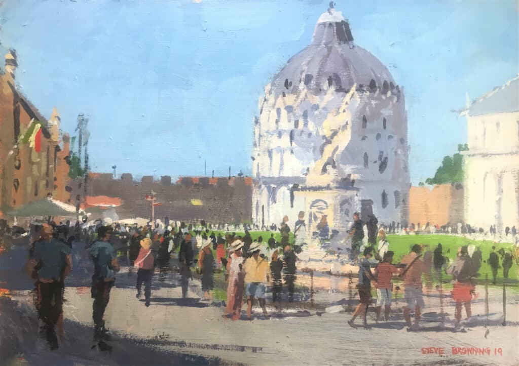
Steve Browning, Pisa, acrylic
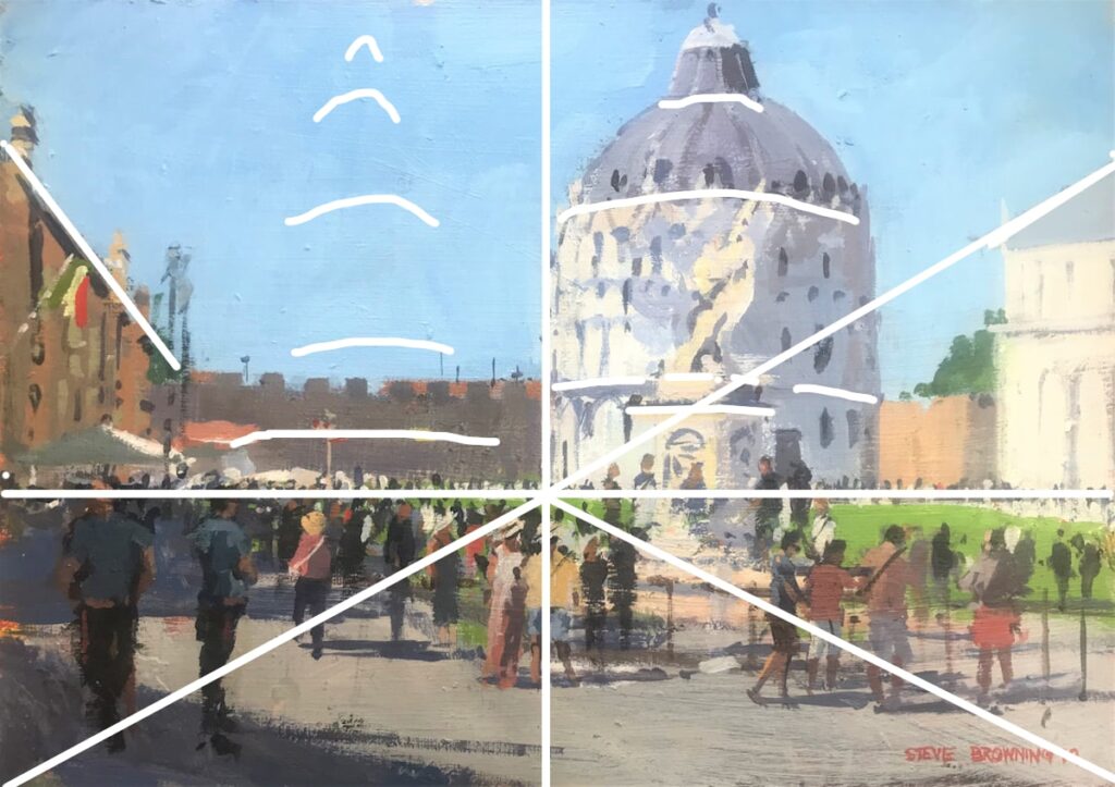
Like the one at the top of the page, this painting of a Italian plaza works great without going overboard on the perspective draughtsmanship. It looks complicated when you diagram it out, but it really isn’t. It’s minimal – there’s just enough. Totally key though is the established horizon line and the implied one-point perspective. Think of the horizon line like a hinge: Browning tilts the foreground plane down, toward us. Everything above the horizon line tilts away from us. Note how he makes the curvature of the tower become more angled as it goes further up from that horizon line (shown in exaggerated lines to the tower’s left, below). It’s not madly drawn out in an armature, it’s simply understood, like a loose guideline, and accordingly understated.
Internalize the rules by doing a few drawings or by delving into an instructional step-by-step video on sketching in perspective, and the rest, as Schaller says, is largely common sense.
Art World as Rotten as Any?
Paz’s donation includes Arjan Martins, Américas (2016).
Courtesy Inhotim Institute.
Wow, the more I keep up with goings on in the Big Money art world the more corruption and disappointingly bad behavior I see. A former head of the Louvre is being investigated for trafficking in stolen antiquities. The former vice chairman of the Whitney Museum in New York resigned when it came out that his company is in the chemical weapons business.
And art collector and former mining magnate, Bernardo Paz, founder of a lavish “art institute” (housing his collection) in Brazil, was accused of transferring nearly $100m in donations to the art center to his mining and steel companies. At least Paz has been acquitted of that crime – and is donating 300 works from his collection to his institution.
La la la la life goes on.
In the paint,
Chris


