Don’t worry about matching the colors the teacher is using.
If a pro is demoing a sunset, let’s say, her students often want to know exactly what red and what yellow to mix in which proportions for those molten lava sky colors. It sounds reasonable enough (and it is!), but it’s only one way of learning to paint, and it’s probably not the best or the most empowering.
Matching colors is less important than mixing colors and making them work on your canvas. Learning to match color is very different from learning how to use color in your paintings. It’s that old “fish vs. fishing” adage – give someone a fish and you feed them for a day; teach them to fish, and they’ll feed themselves for a lifetime.
While totally understandable, it’s unrealistic for a beginner painter to try to get everything precise and perfectly “right” in the compressed timeframe of a workshop or a class. It’s like trying to learn roller-skating and never letting go of the rail.
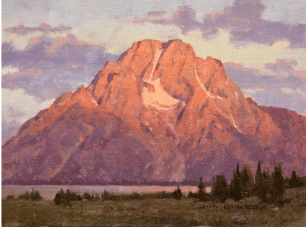
Jim Wilcox, Time to Reflect, oil on canvas, 18 x 24 in.
This is nowhere as important as in the realm of color. It’s far more important to pay attention to the relationships between the colors than trying to match individual colors in isolation. There are multiple ways to match a color – if the teacher is mixing an orange with cadmium red light and you only have cadmium red medium, you’ll just have to use more cadmium yellow than the teacher to match the mix. Painting is learned by doing – so the sooner you embrace that it’s a process of trial and error, the less anxious you’ll be and the faster you’ll make the progress you yearn for.
In technical terms, the whole key to thinking about color relationally is to internalize the principles of value and temperature. Temperature is just the supposed relative “warmth” or “coolness” of that cadmium yellow-orange mix, let’s say (warm) vs. a White/Prussian blue mix (cool). Value is how bright or dark things are when you take color out of the equation. Another way to think of value is contrast.
In fact, if you ever find yourself struggling with color, ask yourself if perhaps the problem isn’t color at all, but value instead. I’ve heard it said that 90% of all color problems can be fixed by adjusting value. According to this school of thought, the other 10% can probably be fixed by dialing back some color intensity (“chroma”) here and there and balancing/offsetting the saturations with more neutral color-mixes.
As for matching (“is that cad red or cad red light?”), if you decide you simply cannot find the “right” color, trust that with enough trial and error, you can always find an equivalent that works just as well and maybe better. The same is not true about value. Either your lights and your darks are what and where they need to be relative to each other, or they’re not.
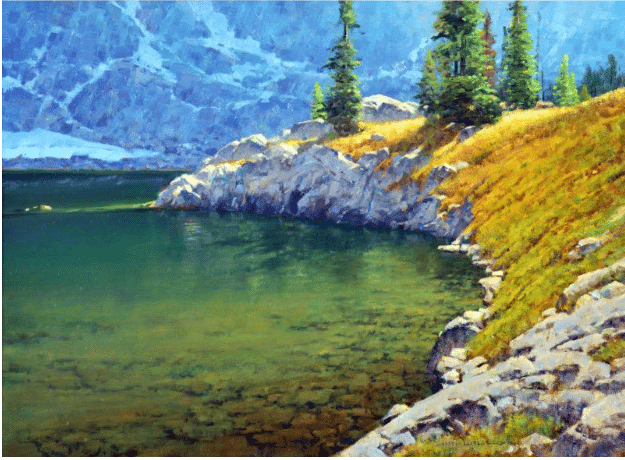
Jim Wilcox, Lake Solitude Point, oil on canvas, 30 x 40 in.
Working with ‘Value Shapes’
One way to start a plein air painting, for example, is to block in three or four big “color-value” shapes with the aim not of matching colors but of matching the major color-value relationships – the light-and-dark relationship between the sky and the land or sea mass that abuts it, and the relationship between the middle ground and the foreground and objects near and far. Once that’s established, it’s a matter of modifying and building detail into the big shapes while preserving the overall value arrangement.
What if two colors already have a similar value relationship? In that case, consider assessing them in terms of temperature or intensity instead of hue.
Again, the key isn’t matching color or even value, it’s matching color-value relationships. And the only way to learn how to do that is by creating those relationships yourself by trial and error. What you really want and need is to develop a feel for how to create, assess, judge, and adjust colors against each other.
Jim Wilcox paints en plein air and in the studio, and he teaches both in “Painting from the Outside In,“his instructional video on applying plein air techniques to your studies outdoors and transforming them into magnificent larger studio paintings back home.
PLEIN AIR CONVENTION & EXPO at LAKE TAHOE
It’s not too late to snag tickets for the 12th annual Plein Air Convention & Expo in beautiful Lake Tahoe May 19-22, but there are under 150 tickets left and they’re going fast. If you want jump in, register here!
There’s a new plein air trip this year too – Switzerland! Eric Rhoads has designed an extraordinary and exclusive 11-day luxury painting trip through Switzerland’s secluded Alpine valleys and charming villages to create the ultimate body of work and a lifetime of memories. Paint the same scenery that inspired Sargent, Monet, Renoir, Sorolla, Courbet, Cassatt, Pissaro, Bierstadt, Levitan and many, many others! More info at https://www.paintswitzerland.com
August Wilhelm Leu, (German, 1819-1897), “A Cheerful Encounter on an Alpine Lake,” 1862