Landscape artist John Hughes shares a simple way of getting the right colors without memorizing elaborate theories.
By John Hughes
Mixing Color Intuitively Using Triads
During instructor demonstrations, a typical question that is often asked by students is, “How did you mix that color?” That’s typically followed by an approximate recipe for the mixture that was used.
When I get that question, I often find myself saying something like, “I used red, yellow, and blue with some white.” While this answer may seem a bit vague, it’s also true, which opens up an opportunity to explain a very simple way of getting to the right color by using triads.
Sometimes I don’t even remember what colors I used to get a certain tone, but I know I can mix it again because color mixing has become more intuitive in my mind than memorizing a bunch of color formulas.
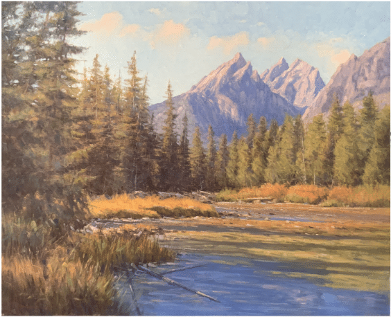
Landscape painting by John Hughes
Before I explain, let’s review the tried and true method of mixing color before going on to simplify the process:
It’s really very scientific: Hue + Value + Intensity + Temperature = The correct color every time
How this translates into actual color mixing goes something like this:
The artist sees a color and wants to reasonably match it.
- Hue:They choose a general color from a (primary/secondary) color wheel – there are only 6 choices – Yellow, Red, Blue, Green, Orange or Violet. The artist picks one of these.
- Value:The artist determines if the color they want to match is a light value, a middle value, or a dark value and then acts accordingly. If the color they are looking for is a dark green, for example, they may start with a dark blue, like Ultramarine, and mix in some yellow. If the color they want is light green, they can start with yellow and add only the amount of blue which will create a light green. White can also be used to lighten a mixture, but one needs to be careful because it also cools colors as well as making them less saturated. Be careful with white which should be used sparingly in the foreground lest you wind up with chalky colors that are more suited to the background.
- Intensity:The artist will then determine the amount of saturation that the color they are after possesses. In other words, how pure and bright the color looks, or how grayed down it appears. The most pure color is straight out of the tube. In order to gray it, or make it look more muted, the artist adds just enough of the color’s complement to get the desired effect. (Complements are colors that are directly across the color wheel from each other.)
- Temperature:The artist then makes further adjustments to the color by deciding if the desired green is warmer or cooler than the mixture they have so far. This brings into play the other six colors on the color wheel, namely the Intermediate Hues – Yellow Green or Blue Green, Yellow Orange or Red Orange, Red Violet or Blue Violet.
In this case, we are concerned with the first two – Yellow Green or Blue Green. If the artist wants a warmer green they just add yellow to the mixture. If they want a cooler green they can add blue or even some white to cool it.
If done correctly, bam, the right color is achieved!
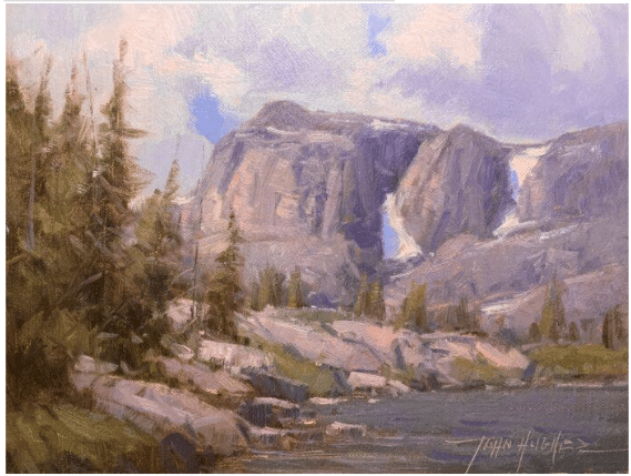
Landscape painting by John Hughes
Now, this brings us to…
Mixing Color Intuitively Using Triads
Sounds interesting, right? Well, it is, because it’s a quicker and easier way to get the exact color I want. The reason this method is quicker is because it streamlines step 3 above and I also don’t have a ton of exotic colors on my palette, which have to be harmonized in order to work well together. Instead, I just mix the colors I want.
The idea in its basic form starts out with a primary palette and can take on several modifications from there. I know one artist who only uses Ultramarine Blue, Alizarin Crimson, and Cadmium Yellow Light and he gets harmonious color all the time.
My preference is to use what I would term – a split complementary palette with a twist, which consists of the following colors in the Utrecht brand: Cerulean Blue Hue, Cobalt Blue Pure, Ultramarine Blue, Cadmium Red Medium, Quinacridone Rose, Cadmium Yellow Hue, and Cadmium Yellow Medium + Titanium White; I like the Blick brand for that. (Occasionally I will add colors to this list, such as Transparent Oxide Red and Yellow Ochre, but only on an as-needed basis).
With this palette, I’m able to mix any color I want without having to think about questions like – What is the complement of red orange for instance? The obvious answer is blue green, but I might have to think about it for a few seconds before moving forward, which to me is a time waster and something that has the potential to knock me out of the “zone” and ruin my momentum in the field.
So instead of switching sides of my brain is figuring things out that feel more like math problems than art, I simply mix my color, (in this case a green), which is made by combining blue and yellow; (two colors in the triad). From there my only other choice if I want to gray down my green, is to add the third color in the triad which is red…boom, I have the color I’m after! (Red also happens to be the complement of green, but I don’t really have to think of it that way, I just add the third member of the triad to mute my color.) It’s very intuitive and using triads is just a bit quicker as a result.
Just remember this – Whenever three members of a primary triad are present in any color combination, a certain amount of “graying down” of that color will take place. Think about this when you are trying to mix a color for pine trees, to use the green example again. They’re not Viridian like many beginners think; remember to add some red to get that dark olive look.
The triad approach to mixing color also frees me up to concentrate on being artistically in tune with nature, and that’s the place I really want to be!
As far as temperature goes, most of those decisions are made easier by the warm and cool primary colors I choose to work with.
If you are new to painting or struggling with color, or just want to experiment making color choices in the field quicker and easier; you might try the concept of triads, using only three colors plus white before branching out to more exotic variations of a primary palette.
Until next time,
John