By Christopher Volpe
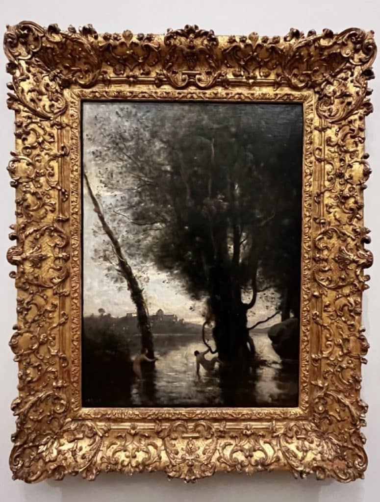
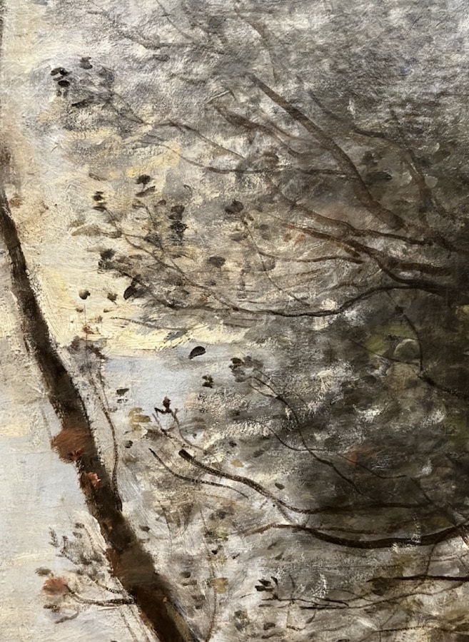
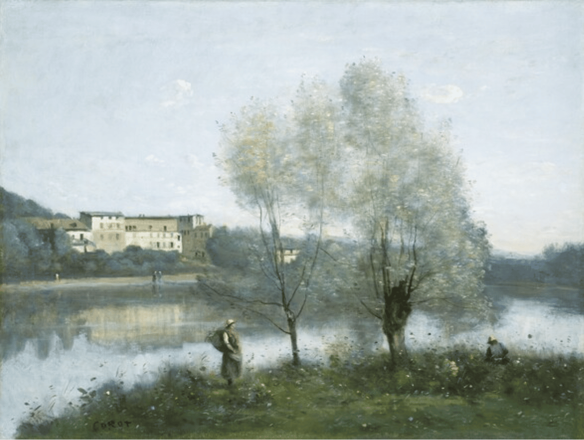
Jean-Baptiste-Camille Corot’s most characteristics landscapes charm the viewer with gauzy, atmospheric veils shimmering with pearlescent grays composed of carefully toned neutral blues, ochres, greens, and violets … and far from painting every leaf, Corot’s foliage looks “like breath on glass” up close.

Corot’s Bathers of the Borromean Isles, 1865-1870, at the Clark Art Museum in Massachusetts.
We now know exactly what pigments he used and how Corot created that poetic, earthy-silvery palette of his. The National Gallery has published their analysis of Corot’s pigments during what they term his most representative period (the 1860s and 1870s). It’s his most muted, pearlescent period as well, and the report is both revealing and surprising.
From the site:
The ground is composed of lead white, over which a brown translucent undercolour has been painted which can be seen through the top paint.. Corot has used cobalt blue in the sky and in the greyish mauve of the middle distance. The mid-green foreground is created from blue and yellow, made up of a transparent yellow (possibly chrome) and a fine blue (possibly Prussian blue) mixture with white, red and black in small amounts (my emphasis).
Much has been written, from Robaut onwards, on how Corot preferred to mix his greens, rather than use ready-made ones but in actual fact he used both, as is evidenced by other paintings in the collection. The very bright orange streaks in the boat and on the woman’s cap have been identified as cadmium orange, a pigment which came into use in the latter half of the 19th century. It has also been identified in Corot’s Les Evaux, near Château Thierry, dated by Robaut to 1855 to 1865 (R1292, private collection).
Cadmiums? Corot? But it’s the admixture of white, red, and (shock! horror!) black to his green mixture that sent off the “ah-ha” moment for me. Between the complementary red and the black, that green is well on its way to a neutral hue, and the white just levels the value as well.
Creating a similar mauve mixture for the background and taking these as the painting’s predominant tones, Corot could easily control the painting’s overall color and value, modulating then with just the slightest variations in the various proportions of light and dark paint.

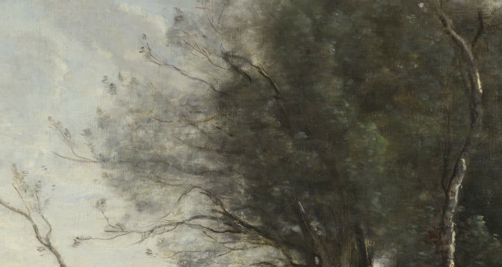
Detail of The Leaning Tree Trunk
Check out the National Gallery page on The Leaning Tree Trunk if you’re as interested in Corot as I am – you can zoom in very close to the painting to check out Corot’s every stroke. It was the first time I’d understood how he painted his tree branches and foliage, too (in darks first, then laying in translucent sky over that, and then extending the branches out into the air using a cool neutral gray in numerous little dabs of shimmering paint.
The Struggle is, Actually, Real

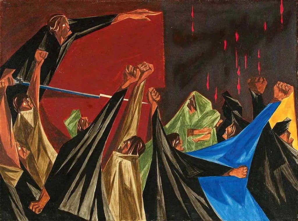
Panel 1 of the Struggle series by Jacob Lawrence, 1955, via Peabody Essex Museum
“The great American artist Jacob Lawrence used vivid colors and dynamic patterns to tell stories about historical figures, impactful events, and personal experiences,” according to art historian Stefani Graf. “His Migration series brought him recognition in his early twenties and it is still considered his most famous work. The subjects of the artist’s dynamic paintings range from political to personal and often tell stories about struggles as well as hope.”
Graf has a lavishly illustrated and lovingly researched appreciation of Lawrence in The Collector.
