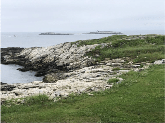
There’s a simple reason that this photo makes a good foundation for a painting: The natural curvature and dynamic angles of the rocky ledges give it an eye-catching composition out of the gate. The scene (Star Island, Isles of Shoals, New Hampshire) has plenty of contrast and perspective, interesting textures and shape variations.
Taken as whole, the image hints strongly at the sense of untamed wildness and chaos that you feel when you are there looking for something to paint. That feeling is the main reason to paint it. All the ready-to-go composition bonuses we just talked about add up to a perfect scaffold for conveying that experience.
Many oil painters follow a basic landscape procedure that can be broken into five distinct stages or steps:
- Composing the sketch
2. Painting in the sky
3. Blocking in the darks
4. Adding the lights
5. Putting in the details, adjusting edges and values, and adding finishing touches

Step 1. Drawing a sketch. The sketch is not necessarily a careful black and white drawing to be filled in with paint. It can be, as it is here, a simplified and abstract design roughed in with a ragged brush. It’s said every painting lives or dies in the first 15 minutes, and if so, it’s because of design – nothing can fix a painting with a weak underlying abstract architecture.
This sketch departs from the photo in at least three important ways: 1. The addition of diagonal lines from the bottom right foreground to lead the eye in to the design. 2. The connecting of the distant islands in the background to the land mass to promote a clear and unbroken “path for the eye” and 3. The flattening of the picture plane so the rocks seem to spill out into the left-hand corner of the foreground. This (No. 3) provides another leading-in diagonal to keep the eye moving in and around the painting and to prevent the composition from getting static. Later, the sky will get counter-balancing diagonals, too.

For the sketch, the ragged “chip” brush promotes spontaneity and “big” unfussy movements. The pigment is a mixture of burnt umber (brown) and ultramarine blue thinned with Gamsol to keep it fluid.
Here’s the completed sketch:

Step 2. Painting the sky. Now we see the addition of more diagonals, on both the right and left hand sides of the picture. Putting in the sky first can help you know how light or dark to make the adjacent land or ocean masses (this is known as “gauging your values.” It’s also encouraging to get a good sky done – you feel like, with a good sky, you’re off to a good start and maybe this painting won’t be a total failure after all.)
These sky colors are ultramarine and Prussian blue mixed with Titanium white and a smidge of yellow ochre. The blue layer was “scrubbed in” first (rather thinly, with a brush), and then, for the clouds, the thicker strands of light yellow paint were applied with a palette knife while the first, thinner sky layer was still wet.

Note how the sky gets lighter and lighter as it nears the horizon, until it’s almost just yellow-white. Skies do that, and it gives your middle-ground sufficient contrast if you keep the sky from being too dark at the horizon.

Step 3. Blocking in the shadows. This step used a darker version (more blue this time) of the same blue-brown mixture used in the initial sketch. There’s been a conscious effort to connect these darks, so that no part of the composition is stranded, an idea that comes from the great Japanese printmakers.

Step 4. Adding the lights. In oil painting, one generally starts with the darks and works up to the lights (the opposite of how one approaches a watercolor). The rocks and the grass are painted right over the still-wet shadow lines, the grass laid on with a brush, the rocks with the knife. There’s not just one but an array of greens, mixed with cadmium yellow and ultramarine to the warm side and broken up in Impressionist fashion with flecks of ochre, violet, brown-green and blue-green. Green is notoriously hard to handle in painting because it can look too hard and bright for its own good.
Though similar, the outline of the rocks differs in several ways from the photo, especially in the more “jagged” feeling of the shapes and edges, which helps support that initial impulse to paint the wildness of the scene. For this to work, you have to stop looking at the scene and just work those shapes with the palette knife until they express the feeling you want.
It’s now time to adjust values and add areas of sunlight and shadow, put in more details and highlights, being careful not to let the rocks get brighter than the water or the sky.

Here is the finished painting. Not a masterpiece, but hopefully instructive. The altered color gives it a warmer, more buoyant, uplifting feeling (without becoming cliché) than in the photo, while also conveying that rough-edged primordial beauty which was the original reason and impetus for painting the picture in the first place.

Albert Handell, Dusk at China Cove, 18” x 24, pastel
This post didn’t go into it, but painting rocks demands its own set of strategies and techniques. Pastel master Albert Handell thoroughly explains what’s involved in his video Painting Water & Rocks, available here.
And don’t miss his master class in pastel, part of PastelLive – coming this week, Aug 17-19!


