There’s a true-to-life scene in the 2014 movie Mr.Turner, where the Royal Academician John Constable is drawing a crowd for a colorful painting with a middle-ground full of dynamic red paint. In reaction, Turner adds a blob of red paint to his own painting – a somber depiction of boats on a wave-rippled sea – then with a thumb-swipe turns it into a buoy and walks out of the room.
When the excitement died down, the critics agreed that Turner’s simpler, more restrained work made Constable’s painting (on which he’d labored for 15 years!) look complex, fussy, and ostentatious. “He has been here and fired a gun,” Constable is said to have murmured.
For painters, the lesson is clear: that one, concentrated spot of red sings louder, more clearly, and more beautifully in Turner’s muted green-gray sea than it does amid all the sound-and-fury in Constable’s busy, red-heavy configuration.

A still from Mr. Turner
Technically, bright, intense, saturated colors, are considered “high chroma.” This means the hue is highly concentrated and unadulterated, i.e., “pure.” Adding the color’s complement, or adding white, will bring down the chroma.
White will do it without changing the hue (e.g. cadmium yellow is very “high chroma” out of the tube; add white and you knock down the chroma, but you’ve still got yellow). However, add its complement, violet, and you will both desaturate (knock down the chroma) and neutralize the color, moving it away from pure yellow and toward a more neutral gray.
Skilled colorists are adept at modulating chroma and value for any given hue. Many painters mix intentionally to bring some or most of their colors off the high-chroma cliff, because too many random high-keyed colors will clash. Keeping colors in check by modulating chroma helps bright, high-keyed, saturated colors play better with others.
Music as an Analogy
If instead of using warm and cool we divided colors into loud and soft musical tones, the “high-keyed” colors, like cadmium red, cad yellow, and cad orange would be loud and high-pitched, like piccolos, violins, or blasting brass horns. The “lower keyed” colors, like ultramarine blue, Payne’s gray, olive green, and the earths, such as umber, would be low, resonant bass-clef tones, more like cellos, violas, and tubas.
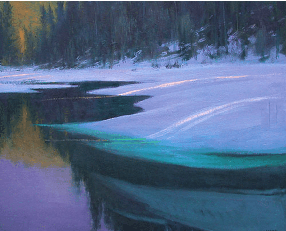
A soprano flute melody would sing out more clearly if floating over low, droning cellos than it would if drowned out by similar instruments, like violins, trumpets, and piccolos, all playing in the same register. That’s the principle guiding Corot, anyway, when he punctuates his warm ochre and cool gray-violet-blue-green landscapes with a peasant’s bright red cap – an eye-catching, enlivening device he used multiple times.

DETAIL of a painting by Corot, showing his restrained use of high-chroma red.
We take it for granted that “colorful” painters like Sargent, Childe Hassam, or Robert Henri just laid down their bright colors, painting in full intensity. This is not the case. Careful analysis shows their paintings contain a great many relative neutrals and semi-neutral colors.
Though you may remember it as a splash of warm, vibrant, colors, John Singer Sargent’s Carnation, Lily, Lily, Rose is very calculated to seem that way, but let’s look again.
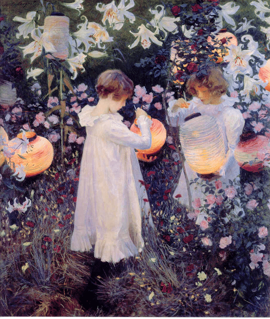
Johan Singer Sargent, Carnation, Lily, Lily, Rose, oil,
Even though this painting of Sargent’s reads as a garden full of blooming summer flowers, if we remove the orange lanterns from this painting, we find very little color jumping out at us.

Same as above with the 3-5 spots of warm orange color grayed out.
It’s still got plenty of color but there’s also a tremendous amount of cooler, neutral and semi-neutralized color tones at work here. Much of the painting, it turns out, lives in the lower, darker value range, deep with umber, indigo, ochre, dark green, and even black. Even in the remaining pink and purple flowers, Sargent has diluted the chroma with white – that way they don’t compete with the lanterns and the very warm tones reflected on the children’s faces in the original painting.
Likewise, Robert Henri preferred “…strong grays in the half-tones and shadows. These modified in later painting… reserving for finish the higher notes.” [Henri’s notes to himself, Archive of Robert Henri, Yale University, Beinecke Library, Box 26, Folder 606, p. 24, referenced on attentiveequations.com]
In the landscape below, Henri mutes his colors, but that green! It’s a pretty low-key green when you take it on its own, but set against the darker grays it “pops” and glows without hinting at becoming strident. Overall, Henri, not unlike Sargent and so many other painters, uses saturated darks contrasted with light-valued neutrals to create a dramatic effect that manages to be at once abstract and full of feeling and “sense of place.”

Robert Henri
This doesn’t mean you shouldn’t use “big” color! Color is beautiful! It’s what painting’s all about, and the love of color – be it big, bright, loud, and lovely – is what keeps artists coming back to their easels. Very colorful paintings work exceptionally well, however, when the artist offsets multiple saturated hues with a few strategically placed lower-chroma or relatively neutral colors. Cooler, quieter colors render louder, hotter ones more eye-popping.
In the painting (below) by Ian Roberts, we get high-chroma color throughout. Yet, the overall work avoids being jarring or “loud” (the way we say a striped tie over a plaid shirt is loud). That’s because Roberts has kept the chroma cranked but varied the “temperature” (warm vs. cool colors).

Ian Roberts, Winter Stillness, oil on canvas, 36” x 36.”
Roberts keeps that fiery shrubbery from getting out of hand by surrounding it with fire-blankets of cool green- and deep-blue hues in shadow. The predominance of the cool colors makes the “hot” accents all the more effective at conveying the sense of nature’s life-energy held in abeyance, quietly contained – the feeling hinted at in the title, “Winter Stillness.”
Edward Hopper also used color quite intentionally, not just strategically but also to express feeling. In the painting Morning Sun (below), the flat fields of cool gray-blues and the aquarium gray greens make the warm strip of sunlit wall outside the window fairly glow in contrast. Hopper used a modified, lower-key version of the same yellow hue in the figure’s skin.

Edward Hopper, Morning Sun (1952). Columbus Museum of Art.
But look how he gives the highest-chroma color in the whole work to the brick building outside the room, way off to the side. The world outside this room is more colorful by far than it is within this interior. Inside, where the focal point – and the life – is supposed to be, the woman’s garment gets merely a faded echo of red – the chroma’s been diluted with white. The relative lack of high-chroma color inside the room stresses the solitude and sense of melancholy clinging to the lone, half-undressed figure staring blankly into the sun while perched on a plain white sheet.
(By the way, for all his evident realism, for Hopper the depiction of the world was very much a projection of his own mind. He kept a quote from Goethe in his wallet and frequently referenced it: “The beginning and end of all literary activity is the reproduction of the world that surrounds me by means of the world that is in me, all things being grasped, related, recreated, molded and reconstructed in a personal form and an original manner.”)
Handling color with intention and strategy comes with experience and training. If you’re ready to dive into the world of finely tuned color handling, one of the following videos may be for you:
- IAN ROBERTS: COLOR – LANDSCAPE PAINTING TECHNIQUES FOR SUCCESS
- JOHNNIE LILIEDAHL: COLOR SOLUTIONS
- SUZIE BAKER: COLOR MAGIC FOR STRONGER PAINTINGS
Unheard Melodies (Update)

Because of an omitted link in the previous edition of Inside Art, the musical notation in Davinci’s Last Supper went unheard for a few additional days beyond the 500 plus years it has remained hidden-in-plain-sight in Leonard’s famous painting. (You can read the original story here<<https://streamlinepublishing.com/inside-art/the-mournful-melody-hidden-in-de-vincis-last-supper/ )
We’d like to correct that mistake and give you the link – you can now hear the secret music in the Last Supper being played at the link below:
https://www.youtube.com/watch?v=ib5BnMe3elQ
On the principle that heard melodies are sweet, but those unheard are sweeter still (when finally audible!), we hope you enjoy the listen.
BTW, we received such a nice response from readers about this article, that we will be following up with another piece on “Easter eggs” in famous paintings in an upcoming Inside Art.
In the Paint,
Chris


