Nineteenth-century painter Martin Johnson Heade (1819-1904) created some of the most beautiful marsh paintings the world has ever seen in a series of strongly horizontal compositions that were quite unusual for the time.
Although his studio was in the same New York City building occupied by many of the Hudson River School painters, Heade remained on the fringes of the movement. His marginal position is reflected in the unusual subjects he preferred: not mountains, forests, and lakes but tidal marshes, from Massachusetts to New Jersey.
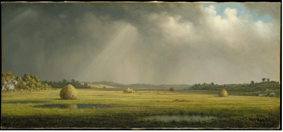
Martin Johnson Heade, Sunlight and Shadow: The Newbury Marshes, c. 1871/1875
These marshes he painted as much for their moods as for their colors and shapes. He followed the Dutch landscape formula: big skies full of drama and a relatively low horizon line. He stretched the view out horizontally like a seascape, which was his own innovation.
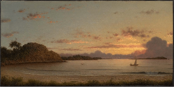
Martin Johnson Heade, Dawn, 1862, oil, 31.1 cm (12.2 in) ; width: 61.5 cm (24.2 in)
Like other painters of the time, Heade painted seascapes in this format. However, in another rebellion against the Hudson River aesthetic, these aren’t huge paintings. “Dawn,” from 1862 (above), is 12” x 24.” Taking the same format but removing the distraction of the ocean’s drama, he invited his viewers to explore atmosphere and light as expressions of internal states, feelings, and mood.
Heade’s marshes became, as the Met Museum writes, “an ideal stage for the transient weather effects that had originated in his earlier coastal storm paintings. He painted these wetlands for 45 years, focusing on haystacks, water, and sky, without extraneous details. His minutely scaled renderings of nature’s climatic cycles may be understood as intimations of his own moods.”
That is to say, these gorgeous paintings are far more than records of place – marshes then were utilitarian haying and grazing areas and far more mundane and ordinary than they might seem to us now. They’re full of interest for discerning eyes, but by the standards of the grandiose Hudson River School, they were flat, both literally and figuratively – boring, featureless stretches without dramatic mountains or vast, timeless distances.
And that’s exactly why Heade chose them. It’s not the view itself but what Heade does with these marsh renderings that makes them great.
Novelist John Updike saw in them something even more universal that speaks to our own time:
“Heade’s calm is unsteady, storm-stirred; we respond in our era to its hint of the nervous and the fearful. His weather is interior weather, in a sense, and he perhaps was, if far from the first to portray a modern mood, an ambivalent mood tinged with dread and yet imbued with a certain lightness.”
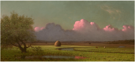
Martin Johnson Heade, Sunrise on the Marshes, c. 1875
“The mood could even be said to be religious: not an aggressive preachment of God’s grandeur but a kind of Zen poise and acceptance, represented by the small sedentary or plodding foreground figures that appear uncannily at peace as the clouds blacken and the lightning flashes.” (John Updike, Still Looking, Essays on American Art)”
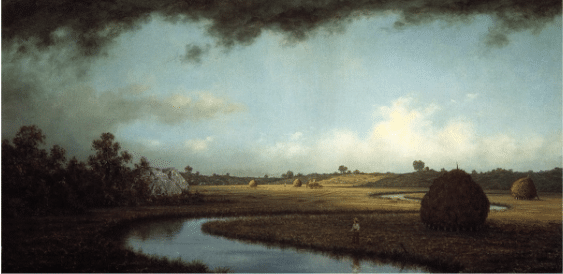
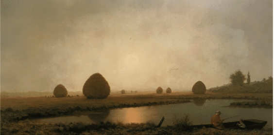
Martin Johnson Heade, Newburyport Marshes, c 1871
As one reader wrote to me recently, it isn’t what you can make people see, it’s what you can make them feel that counts. The great JMW Turner would agree:
“It is necessary to mark the greater from the lesser truth: namely the larger and more liberal idea of nature from the comparatively narrow and confined; namely that which addresses itself to the imagination from that which is solely addressed to the eye.”
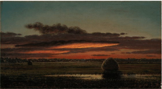
Martin Johnson Heade, Sunset over the Marshes, 1890-1904
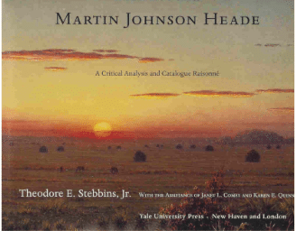
The definitive book on Heade is by Theodore E. Stebbins, Jr. published by Yale University Press.
Making it Contemporary
In her downloadable video, Mary Garrish demonstrates a marsh painting that is more than just how to paint a marsh: it’s a full course in the elements of design and composition by which any painting lives or dies. Download it now.
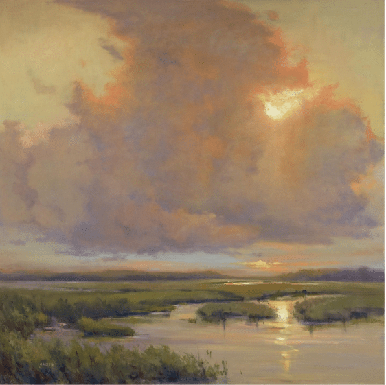
Mary Garrish, Orange Haze, oil, 36” x 36”
Before and After
(Send YOUR patients, I mean paintings, to our Composition Clinic! – We promise not to name names ☺)
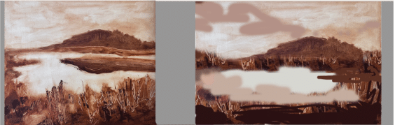
Student underpainting (left) with suggested changes made with image editing software (right). The final painting would need to have plenty of interest in the water to make this composition work.
Above is a before and after comparison of a student under-painting (original on left) that underwent fairly minor changes in an image-editing program on the computer to emerge as a stronger, more satisfying composition (left).
In the original composition on the left, the artis has given almost equal emphasis to the land, the water and the sky. In the name of more satisfying and harmonious interlocking shapes, we can add interest by prioritizing one or at most two but not all of these three elements – land, water, or sky.
Notice how artist Mary Garrish, in her painting “Orange Haze,” prioritizes the sky. But let’s say our student wanted to draw attention to the land. For an improved painting to have as much real estate (space on the canvas) and detail given to the foreground grasses and rocks as in the original, it would probably be best to chop off most of the sky and/or narrow the ellipse of the water, bumping the horizon line up three-quarters of the way to the top. The painting then becomes “about” the grasses and rocks in the foreground.
Alternatively, we can pull back the camera and make it about the water and sky. As in the student example, we can shrink that foreground (things nearer the viewer don’t have to take up more space in a painting just because they might seem bigger in real life – composition trumps transcription – though they surely can and often do have more detail). Then we can concentrate the viewer’s attention primarily on the middle ground (water and land masses) and secondarily on the sky.

The rest of the changes are about “leading lines” and directing the eye more efficiently and subtly (using reflections and shadows instead of the actual landmasses – see left-hand edge and foreground) so we’re moving around smoothly and staying within the four sides of the frame instead of being led out of it.
If you’d like to see an anonymous composition make-over of your own work, send us an image (any size, but bigger is better). We’ll put our best interns on it STAT and post the results here in a future edition of Inside Art.


