Though known for his masterful handling of oil paint and his virtuosity in rendering light and texture, John Singer Sargent created striking, original compositions that did not rely on previous models or inherited rules of thumb. In fact, all the “bravura brushwork” for which he is justly celebrated would be for naught — if not for the unsung geometries (some artists think of them as abstractions) beneath those gorgeous surfaces. This is best observed in his watercolors, painted spontaneously en plein air.
Sargent’s watercolors can suggest the state of feeling very much alive, as when visiting a new place on vacation. They evoke the feeling one has only rarely, of being transported out of the everyday dullness of ordinary life. It’s a moment of mild astonishment at the sparkling visual spectacle that accompanies life fully seen.
It can also be thought of as a moment of fuller living, in which, as writer Colin Wilson says, we realize that life is “self-evidently fascinating and delightful,” – “one of those clear dawns,” as T.E. Lawrence put it, “that wake up the senses with the sun, while the intellect, tired after the thinking of the night, was yet abed.”
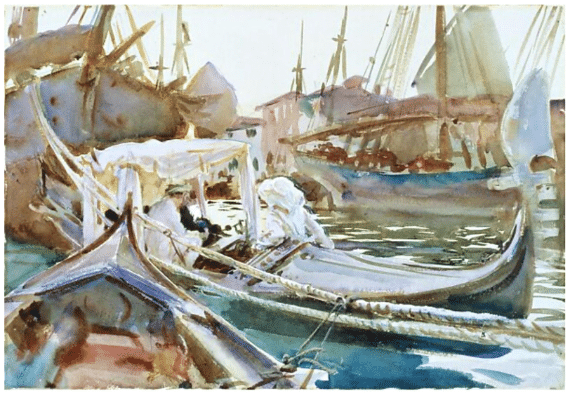
The motif matters little; it’s a portrait of newlyweds in a gondola on the Giudecca canal in Venice. Sargent observed them from a separate gondola; the groom, an artist friend named Wilfrid de Glehn, paints as his new bride looks on. The Venice canal itself has all kinds of romantic associations from previous paintings, but those motifs aren’t being repeated or referred to here; Sargent has no use for them. So what’s left to go by if you resist known compositional strategies? The underlying principles seem to come down to
- Fit the form to the content (allow feeling to guide the big choices)
- Move the eye through the painting (as opposed to pointing it outside of the frame) and
- Create variety within unity (vary everything – size, shape, color, placement, temperature, tonality, marks/strokes, etc).
Let’s look at how Sargent accomplishes these things in the watercolor above.
Sargent’s composition is original; he isn’t repeating the successes of others. He always seems to bring out and cunningly arrange intriguing tensions and rhythms within his motif.
The form fits the content. It’s not just a gondola or the people in it but the lively jostle of the harbor that inspires Sargent, so he channels that sensation (if it had a name, it would be something like “energetic entanglement”) into a cluster of angular, dynamically opposed, yet fluidly connected shapes and lines. Sargent firmly places the moment’s lively, semi-chaotic physical properties fully at the service of the overall feeling expressed: the jostling boats, with their counterpoised rigging, prows, and sails, the gondolas’ sweeping shapes, the marching masts’ verticals vs. the curvilinear ropes and the gondola’s curvaceous horizontality… together with the arabesques of light and shadow on the water, it all conveys liveliness and energy.
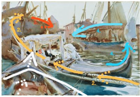
- middle of the painting it’s anything but isolated. All its parts overlap (connect) with all the surrounding “parts” and shapes. There’s a virtual choreography of the surface that I’ve tried to indicate with arrows and numbers:
At 1 or 2, the bottom of the canvas, the eye enters the painting and jumps toward the center cluster of connected shapes via the strongly directional prow of the boat on the lower left. Much of the painting’s immediacy and excitement come from the way “our” boat’s prow is jutting up from the viewer’s space into the picture plane – a hallmark of Italian Baroque painting.
at 2, a directional line (perspective is used to create its directional thrust INTO the picture) along the rope swoops in from the right like a roller coaster with enough propulsion to carry us up to the far left corner and then, at 3., down again and to the right.
At 4, we might end up leaving the painting if not for the masterful use of the gondola’s graceful curving shape to scoop us up and carry us to the top right until gently returning us back to the center and starting point, which we now realize happens to be…
5. one of two figures, not at all visible at once. It’s true the painting’s lightest lights and darkest darks are here, in one of the “power quadrants” of the picture. And yet, the figures are only suggested (the female, to the right, though dead center in the painting, is so enveloped in light that I only noticed her after doing this analysis). In fact, it’s so subtle a “point of interest” that it becomes only a brief resting place for the eyes which immediately continue circulating in and around the picture, creating that lively feeling of interest and dazzle we identified at the beginning.
It’s a good idea to do studies like this of great painters’ compositions once in a while, I think. I think it’s preferable to memorizing lists of basic “design principles” said to inform good composition, especially as no one can seem to agree once and for all what those principles are anyway.