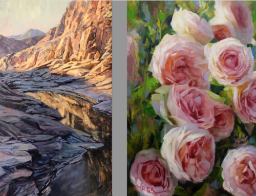
Better a bright painting than a dull one, yes? Who doesn’t like a painting full of light and vitality (although don’t get me wrong, there’s a place for somber and melancholy work too, I hasten to add). Many a painter has started out with bright colors only to find themselves unable to get anything bright enough. The reason is that your brights will only be as bright as your darks are dark.
Intermediate painters (which I count as anyone with more than, say, a dozen or so canvases under their belt) if they want to improve must go beyond the beginners’ basics of composition and color mixing that confront everyone at the start. We invite you to go deeper and avoid some not-so-obvious gaffs as we cover them in the first of this three-part series.
Level Up #1: Values – the missing last step. Remembering to look at values apart from color is crucial. The very last thing you should do with any painting is adjust the relationships between the darks and the lights. Most intermediate students don’t have enough controlled contrast in their paintings. The longer you work on a painting, the more aware you need to be and the harder you must fight against the lights and darks converging toward the (visually boring) middle of the value scale.

The Value Scale. You can do worse than to practice painting using this one as a model. Use a box cutter to cut a 10 in. strip from an 8×10 in. piece of canvas board (or paper if that’s your support) and recreate the value scale – ten one-inch shades between white and black.
A general rule is that landscapes, still lifes, and portraits come alive with a few very bright areas that jump off your canvas and a few deep, dark areas that contrast with them and anchor everything down (without creating black holes).
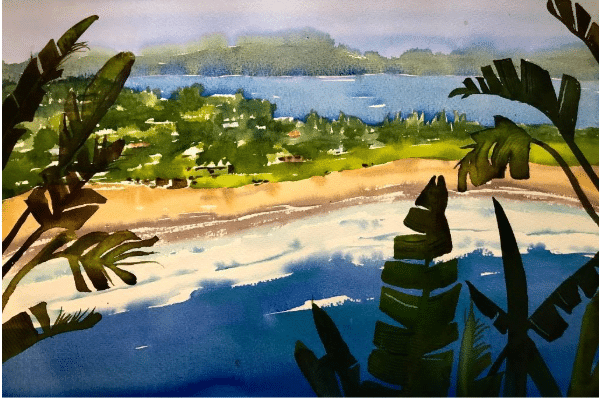
Georgia Mansur, “Palm Beach Vista,” watercolor
Note how bright the lights and how dark the darks are in Georgia Mansur’s painting (above). If we water down the values (by dulling down the lights and washing out the darks) we lose so much more than you might suspect:
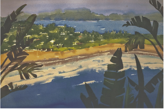
Values flattened toward the middle of the value scale.
THAT’s how important value is in your painting. The last step in painting (in oils and acrylics, not watercolor) is to lighten the lights and darken the darks. By the way, Georgia Mansur teachers a proven “3-Value” shortcut composition method in a video that you can preview here.
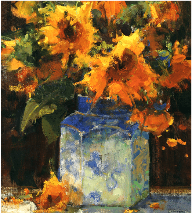
Kathryn Stats, “Sunflowers and Ginger Jar,” Oil, 24 x 18 in.
Kathryn Stats keeps her lights bright by keeping her darks dark (and transparent – by which we mean, not so dark that they lose all detail and act like black holes in the painting – see above: the darks are not flat, they have depth (“transparency”).
Here’s the painting with a lot less contrast, this time with the lights pushed too high without enough darks:
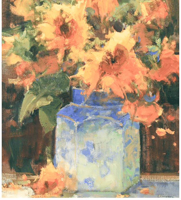
The colors haven’t changed, just the values. (That’s what we mean when we say this is not about color). It’s still nice, but it’s washed out – it hasn’t any of the punch or the grounding of the original, which is much more vivid overall.
Or take Stats’ landscape, “MacDonald Creek,” below. A simple but effective composition divides the canvas into quarters undergird by three varied horizontal shapes (comprising 1. water/foreground, 2, land middle, and 3.trees middle and background) further divided into chunks of unequal visual weight. Stats very effectively connects all these shapes to each other with a curving diagonal line that also invites our gaze from the bottom center and then guides us (like a giant “C”) around and further back into the painting, to the point where the middle ground trees part to reveal distance in the background. The color is lovely but nothing is painted too far from its natural, observed hues unless it’s the violet shadows on the bank.
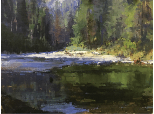
Kathryn Stats, “MacDonald Creek,” oil, 18x 24 in.
The main event is the blaze of light striking an isolated strip of the riverbank and illuminating the foliage of the trees on the right. Tricky spot – to get the sunlight to “pop,” Stats had to keep the ground shadows dark enough and transparent, and to ensure the sunlit trees had enough shadows not to steal all the thunder. Just think about the dramatic range of values between the embankment and the deep dark greens and ochres in the foreground. That’s where value really raises what could have been an average painting to the level of awesome.
Other common intermediate painting mistakes this painting avoids: poor design, such as dividing the shapes (such as the portions of the above in shadow vs. those in light) into equal or similar dimensions, leading to static compositions. Other errors involve having lines “point” directly out of corners or run in parallel horizontal strips, which pulls the viewer’s eye away from the painting. Repetitive or parallel shapes sneak up on you when you’re painting something like clouds, so don’t forget to zoom out and ask yourself what the shapes are doing. And that’s what we’ll cover in #2.
Until then, Kathryn Stats has a whole handful of teaching videos to check out, including her popular tutorial, “Painting the Effects of Light.”
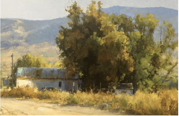
Kathryn Stats, “High Country Summer,” Oil, 20 x 30 in.
And so does Christine Lashley, whose paintings are admired for their vibrancy and sparkle.
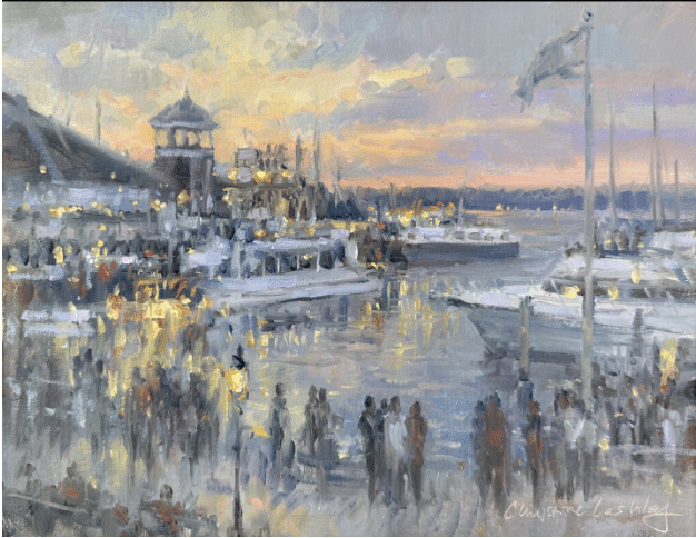
Christine Lashley, Harbor at Twilight, Old Town, oil, 11 x 14 in.
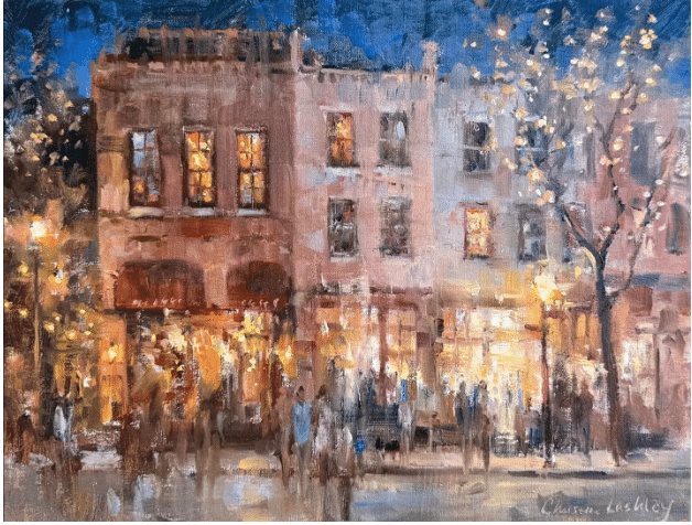
Christine Lashley, Old Town Tonight, Oil, 11 x 14 in. Christine teaches her bright style in a video titled “Paintings that Sparkle”