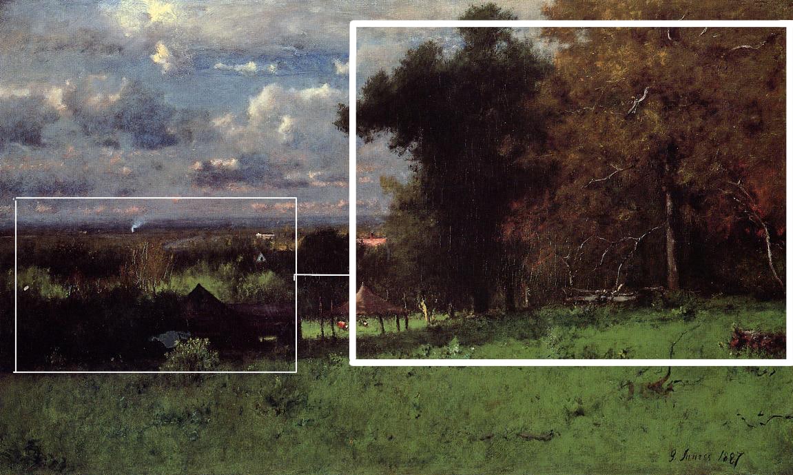
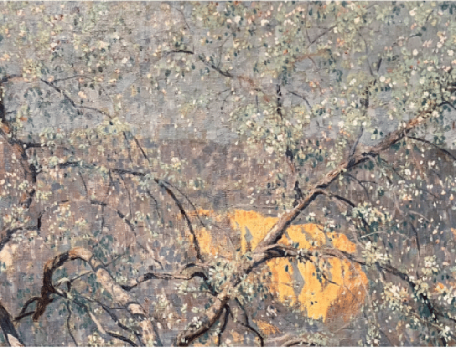
Here’s an old but sound definition: “Composition is the orderly and harmonious grouping and arranging of lines and masses so that they will present a pleasing relation to one another. Unless the various parts of a design or picture are so arranged, they are simply isolated parts and have nothing of interest or value.”
A good composition establishes dynamic relationships between the elements of a picture. Of the many compositional strategies artists have discovered, these are three of the simplest and most widely useful:
- Steelyard
- Pyramid
- Circular
Steelyard
The steelyard composition sounds like it emerged from the gritty early modern-art scene of the 1910s-1930s. However, as I understand it, it’s not named after a horrible place to work but after a balance-type weighing device invented by the ancient Romans. I’d been led to believe at one point that is was named for an artist by that name who often used the composition, but I think someone just didn’t know about the Roman-style scale.
The steelyard composition creates balance between two or more elements that are very different from each other. Usually, it’s one large mass counter-balanced on a theoretical fulcrum by a smaller mass, often further away from the center.
- Creates balance while avoiding monotony
- Generates a mild but lively tension between forms
- One of the most common & effective compositional strategies
The steelyard is a great way to create interest in your designs through asymmetry, which brings with it a healthy degree of tension between the related yet “mismatched” elements. Asymmetry, the opposite of mirror-image similarity, keeps things from getting boring and repetitive while still preserving a “harmonious grouping.” It’s a big part of creating variety, the lifeblood of composition.
Composition is one of those things that’s only apparent once you look for it. It’s a mistake to dismiss Jackson Pollock’s paintings as chaotic splashes, scribbles and drips. Anyone who really looks at a Pollock in person discovers that not only are the lines intricate, elegant, and expressive, the overall composition is as sensitively constructed and as sound as anything by Andrew Wyeth or Monet.
Even Mark Rothko’s fields of vibrating color are anything but monotonous when you see them in person. Rothko’s compositions consist of two or three distinctly varied rectangular color fields, and within each one you see varied edges, shapes, proportions, paint density, color shading, lights and darks – there’s a ton of variety there, it’s just super-subtle and anything but obvious. Rothko put the principles of composition to work in ways that Western art never had before. If you can let go of your expectations about what a painting is supposed to look like, the effect of standing in front of one of his paintings can be akin to a spiritual experience.
We’ll look in depth at the pyramid and circular compositions in follow-up features, coming soon to an inbox near you. If you have your own compositional strategies, send them in. We’ll publish our favorites here in a future issue of Inside Art.


