You can learn almost everything you need to know about composition by closely studying successful ones. To that end, we recently invited you, our readers, to send us paintings for our “Compose Yourself!” series of columns on how composition works in painting. This week we received several images, among them two by artist and illustrator Howard Pyle. If you have a painting we can deconstruct for composition in an upcoming issue, please send it along!
Composition and Design in Howard Pyle’s “Marooned”
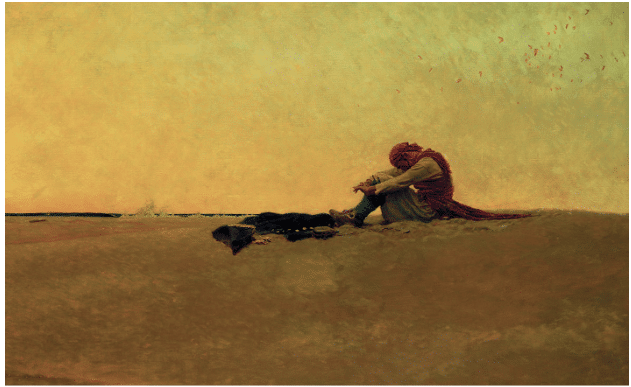
Evocative and emotional, “Marooned” by artist and illustrator Howard Pyle (above) uses composition expressively, as do many great works of visual art. We’re going to explore Pyle’s use of design in “Marooned” and in another marine painting of his, the latter of which involves perhaps the very gang from which our picturesque castaway has been separated.
Pyle is remembered as one of the leading lights of the “golden age of illustration” during the decades immediately before and after the turn the 20th century. His work is marked by dramatic narrative content and imagination, brought to life with an expressive use of color and composition.
“Marooned” might suggest a shipwreck, but the man’s (intact) clothing gives us the essential clue – his red bandana tells us he’s a pirate, and he has been left on this barren desert island to perish as punishment for some unknown crime.
The composition in “Marooned” is dominated by vast stretches of negative space – between a hot, cloudless expanse of sky and an equally desolate landscape
The high horizon line pushes the figure back, away from the viewer, stranding him between the two slabs of near-equal blank linear space. The flat sky presses overbearingly down. The color suggests a parched, waterless heat. The figure slumps forward; his withdrawal into himself contrasts with the awful expansiveness around him, turning the sense of isolation up to 11.
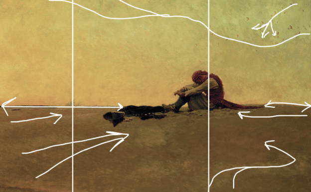
The only other thing breaking that flat sharp horizon line (besides the forlorn figure) is the spray from a wave breaking against the island. This design choice does two jobs at once – it relates the figure directly to the pitiless elements, and it divides the space into thirds where, front and center we find the man’s crumpled, discarded coat.
Unrelieved by verticals, the horizon line just slides back and forth, suggesting the feeling of abandonment and isolation, while minimal diagonals at the corners work to point us in and toward the figure.
Pyle’s composition very successfully conveys a sense of hopelessness and desolation. The scattered flock of birds spreading across the sky in the righthand corner might almost seem to mock the doomed subject’s confinement.
We can learn from the equally expressive use of composition and design at work in another of Pyle’s dramatic illustrations, “Attack on a Spanish Galleon,” which is below.
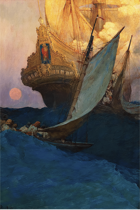
Howard Pyle, “Attack on a Spanish Galleon,” 1905
This one is among Pyle’s most famous works. “An Attack on a Spanish Galleon,” appeared in Harper’s Monthly Magazine in 1905, as part of an article Pyle wrote titled “The Fate of a Treasure Town.” The painting is owned by the Delaware Art Museum, which also owns an excellent 1942 student copy of “Marooned.” If you’re interested, you can see pictures from the painting’s restoration in 2022 over here.
Pyle’s “Attack on a Galleon” (above the Schoonover image) packs visual punch because of the composition, which also expresses the content and enhances the underlying narrative. In this work, a richly appointed ship is beset by a band of pirates (also wearing red bandanas, like our man in “Marooned.”) A ship like this would have been carrying the plundered wealth of the “New World” to the Spanish crown in the 17th century. Such ships were often attacked.
The massive galleon tilts away to the left, at the mercy of the small, lethal pirates’ crafts. “Billowing smoke illuminated by gunfire,” says the Delaware Museum’s wall text, “signals the assault overcoming the galleon’s crew. The ship’s majestic icon, as yet unscathed, looks down upon the ruthless action.”
One critic wrote that the illustrations for “The Fate of a Treasure Town” were the “sensation of the magazine world…each one marvelously rich in color…dramatically stirring and vividly romantic.”
It’s not immediately apparent, but there are two marauding boats here. One (the left) waits to board as the other’s partially hidden crew attacks. Pyle has used design to enhance the drama by tilting the masts of the ornate galleon to the left (green lines) and skewing the masts of the scrappy pirate vessels to the right (white lines). The crowded and opposing verticals expresses a tremendous amount of tension, and the conflict is heightened by the simple broadsail crossing in front of the fancy ship’s stern.
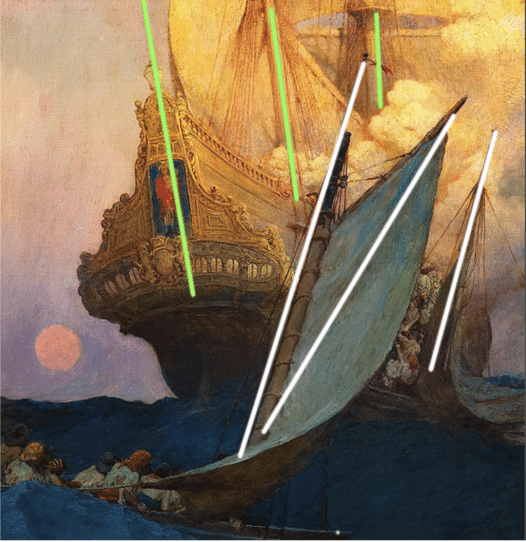
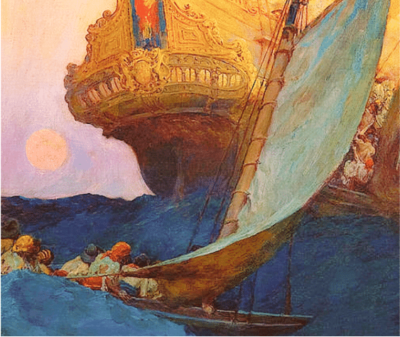
In the detail above, you can better see the two small sail crafts attacking – tucked behind the greenish sail of the main foreground ship there’s a narrow column of men scrambling aboard the galleon. We know they’re the bad guys because at least one of them is wearing the infamous red “pirate” bandana.
As a side note, it may be heartening for artists to know that Pyle used references for his work just as much as anyone else. We can see this at work in a similar illustration he did in 1898 called “The Burning Ship.”
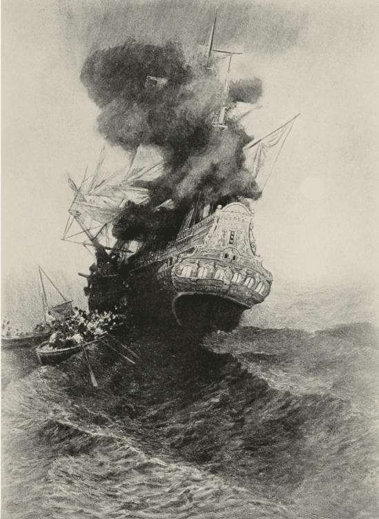
“The Burning Ship” by Howard Pyle, black and white oil on canvas, 1898. The original is on display in the Delaware Art Museum.
As maritime historian Benerson Little points out, the details of Pyle’s burning galleon match up pretty closely to those in a woodcut by the 17th century Dutch artist Wenceslaus Hollar showing the stern of a Dutch East Indiaman trading ship – just the sort of thing for piratical shenanigans.
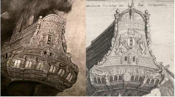
Details from the Pyle and Hollar illustrations.
If you’re captivated by the idea of painting the ocean, you might want to check out some of the teaching videos on offer over here.


