The title of this post about mixing colors without “making mud” is a bit deceptive. When it comes to color mixing, there’s actually no such thing as “mud.”
Don’t believe me? Look at the colors that dominate the lower right quadrant of the following painting by Stephen Quiller, below.
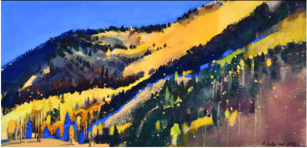
Stephen Quiller, Autumn, Snow Shoe Mountain, 10.5” x 20.5” watercolor and gouache
Well, yeah, there’s “mud color” there, but it only makes the painting better and more interesting. After all, look how well the relatively murky reddish and greenish browns (quite beautiful as colors in themselves) relate to the acid greens, errant mauves, middle-ground blues, and splattered yellows. Think of its role as a muting and balancing “earthy” element next to the electric mango orange in the mountain and the glowing field of saturated blue in the opposite left top corner. Paint that is the color of mud is fine and absolutely right when placed on a canvas with intention and in relationship with other colors.
“Mud” (the bad kind) is something that happens not on the palette but on the canvas. So-called mud happens not from mixing but from smearing paint, usually because you’re either not thinking about what you’re doing or you’re using TOO MANY BRUSHTROKES in a desperate effort to “fix” something that isn’t working in your painting. Either way it ends in a helpless fugue state as you desperate.y try to blend paint into submission (resulting in mud). It’s not the color that’s the problem – it’s that everything’s just mushing together, all of it out of control.

Mud? Not if it “works”!
Nine times out of ten, the trouble isn’t even color at all, but value. In terms of contrast, “mud” lacks it; it sits at the center of the value scale, losing all dynamics of bight vs. dark. So when in doubt, forget color and think only in terms of dark and light – are the darks dark enough? and are the lights light enough? (If you can’t get your lights light enough, darken your darks, and vice versa).
If you find yourself dealing with “mud” on your canvas, it’s time to clear the slate. Scrape it away or paint it out. If it’s still wet, take a palette knife to it and just scoop it off the offending area, rethink, and remix your color to the proper value and then put it back fresh. If it’s dry, paint over it.

Stephen Quiller, Pond by Tahoe Lake, 18” x 24,” watercolor
Something Only Experienced Painters Do
Experienced painters tend to pay as much or more attention to what’s working and not working on the canvas as they do to whether what’s in the painting looks “right,” which usually means looks like other paintings or like what’s “out there.” But think, in the painting above, how much of what we assume to be trees and brush is not detailed draftsmanship but free, amorphous shape and color. Ultimately, it’s not accuracy or “faithfulness” to the visible (to the particular tree, foliage color, or ocean wave), but only what ends up on the canvas that makes a painting live or die.
Consider everything – color, shape, value, stroke – in relation NOT to what’s “there” (in the world) but to everything else on the canvas. If you’re still dead in the water, take a break. Come back later and you’ll see the big picture better. Know that it’s the clear expression of vision and the harmony and integrity of the painting, not what it’s a painting of, that matters most.
Stephen Quiller has a video that starts with the basics of color for artists and moves into the sense of freedom that comes from understanding it thoroughly. Check out “Color Foundation for the Painter” here.