Painting is about feeling, evocation, and “stories” (in the widest sense). The paintings that stay with us often touch upon the mysteries of life, transporting us into realms of mind, imagination, and emotion. But how is it done?
The first requirement is letting go of needing to get it “right.” Basic drawing skills are a pre-req, sure, but feeling, or “mood,” arises not from what you paint but how you paint it. And mood in painting usually comes down to how you handle color, values, and edges – all the “non-descriptive” aspects of painting, really.
It’s a bit like the difference between poetry that evokes and prose that describes. If the goal is atmosphere and mood, the strategy changes from being “correct” or “believable” to something closer to psychological and expressive. The primary goal becomes not correct composition or perspective (which may or may well not be important) – but rather whatever triggers that elusive moment of emotional experience, recognition, and connection with the viewer.
The Role of Color
Color is one of the most potent tools for conveying mood. Yes, each hue carries its own psychological and emotional associations, but you’ll get more milage by thinking in terms of temperature (warm and cool) and chroma (or intensity).
Warm and intense colors, like undiluted (high-chroma) reds, pinks, yellows, oranges, saturated aquas and greens are thought of as high-energy triggers. The cooler, more subdued crimsons, blues, Naples yellow, ochres, raw earths, violets, and grays – or any subdued, less intense/chromatic colors, really – are frequently used to suggest feelings of calmness, serenity, thoughtfulness, and melancholy.
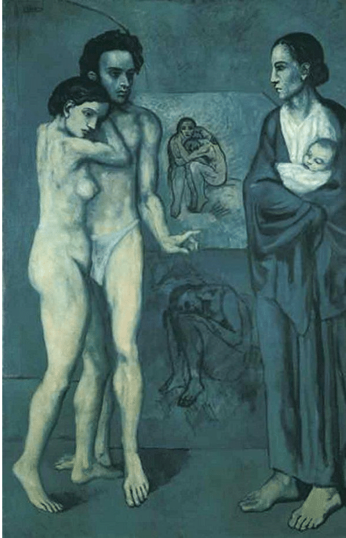
Pablo Picasso, La Vie, 1903
*(Chroma means how “pure” or rather undiluted a color is. It’s like “intensity” in photo editing software. Cadmium yellow out of the tube is an obviously high-chroma color – dilute it by adding a little purple or some burnt umber or yellow ochre and you will gray it somewhat, make it less pure and intense, or as some say, “knock back” the chroma.)
In terms of value, similarly matched values convey balance and, often, a sense of soft or
“quiet” calm, whereas high-contrast areas of dark and light again convey intensity, a sense of “loud” rhythm and vibration. Crucially though, it’s largely how the artist combines and juxtaposes (places side by side) these colors and values that conveys a painting’s mood.
Consider one of Picasso’s blue period paintings, his “Life” from 1903 (above). This early work was inspired by Picasso’s own emotional turmoil and financial destitution during the period (1901-1904). (Newly arrived in Paris from the country with little to no money, Picasso and his best friend from back home were sharing a tiny apartment when the friend, a poet, committed suicide.)
Picasso’s melancholy mood literally colors this period of his work in a way no other artist had ever done before. And yet the imagery moves beyond his personal problems and leans into the universal.
The close and uniformly cool hues and subdued values align with the mysterious figures to create a mournful poetic vision of the cycles of human life. These blues are all low-chroma, edging toward grays. There’s contrast where there needs to be, and accuracy too, but these go in and out of focus, as it were, and play supporting, not primary roles.
The mixed imagery defeats a simple narrative, and the transposition away from the expected colors of daily life removes the scene from ordinary reality and places it in the realm of symbolism and mythology. It’s dark and brooding but also far-seeing and suggestive.
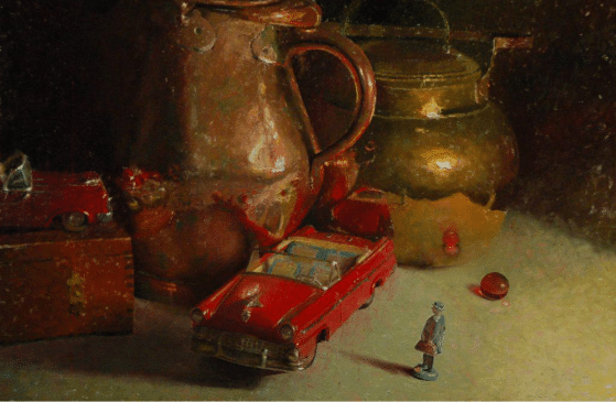
CW Mundy, Off to Work, oil, 24” x 36”
Composition, Arrangement, and Atmosphere
Beyond color, the composition and arrangement of elements within a painting shape mood and convey meaning as well. The placement of objects, the use of perspective, and the overall layout influence how viewers perceive and experience any painting. In the Picasso above that we’ve been studying, the shallow, undefined space and divergent gestures of the closely grouped (yet ambiguously related) figures suggest a somber, ancient drama or story lost to history if not entirely outside time.
In the still life above, C.W. Mundy uses composition to suggest a variety of “stories,” otherwise known as potential meanings. Traditional subjects of still life – brass kettle and copper pitchers – are crowded into a shadowy corner while less conventional subject matter literally takes the spotlight. Here a playful double-meaning comes in – on the one hand, these are toys, on the other they’re antiques, suggestive of lost youth.
The distance between the car and the lead figure – a stereotypical businessman with a briefcase and an overcoat – leaves the man, a stand-in for the viewer, isolated – neither touching nor reflected by anything else in the arrangement. The overall warm light softens the blow and wraps the whole in nostalgia for the past.
Atmosphere relates to the amount of diffusion or deliberate indefiniteness (essentially, either under-drawing or over-blending in the work). Softened (blended) often called “lost” edges leave areas of a painting less defined and therefore require the viewer to become actively involved in completing the image, using technique to convey the work’s emotional content. Strongly atmospheric paintings minimize or eliminate hard edges and attention-getting contrasts. This can evoke an aura of memories or dreams.
Mood in painting is a complex interplay of color, composition, technique, and style. A viewer experiences a painting as an emotional journey when the artist has aspired to convey something of the depths of human feeling.
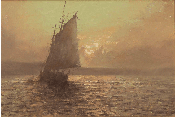
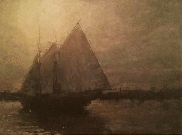
CW Mundy, Sunset Sail, oil, 24” x 36”
CW Mundy has a way of teaching that encourages you to shut down your internal self-talk and just paint without stress and the anxious voice of criticism coming from inside your own head. He shares numerous insights from a 60-year career as an artist and illustrator in his video, Painting with Freedom. Download CW Mundy’s video now.