“It looks flat” is something you hear sometimes during a critique, but what exactly does that mean? I think there are two main criticisms wrapped up in “flatness.” One has to do with depth (how far back your painting goes) the other with breadth, or rather, horizontality (how literally flat and devoid of verticals it is). Good landscapes have a balance between verticals, horizontals, and diagonals. Next time
Another word you sometimes hear to describe paintings composed of unrelieved by verticals or diagonals is “stripy.” By their very nature as horizontal beasts, landscape paintings are prone to “stripiness,” flattened by unbroken parallel shapes stacked neatly one on top of the other.
This can result in paintings that feel lacking in energy or interest. Such paintings have a serious underlying structural problem too: there’s nothing to stop a viewer’s eyes from gliding straight out of the painting’s frame. Below we give an extreme example of stripiness in landscape representation.
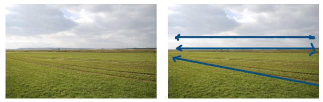
The photographer of the stretch of land above wasn’t trying to do anything more artful than record the geography of the area and show how devoid of hills it is. The horizon line is flat and unbroken and the only strong leading line, that of the diagonal that starts at the bottom righthand corner, actually encourages us to leave the composition by pointing to somewhere outside the frame. This is not a dynamic or even a particularly interesting or aesthetically pleasing image, nor was it meant to be.
B-O-R-I-N-G. Most landscape painters feel it’s their duty to do something nearly the opposite of this example. Traditionally, they aim for aesthetically pleasing compositions that move the eye around within the frame and actively keep the eye from leaving by creating curbs and roadblocks. What follows are strategies to counter stripiness with dynamic design. Most strong compositions utilize more than one of these in combination.
Put in Roadblocks
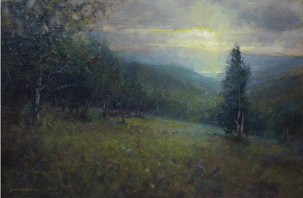
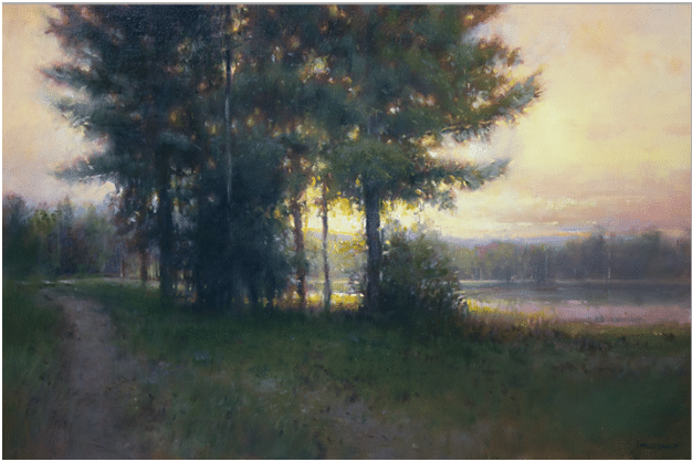
Perhaps the simplest fix is to disrupt horizontal lines and masses with vertical ones. In the paintings above and below (Moonlight from Petersburg Pass and Harmon Pond), artist John MacDonald has placed a variety of verticals (in this case, trees) strategically with this in mind. Framing the scene with trees, he also divides the horizontal space, varying the “rhythm” (the intervals between the horizontal shapes and the interposed vertical ones). In both paintings the effect is to keep the eye from being able to follow the horizon line (or even any horizontal lines) sideways out of the picture.
John MacDonald, Harmon Pond, 9” x 12,” oil on linen
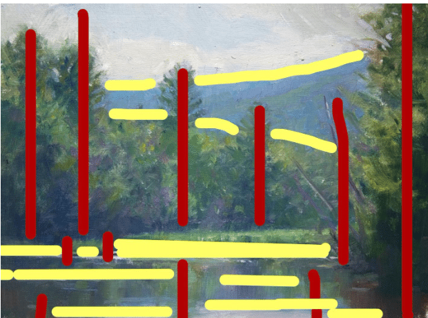
There are also some dynamic diagonals here – particularly the tree trunks jutting out from the right bank – which serve the same purpose while introducing yet more variety. The diagram below shows how in this painting the vertical roadblocks (red lines) break up the horizontals (yellow lines) and stop them in their tracks before they can travel out of the frame. The only horizontals allowed to leave the premises are two at the lower left corner.
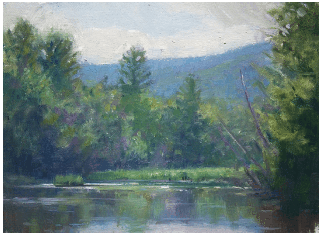
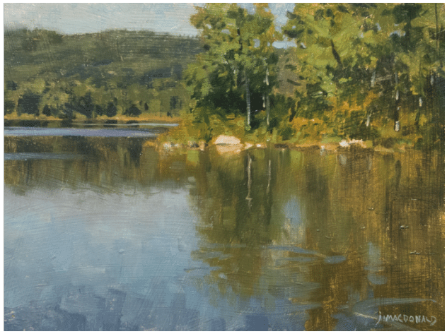
The other major strategy in this regard is to group all the verticals into a large mass that takes center stage, allowing less of the horizon line to show, and then only in relatively small (note, also varied) stretches at the edges. That’s what’s at work in the next, MacDonald’s Pines at the Clark. MacDonald disrupts the horizontality not with many but with one major vertical mass (or mass of verticals, technically).
The grove of pines he plants there is so tall and wide that the equation between horizontal and vertical is completely upended by just this one dominant intervention. (But note how he also pinched off the left edge of the water to a point (over where the trail disappears) to avoid a potentially uninterrupted “stripe” caused by the water’s two banks. Sure, this may be what was actually there, but it doesn’t have to be.
John MacDonald, Pines at the Clark, 16” x 24,” oil on linen
Even if this painting is a “faithful” rendering of reality (which only matters from a technical perspective), MacDonald still had to choose his vantage point and consciously design the composition; he had to compose it in a way that checked the “not too stripey box.”
Add Verticals with Strong Visual Weight
Instead of using verticals to disrupt the flat lines, another way to go is to add and accentuate vertical elements with significant “visual weight” (relative ability to draw the eye). Add counter–horizontals with vertically elongated clouds, reflections, tree trunks, buildings, or any number of other up-and-down elements.
In Mausert’s Pond, Clarkesville, below, MacDonald uses the reflections in the water as a counterweight. He designed this one with a high horizon line that gives more than half of the painting to the vertical elements.
John MacDonald, Mausert’s Pond, Clarkesville, 9” s 12,” oil on linen
In Beyond the Marsh, below, MacDonald uses a foreground tree to disrupt the horizon line, but he also loads the foreground vegetation with a series of sharp, staccato vertical marks echoed by individuated tree trunks in the middle ground. The background hills curve inward and converge toward the center. It all adds up to strong vertical vs. horizontal energy – an enlivening tension, which is what we talk about when we talk about dynamic composition.

John MacDonald, Beyond the Marsh, 16” s 20,” oil on linen
We’ll cover three more important tools for avoiding flat paintings in part two, including how to use diagonals, curvature, and non-parallel lines to keep things from getting boring.
In his teaching video, Dynamic Landscapes, John MacDonald covers how to create effective composition and value structures plus a slew of other game-changers. These include finessing variety and contrast in shapes, values, colors, edges, and details, changing your view to make sure each painting is a brand-new invention and not a copy of what you are seeing, and creating a hierarchy of importance among the painting’s visual elements (where does the eye go first, but also where does it go second and third and after that?). Check it out here.
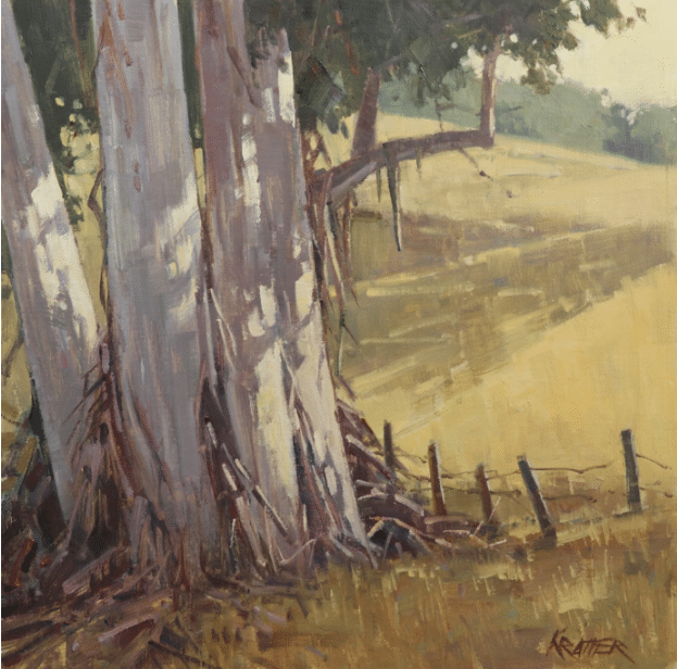
Paul Kratter, Baked!, 12” x 12” oil
Use Diagonals
A surefire way to defeat stripiness is to consciously pull diagonals into the composition (whether they’re obvious in the landscape you’re looking at or not).
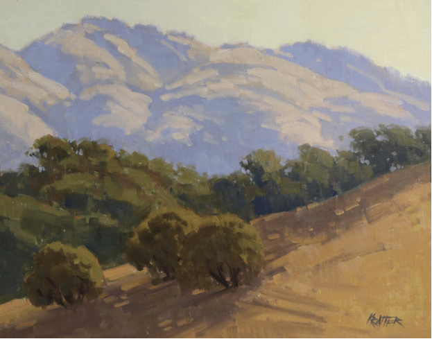
Paul Kratter, Warm Slopes of Diablo, 11” x 14,” oil
In the painting Warm Slopes of Diablo (above) Paul Kratter has pretty much eliminated ANY horizontal lines. Everything is a diagonal – foreground, middle-ground, background mountains.
Build in Circular Design Elements

Paul Kratter, Return to Curry Canyon, 16” x 16” oil
Once again, there are relatively few horizontal lines in Paul Kratter’s painting Return to Curry Canyon, above. In this composition, however, the most prominent leading lines are curved. The tree’s foliage spreads above in a gentle arch, to be answered by the rounded, “u” shaped dip in the dry creek bed directly below it. Together they form a circuit for the eye, which therefore stays in the middle of the painting instead of being escorted to its edges (and out of it). The bank on the left curves downward, the one on the right curves upward (the pointing shadows on either side emphasize these directions). The upward curvature and the downward curvature work together to embed a “secret” circular composition that defeats any untoward horizontality and keeps our eyes circulating smoothly around and around within the painting.
Eliminate Overly Parallel Lines
This one’s subtler and harder to see, but in the painting below, in contrast to the previous two, Kratter uses almost nothing but horizontal lines. However, he subtly varies the “straight” lines with rhythmic curves and widths to successfully keeps things from getting too stripey.

Paul Kratter, Two Headlights, 15” x 29” oil, original above, diagrammed below
As you can see in the diagram, where the several pairs of potentially parallel lines are color-coded, when one line curves up, the one below it curves down.
Change Your Format
Notice how, of all the paintings we looked at, the last one with the most horizontal lines (Two Headlights, 15” x 29”) was also in the most extended “landscape format”? The others were mostly squares, with the exception of the 11” x 14.” Coincidence? Nope. A good way to train yourself away from the flat, stacked horizontal landscape is to vary the format. You can sometimes break the horizontal habit by painting the same scene as a horizontal or a square and deliberately adding strong diagonal or circular compositional elements. Then when you return to the scene of the crime, your horizontal landscapes will stand a better chance of lively, dynamic design. (See Return to Cury Canyon above).
In his teaching video, Landscape Painting and Design, Paul Kratter covers a wealth of insight beyond the basics of design. Paul demonstrates things such as how to make objects such as mountains or trees seem tall and majestic – or, alternately, how to make them recede in space. He also covers brushwork, leading angles and shapes, how to make believable rocks and the virtues of the three-value preliminary sketch. Check it out here.