“Having your head in the clouds, even for just a few minutes each day, is good for your mind, good for your body, and good for your soul.”
– Gavin Pretor-Pinney
“Paintings of clouds are just what the world needs now,” proclaimed a Canadian newspaper article about a recent storm-front of art shows featuring paintings of clouds. “When the earth feels like it’s on fire, the sky – ever-changing, yet essentially the same – is a source of comfort and insight. Here’s how the professionals try to capture its chaos in art.”
For those who are game to “capture chaos” and create the very skies that the world needs now, we offer the following practical advice on how to paint clouds.
Joseph McGurl, Port of Entry, 24″ x 36″ – McGurl is a master of light on water and clouds. He teaches his technique in several popular videos.
#1. Use your clouds as a design tool. Number one rule, always. Contrarian? Maybe, but true, and let me tell you why. The tendency is to paint clouds as are and where they are located/positioned in real life (or accordint to a reference photo). But doing so automatically disrupts arguably the most important aspect by which painting live or die – composition and design. Instead of painting random clouds without consideration for the rest of the composition, use them strategically in relation to the rest of your painting. That means using them as directional shapes, with edges that “point” the eye and keep the viewer’s gaze circulating within the picture’s frame instead of point the gaze out of it (which is what 90% of “accurate” sky renderings would do). Think of them not as clouds but as shapes in the overall composition to be arranged in terms of placement, size, and directional push and pull.
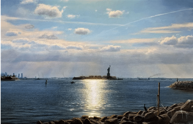
Here’s an example that shows how that plays out. In Port of Entry, above, Joseph McGurl balances long and short cloud shapes in the sky with long and short shapes in the rocks and land masses below. When it comes to rendering a single one solid horizontal band of cloud stretching all the way across, he is careful to raise the edges on both sides so as to form a subtle “V” shape, both sides of which “point” inward, toward the middle of the composition, where the Statue of Liberty forms the main point of interest (the painting isn’t titled “Port of Entry” for nothing).
In addition, McGurl emphasizes the design element by using airplane trails to form a sort of celestial bower or double arch over the main subject (the statue). Finally, even though the monument itself is right of center, it stands smack dab in the middle of the rays of sunlight descending from above and falling on either side of it. Coincidence? Don’t make me laugh. That’s properly using clouds as a design tool.
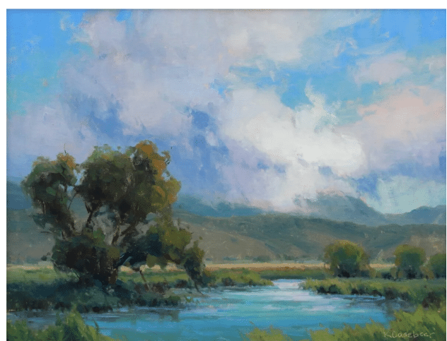
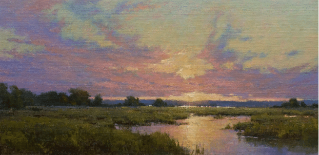
Kathleen Hudson uses her clouds as structural elements in the composition. She makes the main cloud mass on the right taper down like a funnel, with directional reinforcement from the strong diagonal cloud shadow that slides into it from the left side of the canvas. Both shapes converge over the distant area of mountains in atmospheric perspective, where we’re treated to a surprise: rain falling in the distance.
Another design master, Kathleen Hudson teaches her realistic cloud techniques in her video titled Clouds & Distance. As we saw in McGurl, Hudson’s clouds are as important a part of the composition as anything else. Here (in the painting above) they reinforce the movement of diagonal shapes formed by the mountains converging toward the right side of center.
#2. Some artists paint the sky first, leaving spaces for the clouds. Others paint the clouds first, then put the sky around them. Either way, probably don’t paint the whole sky flat and then try to paint the clouds on top of it – it’s too much work. If you’ve painted the sky first and the clouds have a pasted-on look, hit some of the edges with a “dry” (meaning clean, no paint and no thinner) blending brush (like a small or medium filbert). Lightly tickle the edges where the clouds meet the sky using little taps, leaving some edges “lost” (blended) and others “found” (harder-edged). And when you do this, position your brush so as to pull your clouds’ edges in the direction the wind is blowing (doesn’t matter which direction, as long as you’re consistent – see #3).
#3. Clouds obey the wind and the light. Just as your landscape has a “point of light” or directional light that the shadows obey, your clouds have a “directional wind” that their edges obey. Vary the sizes, shapes, and placement of your clouds, but be pay special attention to angling the edges uniformly, as if the imaginary wind is blowing them all in the same direction. Do this and your clouds will take an instant leap to be more believable.
Even though Cindy Baron in the below example uses her clouds to emphasize her painting’s point of interest and to enhance the overall perspective, you can tell the wind is blowing from left to right – all the clouds drift (get pulled) or trail off in the same direction (right in this case).
Cindy Baron paints clouds in oils and watercolors.
If your clouds are cumulous, treat the puffs like spheres, which means they should have a highlight and a shadow side. Note in the cloudscape by Katherine Hudson below that the highlight (where the sunlight beams onto the curved edges) appears not flush with the edge (too predictable) but near it, with the clouds’ rounded edges getting less light as their surfaces curve away from the viewer (see the yellow circles in the image below).
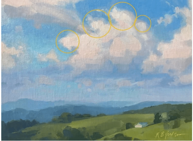
Kathleen Hudson, Afternoon Sky, showing her technique for creating volume and treating clouds as 3-D masses
#4. Clouds follow the rules of perspective, both as a group receding in space toward a vanishing point, and as individual masses. All but the wispiest clouds are three-dimensional objects! Think of them as boxes or pyramids – the bottom is (generally) parallel to the horizon, but their tops and sides should be varied and shaped in perspective with the rest of the painting.
As noted, not just individual clouds but entire skies follow the rules of perspective too. In the painting we looked at by Cindy Baron (see example #3 above) the clouds enhance the illusion of perspectival space, with all the lines converging at the point of the setting sun, which “just happens” to be going down at an ideal point of division around which the whole rest of the landscape is laid out in balanced perspectival proportion.
#5. A word about the sky. Some artists swear by a touch of yellow ochre or cadmium something at the horizon, while others say the sky has to be cooler at the bottom and warmer at the top. Perhaps it depends on the time of day. (Who’s right? Who knows. There are no unbreakable rules in painting!)
Everyone agrees though, that the sky is darker in value at the top and relatively lighter at the bottom, like a dome over top of us. And in addition to shifting in value, the sky gets slightly warmer toward the sun’s position and cooler as it curves away from it.
There’s a lot more to be said about painting skies and clouds, and these are far from hard and fast rules. This is painting, after all! (Rules? Ha ha ha!) But keeping a few guidelines in mind will at least give you somewhere to start.
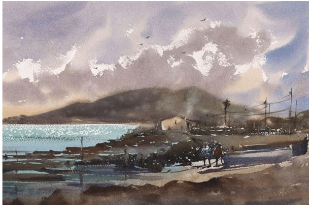
Keiko Tanabe paints watercolors that often include fantastic, rhythmic, and dramatically lit skie
By the way, in addition to the individual videos they make, all of the artists featured in this post are collected in a single video, Clouds & Sky. This is a compilation of 14 artists and their methods and advice for painting successful and spectacular clouds. It’s a full course created for landscape painters, skyscape painters, watercolorists, and oil painters at any skill level.
May your clouds always drift and billow and sometimes even dance across your canvas. And may all your skies be blue.
This is a compilation of 14 artists and their methods and advice for painting successful and spectacular clouds. It’s a full course created for landscape painters, skyscape painters, watercolorists, and oil painters at any skill level.
May your clouds always drift and billow and sometimes even dance across your canvas. And may all your skies be blue.