French painter Eugene Delacroix’s (1798 – 1863) work epitomizes the setting-free of painting from the strict classical ideals of the Academy that had come before. From an artist’s inside view, we can see Delacroix’s technique was about designing in color and value masses rather than linear drawing, which, though equally important, came in relatively late in his process.
Here’s a quote from Delacroix’s Journal for May 5, 1852 (Walter Pach translation):
“One should lay in one’s picture so that it has the look of representing the scene on a gray day, without sun, without clear-cut shadows. Speaking radically, there are neither lights nor shades. There is a color mass for each object, having different reflections on all sides…. How strange it is that this truth has been understood by only a very small number of great painters, even among those who are regarded as colorists.”
In other words, he advises the artist to begin by “laying in” (painting quickly, thinly, and roughly) not “things” but color-value shapes (“tones” and “masses of color”). Refining and focusing the shapes from there, the things, even “lights and shades,” will take care of themselves. Keeping the attention on shape and tone that far into a painting is still a bit of a radical approach and a challenge. The mind really, really wants to draw and paint the things! But Delacroix is saying no, trust the eye as long as possible. Another interpretation I’ve heard goes, “When the tones are right, the lines take care of themselves.”
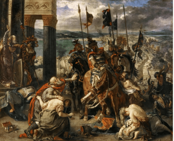
The painting at the top of the page depicts a brutal episode of the armed European invasions of the Middle East in the name of Christendom known as the Crusades, a military attempt to “take back” the Christian “Holy Land.”

Detail, Eugene Delacroix, “The Entry of the Crusaders into Constantinople,” 1840, oil on canvas, 498 cm × 410 cm (196 in × 160 in).
In this particular expedition, a Crusading army in 1202 abandoned its plan to invade Muslim Egypt and Jerusalem, and instead sacked the Christian (Eastern Orthodox) city of Constantinople, today’s Istanbul, then the capital of the Byzantine (Eastern Holy Roman) Empire. The painting was exhibited in the Salon of 1841, where the painterly romanticism of its style seemed an attack on the classicism of the Academy.
The French Neoclassicists stood squarely on the “designo” side of the old “designo vs. colore debate.” For them, as Ingres said, “Drawing in everything; color is nothing.” That insistence on the primacy of drawing is partly why Ingres’ “Odalisque” is so haunting. While it’s easy to see why Ingres’ contemporaries respected him, it is, as E.M. Gombrich remarks, “equally easy to understand why his more passionate contemporaries found such smooth perfection unbearable.”

Jean-Auguste Ingres, “The Grand Odalisque,” 1814, oil on canvas, 35 x 64 in.
In opposition to Ingres, Delacroix was influenced by attempt to break the stranglehold of the authoritarian and elitist government of that period and to some extent contributed to the progression from Enlightenment (reason and logic) to Romanticism (feeling and imagination).
Delacroix rejected the Academy’s stuffiness and stagnation in the past. He believed that color was more important than drawing and imagination more potent than knowledge. His passion was to involve his viewers in an intensely exciting moment and to share his joy in the vitality, movement, and romance of his scenes.
During the French Revolution, “The storm had broken,” writes Helen Gardner in her venerable History of Art. “The result of the Revolution waws to liberate powerful energy and tumultuous feelings that could not find expression in cold severity of David’s and Ingres’ classical ideals.” But how to save such a canvas from amounting to chaos?

Delacroix uses an oval design that unifies all the shapes and lines. I suspect the golden mean is behind the proportions of the columns on the left and the rest of the space on the right (if you know how to test that theory, let me know). And looking at values alone, we see the central mass of the horsemen in shadow flanked in front by two dramatically illuminated figures (vulnerable victims of the murderous assault) on either side.
Within the confines of rigorous composition, in “The Entry of the Crusaders into Constantinople,” Delacroix allowed the disruptive cultural energy of the time to dictate his dramatic subjects and to inform his fluid, dynamic compositions. “The composition is based chiefly upon the balance of lights and darks, and upon color masses,” says Gardner. “The warmth of vivid hues appealed to Delacroix, who said, ‘gray is the enemy of all painting.’ Hence, color, mass, and rich chiaroscuro rather than incisive line became his medium of expression.” And thus
Esoterica: “The Entry of the Crusaders into Constantinople” appeared on the cover of an album by British death-metal band Bolt Thrower.
A Note on Less is More

I have a lovely, 1926 dark green hardcover edition of Helen Gardner’s art history textbook, “Art Through the Ages.” I bought it for $6 in a used bookstore back in the day. When I took my first art history class – a two-semester survey at Stony Brook University – in 1993, this was the text we used. It’s still in print (16th edition) and talked up as “the market-leading text for the art history survey course.” Through its pages, says Amazon, “thousands of students have watched the story of art unfold in its full historical, social, religious, economic, and cultural context, and thus deepened their understanding of art, architecture, painting, and sculpture.”
It comes in two thick, heavy oversized paperback bindings. I prefer the 1926 single volume edition, not least for its warmly yellowed pages and musty sweet smell. This book still surprises me; like the other day when a small handwritten note fell out of it.
It took a minute to decipher the faded pencil lettering, so here’s a transcription of what it says:
A line for the shore
A stroke for the bay
The art to do more
And the skill to refrain
I think the advice still stands. Don’t get caught up in details: “Leave something for the viewer,” we say in our far less charming vernacular. An interesting little letter from an art student long ago, no?