Red is the ultimate cure for sadness. – Bill Blass
Red is the rose, the heart, the passion, the lifeblood of the living. It’s also STOP, danger, the dreaded red pen, play with fire and you know what.
Either way, it’s irrepressible. That’s because red is one of the most visible of the “high impact” primaries, also known as one of the “loudest”* – hence firetrucks, flashing lights, “DO NOT” signs and the Devil, but also energy, intensity, finish-lines, wildfire love – and so much more.
*“It is not pure fantasy to say that the color red is like the sound of a trumpet.” – Joyce Carey

ohn Singer Sargent, A Dinner Table at Night, 1884, oil, 20 x 27 inches
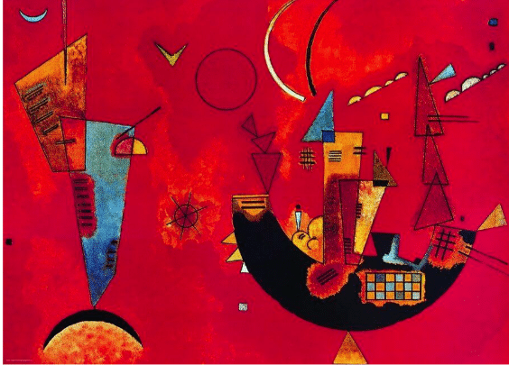
Artists, in fact, seem often inclined to think of red in terms of sound. Kandinsky did, and so did Renoir: “I want a red to be sonorous, to sound like a bell,” Renoir said. “If it doesn’t turn out that way, I add more reds and other colors until I get it.” Boom.
In alchemy, redness (Latin “Rubedo”) symbolizes the final stage in the Magnum Opus, signaling alchemical success and the completion of the Great Work. Red is the alchemists’ final velvet curtain, as it were, melting before the coveted transmutational gold and the philosopher’s stone.
“Red,” writes historian Michel Pastoureau in Red: The History of a Color, “is the archetypal color, the first color humans mastered, fabricated, reproduced, and broke down into different shades.” Still, throughout the history of oil painting anyway, bright red was a big problem.
Red was (and unless we’re talking cadmium red, still is) one of the “fugitive” colors, meaning it’s likely to fade over time in any kind of light. Sure, there were relatively stable red earths like ochre and iron oxide, but just about anything more striking had to be either 1) cinnabar, a rare earth, highly toxic and too expensive, 2) vermillion, which turned black if exposed light 3) “minimum” or lead red, which light turned white instead, or 4) organic, which meant it would inevitably fade.
Until modern chemistry swooped in, most artists used a fugitive pigment called either cochineal (or euphemistically crimson lake), made from the ground-up bodies of the small red Armenian scale insect it was originally named after. After synthetic pigments and dyes such as alizarin were invented in the late 19th century, use of natural-dye products such as cochineal gradually diminished, at least in art and textiles (with mixed results). However, “carmine” (aka cochineal extract aka “natural red 4”) named for the carminic acid that produces the insects’ tint, is still used widely today in things like artificial flowers, food coloring, and lipstick (yep you could be eating and/or smearing the dead bodies of thousands of little scaly bugs all over your lips, I’m sorry to say.)
Matisse loved the color so much he produced one of the first nearly fully abstract “color field” paintings when he completed “The Red Studio” in 1911. Oddly, Matisse once quipped, “a thimbleful of red is redder than a bucketful.” Um…
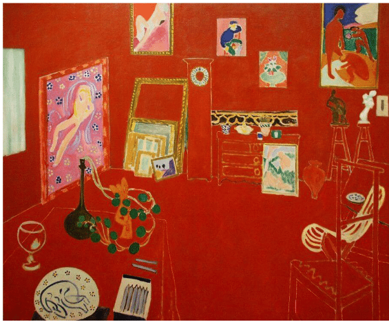
Henri Matisse, “The Red Studio” Issy-les-Moulineaux, 1911
The “Red Studio” was hardly the only painting into which the modern master spilled bucketfuls of the pigment, either. And all this liberal rubedo led, fairly directly one could argue, to Mark Rothko and Barnett Newman.
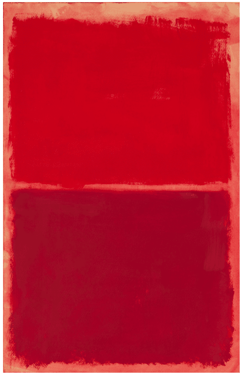
Mark Rothko, Untitled/Red on Red 1969
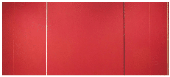
Barnett Newman, “Vir Heroicus Sublimis,” 1950-51 Sharon Mollerus via Flickr under CC BY-SA 2.0
There’s a joke among artists that goes, if you want a sell a painting, put red in it, and there’s a kernel of truth to it; red artworks have been found to fetch higher prices at auctions (though not as high as blue ones it turns out). Monochrome madman and 1980’s “Chromatic Expressionist” George De Groat agreed, anyway: “You can’t go wrong with the use of red; every painting should have red in it,” he said
“Painters use red like spice,” according to contemporary artist Derek Jarman, and it’s not a bad idea. “Of all the hues, reds have the most potency, claims American textile czar Jack Lenor Laresn. “ If there is one electric blue, a dozen reds are so charged. Use them to punctuate white, burn into bronzes, or dynamite black.” Well, yeah!

Georgia O’Keefe, “Red Hill and Bones,” 1941. Death? Nah, life everlasting, And red is the new black.
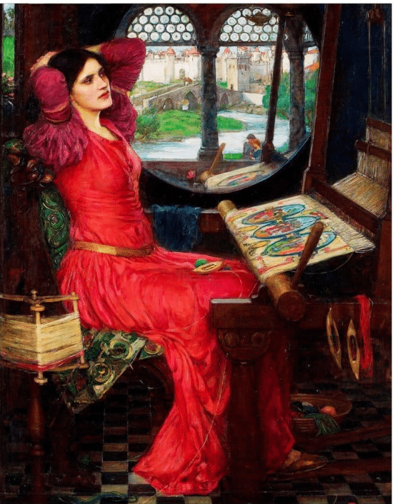
John Waterhouse, “’I Am Half Sick of Shadows,’ said the Lady of Shalott,” 1915. Well, that dress oughtta do it if anything can!
If you need more color expertise in your artist’s toolbox, check out some of these deep-dive DVDs on color theory and how to apply it to create brighter and more compelling paintings.