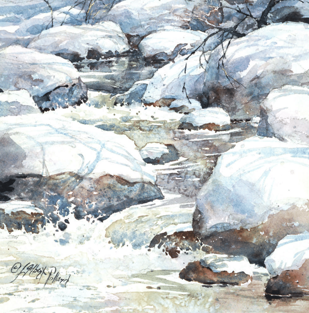
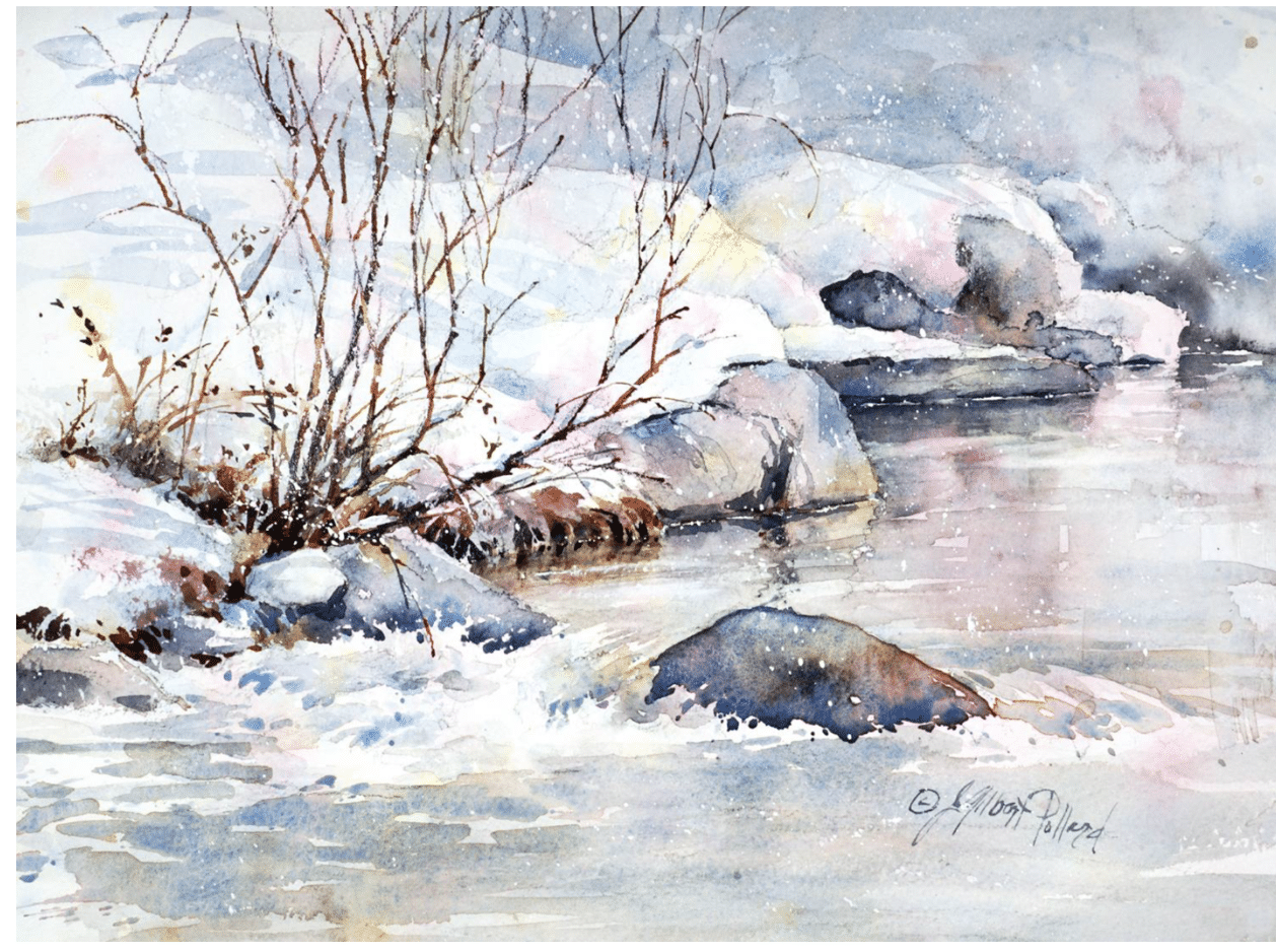
Julie Gilbert Pollard makes some of the most colorful winter snow paintings you’ll see. She makes both watercolors and acrylic paintings, and this method at times combines the two. She begins her most colorful watercolor snow paintings with an abstract acrylic or watercolor “rainbow underpainting,” a technique she credits to “an old how-to watercolor book by John Pike.”
“It tends to impart a prismatic misty and atmospheric feel to a painting,” she says. “I call it a ‘rainbow underpainting’ which I don’t think he did, but others might.”
Example of Julie Gilbert Pollard’s rainbow underpainting for colorful winter scenes.
Here’s her formula:
- In a wet-into-wet manner, splatter (on paper or watercolor canvas) the equivalent of yellow, magenta, and cyan or yellow, red, and blue (try different color choices) randomly over the surface. You can pull some of the color together by rocking the paper back and forth or gently brushing into the wet surface – or not – as you wish.
- When pulling together, be careful not to pull the colors together to the point that the three primaries are mixed to create a neutral color. We want to see at least a bit of color identity, not a gray surface!
- Sometimes I use Watercolor, sometimes Golden High Flow Acrylics, or Golden Fluid Acrylics – all highly diluted. In the case of using acrylic, I want the color to stain the paper, not give a plastic non-water-permeable surface, which is what we often expect with acrylic.
- I do the drawing after the paper is completely dry. Then paint more-or-less as usual. You could also paint into this underpainting wet-into-wet if you wish.
“Snow isn’t as white as we might think,” she says. In watercolor, however, we tend to want to see white paper. Therefore, care needs to be taken with value, preserving enough of that precious white paper, though not too much!” Shapes matter most, regardless of the underpainting technique, she says. As always “’good’ shapes in appropriate values ‘make’ the painting.”
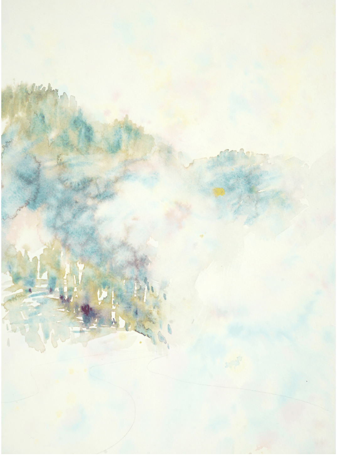
As soon as the underpainting is dry, she begins developing the shapes, keeping the paint open and semi-transparent in some place and opaque in others, all in counterpoint with the initial colors.
Additional Considerations
“I loosely follow nature but usually make it more colorful than it actually is,” she says, “making sure to use the colors in harmony with each other and balanced within the composition.”
“I try not to add too much fine detail. But there’s ‘detail,’ such as the cracks in the rocks or maybe defining separate leaves instead of seeing the mass of a gazillion leaves on a tree as a single large shape, for example… Then, there’s ‘detail’ of a very different nature, such as making sure the value patterns and color choices are balanced, that the principles and elements of design are working well. The types of details I focus on are the latter. In case I can’t tell what is working and not working, I have my list of the Principles & Elements of Design to consult.”
Julie returns to this year’s Acrylic Live online learning event in March.
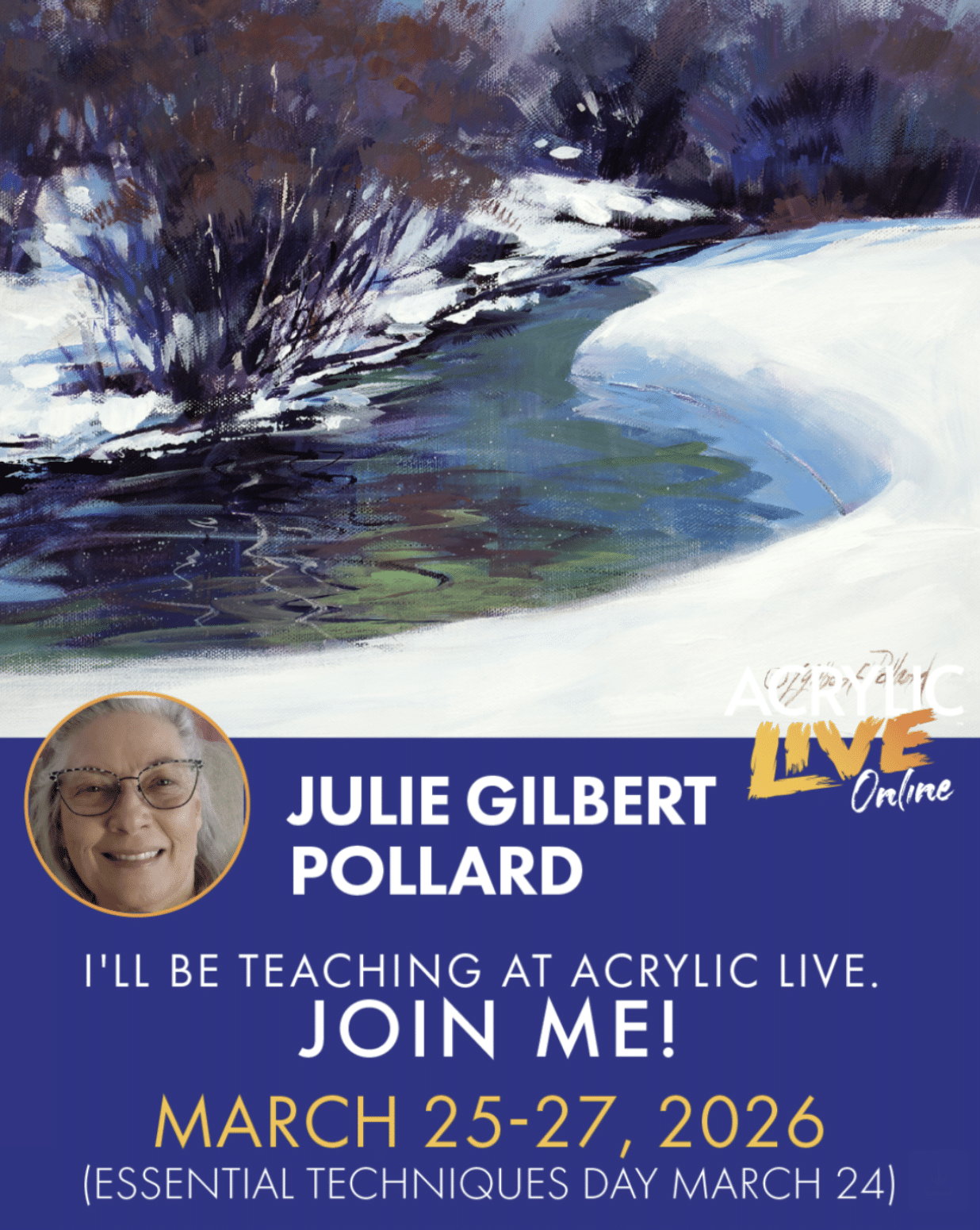
Acrylic Live is 4-day online event designed to immerse participants in the methods and techniques of major, leading artists in demonstrations designed to save years of trail and error. Goals are building confidence, bringing fresh inspiration, and turbocharging your progress—whether you’re just getting started, stuck in a creative rut, or looking to paint at a higher level. Learn more and register here.
She also has several popular videos available for streaming right to your computer screen, including “Acrylic Unleashed: Painting a Snowy Landscape.” Check it out here.