Rocks are hard.
That’s a fact. But painting them gets easier with a few basic principles in mind. Number one pitfall to avoid: making your rocks look like potato sacks. Okay, but how? The following tips apply to oils, acrylics, watercolors, pastels, oils, pencil sketches and charcoal alike.
- Don’t ever make a rock without at least one sharp angle or edge. Some rocks look smooth and roundish – especially river rocks. Don’t be fooled. They were once jagged, angular, geometric blocks. Draw them that way and it will show.
- Light and shadow are your friends – keep them consistent on each rock. Decide what direction the light is coming from and position all your highlights and shadows in line with the same angle.
- Every rock has at least three planes (top, bottom, side) – give them a hierarchy. This is a great to fix a “potato.” Rocks aren’t represented well by uniform, rounded, evenly lit forms. Decide for each rock which plane is dominant – it will either be the lighted plane (usually the lightest lights and on top), the midtone plane, reflected-light/shadow side, or the shadow plane (usually darkest and on the bottom). Give one plane on each rock top billing. Then add details. Think of this part as subdividing the planes with angular irregularities – spots where protruding edges of the rock catch the light, or where receding bits collect more shadow.
- Use the edges (shapes) of the highlights and the shadows to establish texture and the relative smoothness or roughness of the rocks. Last but not least: you’ll be amazed how much a difference in “believability” this can make.
- Overall, treat your rocks like geometric blocks, and make them asymmetrical and uneven rather than round and uniform (so, no cubes or perfect rectangles).
Hudson River School painter Asher B. Durand makes a great mentor to learn and practice from. Durand was trained as an engraver and recognized as one of the best in the country (he was so good that he drew the intricate engravings on paper money).
That draftsmanship and engraver’s precision Durand carried into easel painting. In his approach to landscape, he nailed the technique being called for by influential English art theorist John Ruskin, who began in 1840s to advocate the close observation of the physical world. Durand, like his peer Albert Bierstadt, made hundreds of “scientific-quality” on-site studies of specific North American trees, grasses, shrubs, wildflowers, streams, and rocks. Those sketches were the building blocks for the larger complete paintings they made in the studio.
Here’s a typical example of one such painting (below). It shows Durand’s ability to merge the soft mood of European painters such as Claude Lorraine with sharply observational accuracy specific to nature in North America. The beauty in it comes from Durand’s reverence for the honeyed light of Claude; its’ important to note that he wasn’t just about accuracy. He treated realism as a tool. Durand was really after mood, beauty, and something more besides – a feeling for the spiritual in the particular, or what he called in his own words, the “veneration for, and faith in, the simple truths of Nature, which constitute the true Religion of Art.”
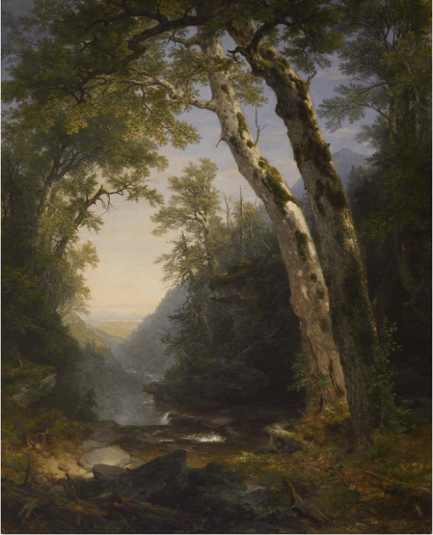
Asher B. Durand, The Catskills, oil, 1859. The Walters Art Museum
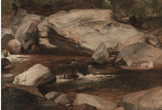
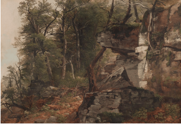
Though grainy, this reproduction (below) clearly shows how Durand used rocks to give dynamism and energy to his landscapes.
Asher B. Durand, Kaaterskill Landscape,1850 Princeton University Art Museum.
Here is a study Durand made:
The study above appears in the reprint of Durand’s 1855 “Letters on Landscape Painting,” which you can buy as a reprint or read for free on the Internet Archive right here.
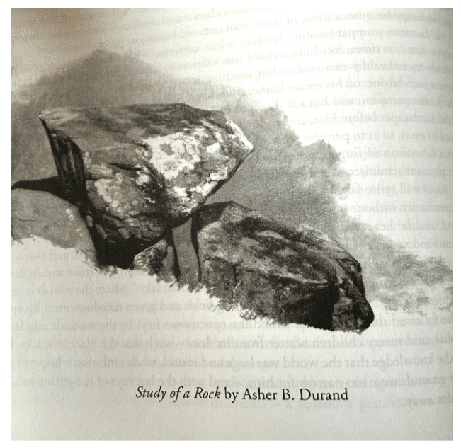
It’s helpful to see it in black and white. Copying this study will do more for your rocks than anything I might be able to write here. I took a stab at it, but my pencil was too soft for the task, and I’m sure you can do better job. If you do copy the sketch, please send it in – I’d love to see it.
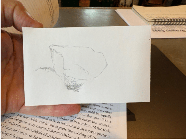
Step 1: Start with a basic outline of the big shapes, taking care to include some flat planes and relatively sharp angles.

Step 2: Fill in details using light and shadow. Note the hierarchy of the planes – the plane getting the most love is the midtone (mostly side) plane, with the least real estate allotted to the light plane (brightest highlights) and the shadow plane (darkest shadow areas). That choice has to be made!
Step 3 would be to correct inaccuracies in the drawing and then darken the darks and lighten the lights. And definitely to get rid of that weird “eye” that appeared somehow… See it? It’s smack in the middle of the big rock. Eek!
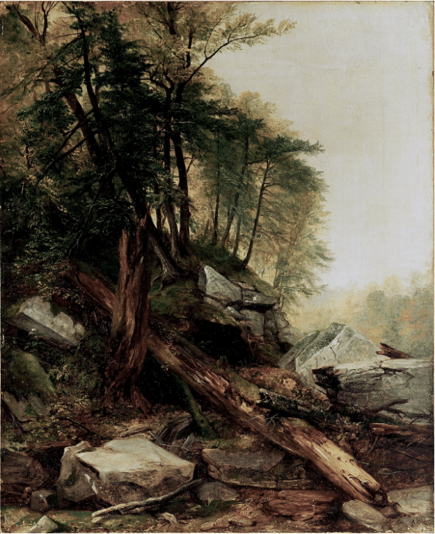
Here are two more of Durand’s paintings featuring awesome rocks. Saving and changing these to black and white on your computer will give you excellent value studies to copy, which is probably the best way to learn the principles of rock painting. I’m sure you can find more and better Durand studies to work from online too.
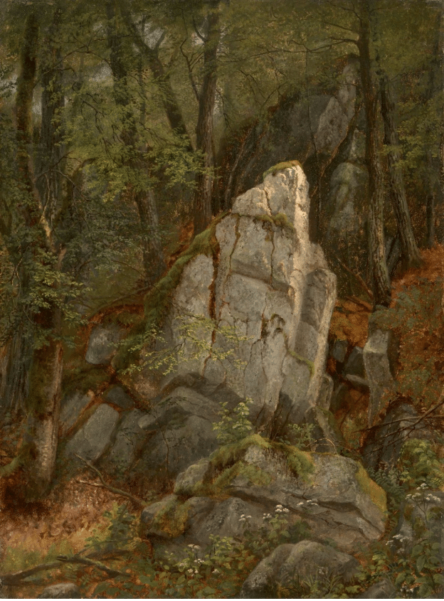
Asher B. Durand, Trees on a Rocky Hillside, c. 1849. Oil on canvas; framed: 64.8 x 83.2 x 7.9 cm (25 1/2 x 32 3/4 x 3 1/8 in.); unframed: 42.5 x 61.3 cm (16 3/4 x 24 1/8 in.); former: 53.5 x 72 x 6.5 cm (21 1/16 x 28 3/8 x 2 9/16 in.). The Cleveland Museum of Art, Mr. and Mrs. William H. Marlatt Fund, 1968.21
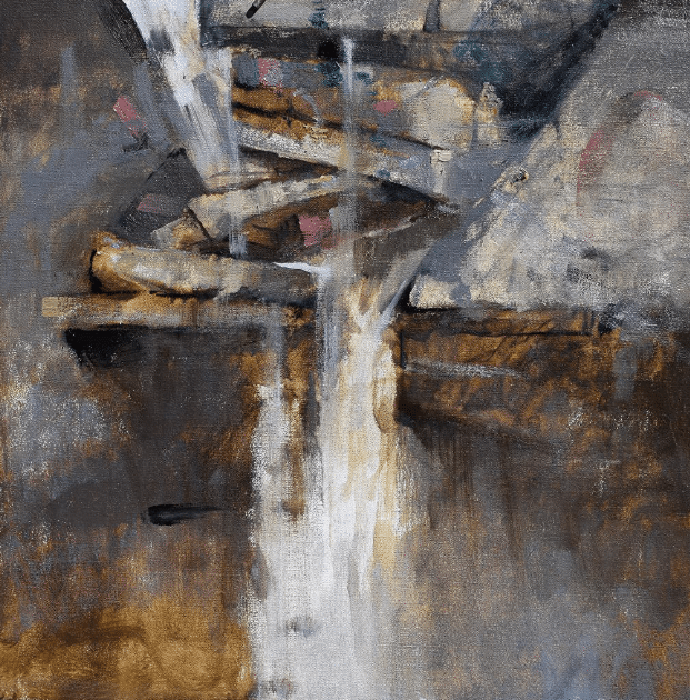
Albert Handell, At the Kaaterskill Waterfalls ‐ Oil ‐ 22 x 22
Albert Handell has painted and sketched in some of the same locations as Durand and other Hudson River School masters. He is particularly well known for his dynamic paintings of rocks and water. He has a teaching video that takes it step by step.
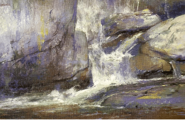
Albert Handell, Buttermilk Falls, VT ‐ Pastel ‐ 12 x 18.


